1. Basic Understanding
1.1. Introduction
HTML, CSS, and JavaScript are often used together in many websites to design web pages, web applications, and mobile applications' user interfaces. As we all know, a webpage generally consists of text, images, audio, video, hyperlinks, etc. Once an HTML file is parsed and rendered by the browser, it transforms into a visual webpage that users can see. HTML describes the structure and semantics of a website, following a linear presentation, which is why it is classified as a markup language rather than a programming language. The name of HTML—HyperText Markup Language—indicates this as well.
Due to the diversity of browsers available, their corresponding rendering engines also vary significantly, leading to certain differences in the way the same code is interpreted. To ensure a consistent user experience, web standards are generally used for web development. Web standards consist of three main parts:
| Component | Language | Description |
|---|---|---|
| Structure | HTML | Defines web elements and content |
| Presentation | CSS | Controls the appearance and layout of the web elements |
| Behavior | JavaScript | Defines page interactions and web simulations |
1.2. Introduction to HTML
(1) HTML Skeleton
HTML is a markup language that achieves its functions by using a series of tags. The layout of these tags is not random but follows a structural hierarchy (e.g., overall structure, head, title, body, etc.).
<html>
  <head>
    <title>Webpage Title</title>
  </head>
  <body>
    <!-- Webpage content goes here -->
  </body>
</html>
As shown above, the entire HTML code is enclosed within <html></html> tags. Inside the <html> tag, there are the <head> (head) and <body> (body) tags. The <head> tag contains the <title> (title) tag, which is the foundation of HTML's skeleton. The content within the <title> tag corresponds to the title of the webpage. For example:
<title>Example Webpage</title>
(2) HTML Syntax Rules
-
Comments: These are informative or descriptive notes added to the code, primarily to help developers understand the code. In VS Code, comments can generally be added using ctrl+/.
<!-- This is a comment -->
-
Structure Composition: Tags mainly consist of <, >, /, and some English letters. The word or letter enclosed within the <> is called the tag name. Most tags are composed of two parts, known as double tags. The first part is the opening tag, and the second part is the closing tag. Some tags are composed of only one part, known as single tags, and cannot enclose content.
<h1>Double Tag</h1>
<!-- Double tag example -->
<hr>
<!-- Single tag example -->
-
Tag Relationships: The relationship between HTML tags can be classified into two types: parent-child relationships (nested relationships) and sibling relationships (parallel relationships). The parent-child relationship is where a parent tag wraps around its child tag(s), while the sibling relationship refers to two tags that are on the same level, side by side.
2. Learning HTML Tags
Summary: A webpage is generally composed of text, images, audio, video, and hyperlinks. As a hypertext markup language, HTML uses tags to display these elements. The study of tags can be divided into four parts: layout tags, text formatting tags, media tags, and link tags.
1. Layout Tags
(1) Heading Tags
Headings are an important part of an article and have their unique format, such as occupying an entire line and displaying bold text. They can be divided into multiple levels.
In code, the h series of tags (double tags) are used for this purpose. The h series generally has six levels. When using them, simply specify the level by adding the appropriate number after the h.
<h1>Heading Level 1</h1>
<h2>Heading Level 2</h2>
<h3>Heading Level 3</h3>
<h4>Heading Level 4</h4>
<h5>Heading Level 5</h5>
<h6>Heading Level 6</h6>
(2) Paragraph Tags
Just like headings, articles have paragraphs. The unique feature of paragraph tags is that there is a gap between paragraphs, and they also occupy an entire line.
In code, the p (double tag) is used to display text in paragraphs. It is important to note that when the text exceeds the width of the text box, the text will automatically wrap.
<p>This is a paragraph of text.</p>
(3) Line Break and Horizontal Line Tags
When you need to break a line at a specific point or when the text reaches a certain length, you can use the br tag (single tag) for line breaks.
Horizontal lines are also frequently used in text displays, such as between a large heading and a paragraph. The hr tag (single tag) can be used for this purpose.
<br>
<hr>
(4) Complete Example
<!DOCTYPE html>
<html>
<head>
    <meta charset="UTF-8">
    <meta name="viewport" content="width=device-width, initial-scale=1.0">
    <title>Document</title>
</head>
<body>
    <h1>Typhoon: Will Shanghai Cool Down? How Long Will the Heat Continue?</h1>
    <hr>
    <p>Shanghai's heatwave continues, with mostly cloudy weather today.
    Temperatures will rise quickly. <br> In the afternoon, watch out for
    isolated thunderstorms. Today's high is expected to reach 38-39°C.</p>

    <p>The Shanghai Meteorological Center issued an orange high-temperature
    warning at 8:40 AM. Stay hydrated and cool! <br> Winds will increase
    slightly today, with southerly winds at 4-5 levels and gusts of
    7-9 levels during thunderstorms, shifting northward. Relative
    humidity will range between 85% and 40%.</p>
</body>
</html>
2. Text Formatting Tags
Summary: When you need to apply formatting effects to text such as bold, underline, italic, or strikethrough, you can use text formatting tags. Common text formatting tags are as follows:
| Effect | Tag 1 | Tag 2 |
|---|---|---|
| Bold | <b> | <strong> |
| Underline | <u> | <ins> |
| Italic | <i> | <em> |
| Strikethrough | <s> | <del> |
From the table, you can see that two different tags can achieve the same effect. This is because the importance of the text with the same formatting effect may vary. For example, formatting for ordinary text and for important information such as prices or numbers. Therefore, more prominent Tag 2 series is generally used for important text formatting, while simpler Tag 1 series is used for general text formatting.
This approach helps to make the code clearer and more readable.
<!DOCTYPE html>
<html>
<head>
    <meta charset="UTF-8">
    <meta name="viewport" content="width=device-width, initial-scale=1.0">
    <title>Document</title>
</head>
<body>
  <b>Bold</b>
  <strong>Bold</strong>
  <u>Underline</u>
  <ins>Underline</ins>
  <i>Italic</i>
  <em>Italic</em>
  <s>Strikethrough</s>
  <del>Strikethrough</del>
</body>
</html>
Note: The above text formatting tags each occupy a single line and do not have a line break effect.
3. Media Tags
(1) Path
To display images, videos, audio, etc., you first need to know their storage location. The information on how to reach this location is called a path. Paths can be categorized into absolute paths and relative paths.
An absolute path refers to the exact location on the directory, typically starting from the drive letter (e.g., C:UsersLENOVOPicturesSaved Picturesimage.jpg). A complete web address is also considered an absolute path.
In contrast, relative paths are used in development, which start from the current HTML file to the target file.
There are three ways to navigate:
-
./ (to the same level directory)
-
/ (to the subdirectory)
-
../ (to the parent directory)
Each time you navigate, include the folder or file name until you reach the target file.
(2) Images
Images are displayed using the img tag (single tag).
<img src="" alt="">
The img tag includes attributes like src and alt. These are attributes of the tag, where src specifies the image path and alt provides alternative text if the image fails to load. The alt text helps in error handling by providing information to users when the image cannot be displayed. Other attributes can be added to the tag to set display properties.
Attribute Considerations:
-
Attributes are written inside the tag.
-
A tag can have multiple attributes.
-
Attributes are separated by spaces, and there is a space between the attribute and the tag name.
-
The order of attributes does not affect tag display.
-
Many attributes are universal and can be used in multiple tags.
width and height attributes:
These attributes take numerical values to set the width and height of the image. When only one is set, the other adjusts proportionally to maintain the original aspect ratio of the image.
title attribute:
The title attribute provides additional information that appears when the user hovers over the element.
(3) Audio Tags
Audio is also an important part of web content, and the corresponding audio tag is <audio> (double tag).
<audio src=""></audio>
The audio tag supports attributes like controls, autoplay, and loop:
| Attribute Name | Function | Attribute Value |
|---|---|---|
| controls | Shows playback controls (with progress bar, play/pause, etc.) | None |
| autoplay | Autoplay (not supported by some browsers) | None |
| loop | Loop playback | None |
These attributes can be added to the tag without values, separated by spaces. Note that many browsers do not support automatic audio playback for user experience reasons.
Note: Audio generally supports three formats: MP3, WAV, and OGG.
(4) Video Tags
To insert a video into a webpage, use the <video> tag.
<video src=""></video>
The video tag also supports autoplay, loop, and controls attributes, used similarly to audio. Unlike audio, autoplay can be paired with the muted attribute to enable automatic playback with no sound (sound can be controlled using the controls attribute).
Note: The video tag generally supports three formats: MP4, WebM, and OGG.
(5) Link Tags
To create hyperlinks for webpage navigation, use the <a> (double tag) link tag.
<a href="#">Hyperlink</a>
The a tag includes the href attribute, which specifies the path to the webpage to be linked. The text within the a tag becomes the clickable link. If the target path is unknown during development, # can be used temporarily.
Additionally, the target attribute controls how the target webpage opens. The target attribute can have two values:
-
_self: Default, opens in the same window, replacing the current page.
-
_blank: Opens in a new window, keeping the original page open.
The a tag does not occupy a single line by itself.
4. List Tags
Lists are a collection of elements arranged linearly. Lists can be categorized into ordered lists, unordered lists, and definition lists.
Unordered List:
An unordered list has no specific order. Each item in the list is preceded by a default bullet point. This is implemented using the <ul> (unordered list) and <li> (list item) tags. The <ul> tag represents the overall list, while the <li> tag represents each item within the list. The <ul> tag is the parent of the <li> tags, and <ul> can only contain <li> tags, although <li> tags can contain any content.
<ul>
    <li>Item 1</li>
    <li>Item 2</li>
    <li>Item 3</li>
</ul>
Ordered List:
An ordered list is used when the list items have a specific order. This is implemented using the <ol> (ordered list) tag and <li> (list item) tags, similar to unordered lists. The <ol> tag represents the overall list, and <li> tags represent each item. An ordered list displays items with a preceding number based on the order of the <li> tags. The <ol> tag can only contain <li> tags, and <li> tags can contain any content.
<ol>
    <li>Item 1</li>
    <li>Item 2</li>
    <li>Item 3</li>
</ol>
Definition List:
Definition lists are often used for creating navigation menus at the bottom of a webpage. They are implemented using the <dl> (definition list), <dt> (definition term), and <dd> (definition description) tags. The <dl> tag represents the entire list, containing only <dt> and <dd> tags. The <dt> tag represents the term or topic, and the <dd> tag represents the details or description for that term. <dd> tags automatically show an indent effect. <dt> and <dd> tags can contain any content.
<dl>
    <dt>Help Center</dt>
    <dd>Shopping Guide</dd>
    <dd>Account Management</dd>

    <dt>Service Support</dt>
    <dd>After-sales Policy</dd>
    <dd>Automated Services</dd>
</dl>
5. Table Tags
Tables display data in a grid of rows and columns and are implemented using the <table>, <tr>, and <td> tags. The <table> tag represents the entire table, <tr> represents each row, and <td> represents each cell within the row. They are nested hierarchically: <table> wraps <tr>, and <tr> wraps <td>. By default, tables have no border or other visual effects, but these can be set using attributes.
Attributes:
-
border: Defines the width of the table border. -
widthandheight: Set the width and height of the table.
<table border="3" width="300" height="300">
    <tr>
        <td>Name</td>
        <td>Age</td>
        <td>Score</td>
    </tr>
    <tr>
        <td>John</td>
        <td>3</td>
        <td>100</td>
    </tr>
    <tr>
        <td>Jane</td>
        <td>2</td>
        <td>99</td>
    </tr>
</table>
Additional Tags:
-
<caption>: Provides a title for the table, displayed centered above the table. It is placed inside the<table>tag but at the same level as<tr>. -
<th>: Represents header cells with bold text and centered alignment, used in the first row to replace<td>.
<table border="3" width="300" height="300">
    <caption>Table Title</caption>
    <tr>
        <th>Name</th>
        <th>Age</th>
        <th>Score</th>
    </tr>
    <tr>
        <td>John</td>
        <td>3</td>
        <td>100</td>
    </tr>
    <tr>
        <td>Jane</td>
        <td>2</td>
        <td>99</td>
    </tr>
</table>
Table Sections:
-
<thead>: Groups header content (used for the header row). -
<tbody>: Groups body content (used for data rows). -
<tfoot>: Groups footer content (used for summary or footer rows).
These tags help to organize the table structure without affecting its display.
<table border="3" width="300" height="300">
    <caption>Table Title</caption>
    <thead>
        <tr>
            <th>Name</th>
            <th>Age</th>
            <th>Score</th>
        </tr>
    </thead>
    <tbody>
        <tr>
            <td>John</td>
            <td>3</td>
            <td>100</td>
        </tr>
        <tr>
            <td>Jane</td>
            <td>2</td>
            <td>99</td>
        </tr>
    </tbody>
</table>
Merging Cells:Cells can be merged both horizontally (across columns) and vertically (across rows) using the rowspan and colspan attributes. These attributes specify the number of rows or columns to span. Cells are merged according to the top-left cell position. Ensure to add rowspan or colspan attributes to the main cell and remove the other cells in the merged area.
<table border="3" width="300" height="300">
    <caption>Table Title</caption>
    <thead>
        <tr>
            <th>Name</th>
            <th>Grade</th>
            <th>Score</th>
        </tr>
    </thead>
    <tbody>
        <tr>
            <td>John</td>
            <td rowspan="2">3</td>
            <td>100</td>
        </tr>
        <tr>
            <td>Jane</td>
            <td>99</td>
        </tr>
    </tbody>
</table>
Note: Cells cannot span across table section tags (e.g., <thead>, <tbody>, <tfoot>) but can span within the same section.
6. Form Tags
(1) Basic Usage
Form tags are used to let users submit information to us, such as login, registration, and search functionalities on a webpage. All these functions are implemented using the input tag. The input tag can perform various functions by changing the value of its type attribute:
| Type Attribute Value | Description |
|---|---|
| text | Textbox for entering a single line of text |
| password | Password field for entering a password |
| radio | Radio button (select one from multiple) |
| checkbox | Checkbox (select multiple from several) |
| file | File chooser for uploading files |
| submit | Submit button for form submission |
| reset | Reset button for clearing form data |
| button | Standard button, can be enhanced with JS |
Name: <input type="text">                              <br>
Password: <input type="password">                        <br>
Gender: <input type="radio">Male<input type="radio">Female   <br>
Hobbies: <input type="checkbox">Eat
<input type="checkbox">Drink
<input type="checkbox">Play
<input type="checkbox">Sleep                               <br>
Relevant Documents: <input type="file">                           <br>
<input type="submit">
<input type="reset">
(2) Placeholder Attribute: Textbox Placeholder
The placeholder attribute can be used with the type attribute to display a prompt text for users. It can be used with textboxes, password fields, etc.
Name: <input type="text" placeholder="Please enter your real name">                              <br>
Password: <input type="password" placeholder="Enter six-digit password">
(3) Radio Button Functionality and Default Selection
If you only add several radio buttons without any additional setup, the radio button functionality is not properly implemented, meaning multiple buttons can be selected at once. This happens because there is no direct relationship between these radio buttons, and the system doesn't know which buttons are meant to be grouped. Therefore, when the type attribute value is radio, remember to use the name attribute to group them. Radio buttons with the same name attribute value belong to the same group, and only one can be selected at a time.
Gender: <input type="radio" name="sex">Male
<input type="radio" name="sex">Female
The name attribute value can be customized and can consist of letters, numbers, and underscores, with case sensitivity.
If you want to set a default selection for a radio button, you can add the checked attribute (without a value) to its input tag. This way, the radio button will be pre-selected when the user accesses the form.
Gender: <input type="radio" name="sex" checked>Male
<input type="radio" name="sex">Female
(4) Uploading Multiple Files
When the type attribute of the input tag is file, it allows file uploads. By default, only one file can be uploaded at a time. To enable multiple file uploads, use the multiple attribute (without a value).
<input type="file" multiple>
(5) Buttons
The input tag supports three types of buttons: submit, reset, and button. To properly implement the functionality of these buttons, they need to be used in conjunction with the form tag. The action attribute of the form tag specifies the backend server address, allowing users to submit their information to the server using the submit button or reset the input information using the reset button. The form tag should enclose all the information to be submitted (the entire form).
To change the placeholder text of the buttons, use the value attribute.
<form action="">
    Username: <input type="text" placeholder="Chinese characters">    <br>
    Password: <input type="password" placeholder="Six-digit password">  <br>
    Gender: <input type="radio" name="sex">
          <input type="radio" name="sex">  <br>
          <input type="submit"> <input type="reset"><input type="button" value="Standard Button">
</form>
In addition to using the input tag for buttons, the button tag can also be used. The button tag also has a type attribute with three values: submit (default), reset, and button. The content enclosed by the button tag serves as the button's placeholder text.
<button type="submit">Submit</button>
<button type="reset">Reset</button>
<button type="button">Standard Button</button>
(6) Select Dropdown Menu Tag
If you need users to choose one option from a limited set of options you provide, use the select tag to add a dropdown menu control. The dropdown menu is implemented using two tags: select and option. The select tag represents the overall dropdown menu, while option represents an item within the menu.
To set a default selected item, use the selected attribute.
<select>
    <option>Beijing</option>
    <option selected>Shanghai</option>
    <option>Guangdong</option>
    <option>Shenzhen</option>
</select>
(7) Textarea Tag
The textarea tag provides a form control for inputting multiple lines of text. The cols and rows attributes define the initial visible width and number of visible lines of the textarea. Users can resize the textarea by dragging the bottom-right corner.
<textarea cols="30" rows="10"></textarea>
(8) Label Tag
The label tag binds the content to a form element, meaning that the content within the label tag has the same functionality as the associated form element. To use it, wrap the content and its associated tag within the label tag.
<!-- Clicking on 'Male' or 'Female' will also select the corresponding radio button -->
Gender:
<label>
    <input type="radio" name="sex">Male
</label>
<label>
    <input type="radio" name="sex">Female
</label>
-
Semantic Tags
(1) Non-Semantic Layout Tags
-
div: Takes up a full line. -
span: Multiple can be displayed on one line.
<div>1</div>
<div>2</div>
<span>1</span> <span>2</span>
(2) Semantic Layout Tags
| Tag Name | Meaning |
|---|---|
| header | Header of the webpage |
| nav | Navigation of the webpage |
| footer | Footer of the webpage |
| aside | Sidebar of the webpage |
| section | Section of the webpage |
| article | Article on the webpage |
These tags have similar display characteristics to the div tag, but they provide additional semantic meaning. They are commonly used in mobile web design.
<header>Header</header>
<nav>Navigation</nav>
<footer>Footer</footer>
<aside>Sidebar</aside>
<section>Section</section>
<article>Article</article>
-
Character Entities
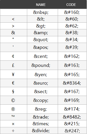
When adding a lot of spaces within a block of text, you’ll find that only one space is effective. This is because some special characters on the web need to be replaced with character entities. Character entities are represented by & followed by the name of the entity.
Common character entities include:
