16.1 Text
The Text widget is used to display simple styled text. It contains several properties for controlling the appearance of the text. Here’s a simple example:
Text("Hello world",
  textAlign: TextAlign.left,
);

Text("Hello world! I'm Jack. "*4,
  maxLines: 1,
  overflow: TextOverflow.ellipsis,
);

Text("Hello world",
  textScaleFactor: 1.5,
);
The output is shown in Figure:
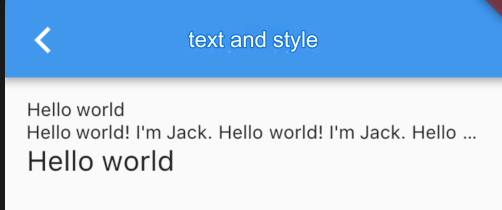
textAlign: Defines the text alignment. You can align the text to the left, right, or center. Note that the alignment is relative to the
Textwidget itself. In this example, although center alignment is specified, it has no effect since the width of the text content does not span an entire line. The alignment property only has meaning when theTextwidget’s width exceeds the length of its content. Now, let’s specify a longer string:
Text("Hello world "*6,  // The string is repeated six times
  textAlign: TextAlign.center,
);
The output is shown in Figure:

The string content exceeds one line, and the Text widget width is equal to the screen width. The second line of text will be center-aligned.
maxLines, overflow: Specifies the maximum number of lines the text can occupy. By default, the text will automatically wrap. If this parameter is set, the text will not exceed the specified number of lines. If there is extra text, the
overflowproperty can be used to define how it’s truncated. The default behavior is to simply cut off the text. In this example, we useTextOverflow.ellipsis, which truncates the extra text and replaces it with an ellipsis (“...”). For other overflow options, refer to the SDK documentation.textScaleFactor: Represents the scaling factor for the text relative to its current font size. This is a convenient way to adjust the font size instead of setting it via the
fontSizeproperty inTextStyle. The default value can be obtained throughMediaQueryData.textScaleFactor. If noMediaQueryis available, the default value will be 1.0.
16.2 TextStyle
TextStyle is used to define the appearance of text, such as color, font, weight, background, etc. Here’s an example:
Text("Hello world",
  style: TextStyle(
    color: Colors.blue,
    fontSize: 18.0,
    height: 1.2,
    fontFamily: "Courier",
    background: Paint()..color = Colors.yellow,
    decoration: TextDecoration.underline,
    decorationStyle: TextDecorationStyle.dashed,
  ),
);
The output is shown in Figure:

This example only shows some of the properties of TextStyle. There are other properties as well, which are self-explanatory. You can refer to the SDK documentation for more details. A few points worth noting:
height: This property defines the line height, but it’s not an absolute value. It’s a factor where the actual line height equals
fontSize * height.fontFamily: Since different platforms support different font sets by default, you should test manually specified fonts on various platforms.
fontSize: Both
fontSizeandtextScaleFactorcan control the font size. However, there are two main differences:fontSizeallows you to specify the exact font size, whereastextScaleFactorcontrols it using a scaling factor.textScaleFactoris mainly used for globally adjusting font size based on system settings, whilefontSizeis usually used for individual text elements and does not follow system font size changes.
16.3 TextSpan
In the previous examples, all text within the Text widget can only be displayed using a single style. If you need to display different parts of the text with different styles, you can use TextSpan, which represents a "span" of text. Let’s look at its definition:
const TextSpan({
  TextStyle style,
  String text,
  List<TextSpan> children,
  GestureRecognizer recognizer,
});
The style and text properties define the style and content of the text span. The children property is an array of TextSpan, meaning that a TextSpan can contain other TextSpans. The recognizer is used for handling gesture recognition on the text span. Now, let’s create the effect shown in Figure using TextSpan:

Source code:
Text.rich(TextSpan(
    children: [
      TextSpan(
        text: "Home: "
      ),
      TextSpan(
        text: "https://flutterchina.club",
        style: TextStyle(
          color: Colors.blue,
        ),
        recognizer: _tapRecognizer,
      ),
    ],
));
In the above code, we created a basic text span and a link span using TextSpan. The TextSpan is then added to the Text widget using the Text.rich method. This works because Text is essentially a wrapper around RichText, a widget capable of displaying multiple styles (rich text).
The _tapRecognizer is a handler for tapping the link (the code is omitted). More details on gesture recognition will be introduced later.
16.4 DefaultTextStyle
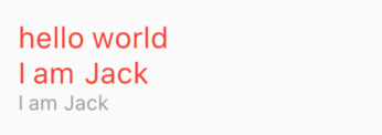
In the widget tree, text styles can be inherited by default. If a child text widget does not specify a style, it will inherit the default style from its parent in the widget tree. DefaultTextStyle is used to set the default text style for a subtree. Let’s look at an example:
DefaultTextStyle(
  style: TextStyle(
    color: Colors.red,
    fontSize: 20.0,
  ),
  textAlign: TextAlign.start,
  child: Column(
    crossAxisAlignment: CrossAxisAlignment.start,
    children: <Widget>[
      Text("hello world"),
      Text("I am Jack"),
      Text("I am Jack",
        style: TextStyle(
          inherit: false, // Do not inherit the default style
          color: Colors.grey,
        ),
      ),
    ],
  ),
);
In the above code, we first set a default text style with a font size of 20 logical pixels and a red color. The DefaultTextStyle is applied to the Column widget, so all text descendants of Column will inherit this style unless they explicitly choose not to, as indicated by the comment in the code. The output is shown in Figure :
16.5 Fonts
You can use different fonts in a Flutter application. For example, you might use a custom font created by a designer or other third-party fonts like those from Google Fonts. This section explains how to configure and use fonts in Flutter when rendering text.
Using fonts in Flutter involves two steps. First, declare them in pubspec.yaml to ensure they are bundled with the app. Then, use the font via the TextStyle property.
Declaring in assets
To bundle font files with your app, declare them in pubspec.yaml, just like other assets. Then, copy the font files to the location specified in pubspec.yaml. Example:
flutter:
  fonts:
    - family: Raleway
      fonts:
        - asset: assets/fonts/Raleway-Regular.ttf
        - asset: assets/fonts/Raleway-Medium.ttf
          weight: 500
        - asset: assets/fonts/Raleway-SemiBold.ttf
          weight: 600
    - family: AbrilFatface
      fonts:
        - asset: assets/fonts/abrilfatface/AbrilFatface-Regular.ttf
Using the font
// Declare text style
const textStyle = const TextStyle(
  fontFamily: 'Raleway',
);

// Use text style
var buttonText = const Text(
  "Use the font for this text",
  style: textStyle,
);
Using fonts from a package
To use fonts defined in a package, the package parameter must be provided. For example, if the above font declaration is in a package called my_package, the TextStyle can be created as follows:
const textStyle = const TextStyle(
  fontFamily: 'Raleway',
  package: 'my_package', // Specify the package name
);
If the package is using its own fonts, the package parameter should still be specified when creating the TextStyle, as shown above.
A package can also provide font files without needing to declare them in pubspec.yaml. These files should be placed in the package’s lib/ folder. The font files won’t be automatically bound to the app, so the app can selectively use them when declaring fonts. For example, if a package called my_package contains a font file:
lib/fonts/Raleway-Medium.ttf
Then, the app can declare a font like this:
flutter:
  fonts:
    - family: Raleway
      fonts:
        - asset: assets/fonts/Raleway-Regular.ttf
        - asset: packages/my_package/fonts/Raleway-Medium.ttf
          weight: 500
Since lib/ is implicit, it shouldn’t be included in the asset path.
In this case, because the font is defined locally in the app, the package parameter can be omitted when creating TextStyle:
const textStyle = const TextStyle(
  fontFamily: 'Raleway',
);
