This section will provide a detailed overview of how to use dialogs in Flutter, including their implementation principles, style customization, and state management.
55.1 Using Dialogs
Dialogs are essentially UI layouts that typically include a title, content, and some action buttons. The Material library provides several pre-built dialog components to quickly construct a complete dialog.
1. AlertDialog
Here, we will mainly introduce the AlertDialog component from the Material library, which is defined as follows:
const AlertDialog({
  Key? key,
  this.title, // Dialog title component
  this.titlePadding, // Title padding
  this.titleTextStyle, // Title text style
  this.content, // Dialog content component
  this.contentPadding = const EdgeInsets.fromLTRB(24.0, 20.0, 24.0, 24.0), // Content padding
  this.contentTextStyle, // Content text style
  this.actions, // Dialog action button group
  this.backgroundColor, // Dialog background color
  this.elevation, // Dialog shadow
  this.semanticLabel, // Dialog semantic label (used for screen readers)
  this.shape, // Dialog shape
})
The parameters are quite straightforward, so we won't elaborate further. Let's look at an example where we need to show a confirmation dialog when deleting a file, as shown in Figure :
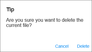
The style code for this dialog is as follows:
AlertDialog(
  title: Text("Tip"),
  content: Text("Are you sure you want to delete the current file?"),
  actions: <Widget>[
    TextButton(
      child: Text("Cancel"),
      onPressed: () => Navigator.of(context).pop(), // Close the dialog
    ),
    TextButton(
      child: Text("Delete"),
      onPressed: () {
        // ... Execute delete operation
        Navigator.of(context).pop(true); // Close the dialog
      },
    ),
  ],
);
The implementation code is quite simple, so we won't go into detail. The only thing to note is that we close the dialog using the Navigator.of(context).pop(...) method, which is consistent with how routes return, and we can return a result data. Now that we have constructed the dialog, how do we show it? Also, how should we receive the data returned from the dialog? The answers to these questions lie in the showDialog() method.
showDialog() is a method provided by the Material component library for popping up a Material-style dialog, with the following signature:
Future<T?> showDialog<T>({
  required BuildContext context,
  required WidgetBuilder builder, // Builder for dialog UI
  bool barrierDismissible = true, // Whether to close the dialog when tapping the barrier (overlay)
})
This method has only two parameters, as described in the comments. It returns a Future, which is used to receive the return value of the dialog: if we close the dialog by tapping the overlay, the value of the Future will be null; otherwise, it will be the result value returned by Navigator.of(context).pop(result). Below is the complete example:
// After clicking this button, the dialog will pop up
ElevatedButton(
  child: Text("Dialog 1"),
  onPressed: () async {
    // Pop up the dialog and wait for it to close
    bool? delete = await showDeleteConfirmDialog1();
    if (delete == null) {
      print("Delete canceled");
    } else {
      print("Delete confirmed");
      // ... Delete the file
    }
  },
),

// Pop up the dialog
Future<bool?> showDeleteConfirmDialog1() {
  return showDialog<bool>(
    context: context,
    builder: (context) {
      return AlertDialog(
        title: Text("Tip"),
        content: Text("Are you sure you want to delete the current file?"),
        actions: <Widget>[
          TextButton(
            child: Text("Cancel"),
            onPressed: () => Navigator.of(context).pop(), // Close the dialog
          ),
          TextButton(
            child: Text("Delete"),
            onPressed: () {
              // Close the dialog and return true
              Navigator.of(context).pop(true);
            },
          ),
        ],
      );
    },
  );
}
After running the example, if we click the "Cancel" button on the dialog or the overlay, the console will output "Delete canceled." If we click the "Delete" button, the console will output "Delete confirmed."
Note: If the content of the AlertDialog is too long, it will overflow, which is often not desired. Therefore, if the dialog content is long, we can wrap the content in a SingleChildScrollView.
2. SimpleDialog
SimpleDialog is another dialog provided by the Material component library that displays a list for selection scenarios. Below is an example for selecting the app's language, with the running result shown in Figure .
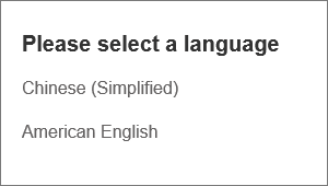
The implementation code is as follows:
Future<void> changeLanguage() async {
  int? i = await showDialog<int>(
      context: context,
      builder: (BuildContext context) {
        return SimpleDialog(
          title: const Text('Please select a language'),
          children: <Widget>[
            SimpleDialogOption(
              onPressed: () {
                // Return 1
                Navigator.pop(context, 1);
              },
              child: Padding(
                padding: const EdgeInsets.symmetric(vertical: 6),
                child: const Text('Simplified Chinese'),
              ),
            ),
            SimpleDialogOption(
              onPressed: () {
                // Return 2
                Navigator.pop(context, 2);
              },
              child: Padding(
                padding: const EdgeInsets.symmetric(vertical: 6),
                child: const Text('American English'),
              ),
            ),
          ],
        );
      });

  if (i != null) {
    print("Selected: ${i == 1 ? "Simplified Chinese" : "American English"}");
  }
}
In the example, we used the SimpleDialogOption component to wrap the list item components. It acts like a TextButton, except the button text is left-aligned and has smaller padding. After running the example, once the user selects a language, the console will print the selection.
3. Dialog
In fact, both AlertDialog and SimpleDialog utilize the Dialog class. Since AlertDialog and SimpleDialog use IntrinsicWidth to attempt to adjust their sizes based on the actual dimensions of child components, this causes their child components to not be able to use lazily-loaded models (such as ListView, GridView, CustomScrollView, etc.). For example, the following code will result in an error when run:
AlertDialog(
  content: ListView(
    children: ... // omitted
  ),
);
What should we do if we need to nest a ListView? In this case, we can directly use the Dialog class, like this:
Dialog(
  child: ListView(
    children: ... // omitted
  ),
);
Now, let's look at an example that pops up a dialog with 30 list items, as shown in Figure :
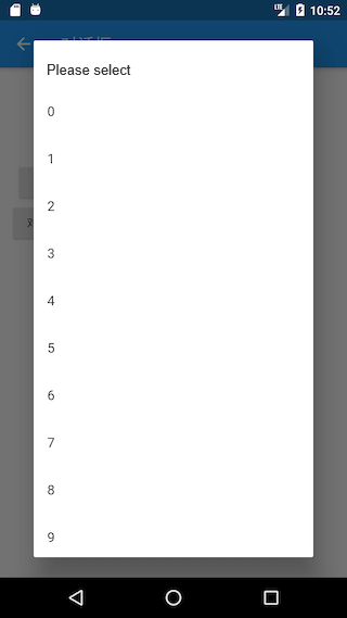
The implementation code is as follows:
Future<void> showListDialog() async {
  int? index = await showDialog<int>(
    context: context,
    builder: (BuildContext context) {
      var child = Column(
        children: <Widget>[
          ListTile(title: Text("Please select")),
          Expanded(
              child: ListView.builder(
            itemCount: 30,
            itemBuilder: (BuildContext context, int index) {
              return ListTile(
                title: Text("$index"),
                onTap: () => Navigator.of(context).pop(index),
              );
            },
          )),
        ],
      );
      // Using AlertDialog will cause an error
      // return AlertDialog(content: child);
      return Dialog(child: child);
    },
  );
  if (index != null) {
    print("Clicked: $index");
  }
}
Now that we have covered AlertDialog, SimpleDialog, and Dialog, it is worth noting that in the examples above, when calling showDialog, we constructed one of these three dialog components in the builder. Some readers might instinctively think that the builder can only return one of these three, but this is not mandatory! For instance, we can completely replace Dialog with the following code:
// return Dialog(child: child)
return UnconstrainedBox(
  constrainedAxis: Axis.vertical,
  child: ConstrainedBox(
    constraints: BoxConstraints(maxWidth: 280),
    child: Material(
      child: child,
      type: MaterialType.card,
    ),
  ),
);
Running the above code will achieve the same effect. In summary, AlertDialog, SimpleDialog, and Dialog are three types of dialogs provided by the Material component library designed to help developers quickly build dialogs that conform to Material design specifications. However, readers can fully customize the dialog styles, allowing for various styles of dialogs, thus providing ease of use while also being highly extensible.
55.2 Dialog Opening Animation and Overlay
We can divide the dialog into two parts: internal style and external style. The internal style refers to the specific content displayed in the dialog, which we have already introduced above. The external style includes the overlay style of the dialog, opening animations, etc. This section mainly discusses how to customize these external styles.
We will detail animation-related content in Chapter 9 of this book. For now, readers can get a basic understanding (there’s no need to delve too deeply into it) and revisit it after learning about animations.
We have already introduced the showDialog method, which is provided by the Material component library for opening a Material-style dialog. But how can we open a standard style dialog (non-Material)? Flutter provides a showGeneralDialog method with the following signature:
Future<T?> showGeneralDialog<T>({
  required BuildContext context,
  required RoutePageBuilder pageBuilder, // Builds the internal UI of the dialog
  bool barrierDismissible = false, // Whether to close the dialog when tapping the overlay
  String? barrierLabel, // Semantic label (for screen readers)
  Color barrierColor = const Color(0x80000000), // Overlay color
  Duration transitionDuration = const Duration(milliseconds: 200), // Duration of the dialog open/close animation
  RouteTransitionsBuilder? transitionBuilder, // Animation for opening/closing the dialog
  ...
})
In fact, the showDialog method is just a wrapper around showGeneralDialog, customizing the overlay color and animation for Material-style dialogs. The open/close animation for Material-style dialogs is a fade animation. If we want to use a scale animation, we can customize it through the transitionBuilder. Below is a method showCustomDialog that we can encapsulate, which customizes the dialog animation to a scale animation and sets the overlay color to Colors.black87:
Future<T?> showCustomDialog<T>({
  required BuildContext context,
  bool barrierDismissible = true,
  required WidgetBuilder builder,
  ThemeData? theme,
}) {
  final ThemeData theme = Theme.of(context, shadowThemeOnly: true);
  return showGeneralDialog(
    context: context,
    pageBuilder: (BuildContext buildContext, Animation<double> animation,
        Animation<double> secondaryAnimation) {
      final Widget pageChild = Builder(builder: builder);
      return SafeArea(
        child: Builder(builder: (BuildContext context) {
          return theme != null
              ? Theme(data: theme, child: pageChild)
              : pageChild;
        }),
      );
    },
    barrierDismissible: barrierDismissible,
    barrierLabel: MaterialLocalizations.of(context).modalBarrierDismissLabel,
    barrierColor: Colors.black87, // Custom overlay color
    transitionDuration: const Duration(milliseconds: 150),
    transitionBuilder: _buildMaterialDialogTransitions,
  );
}

Widget _buildMaterialDialogTransitions(
    BuildContext context,
    Animation<double> animation,
    Animation<double> secondaryAnimation,
    Widget child) {
  // Use scale animation
  return ScaleTransition(
    scale: CurvedAnimation(
      parent: animation,
      curve: Curves.easeOut,
    ),
    child: child,
  );
}
Now, we will use showCustomDialog to open a file deletion confirmation dialog, as shown in the following code:
... // omitted irrelevant code
showCustomDialog<bool>(
  context: context,
  builder: (context) {
    return AlertDialog(
      title: Text("Tip"),
      content: Text("Are you sure you want to delete the current file?"),
      actions: <Widget>[
        TextButton(
          child: Text("Cancel"),
          onPressed: () => Navigator.of(context).pop(),
        ),
        TextButton(
          child: Text("Delete"),
          onPressed: () {
            // Execute delete operation
            Navigator.of(context).pop(true);
          },
        ),
      ],
    );
  },
);
The running effect is shown in Figure :

It can be observed that the overlay color is darker compared to the dialog opened using the showDialog method. Additionally, the dialog open/close animation has changed to a scale animation. Readers can run the example themselves to see the effect.
55.3 Implementation Principle of Dialogs
Let's take the showGeneralDialog method as an example to examine its specific implementation:
Future<T?> showGeneralDialog<T extends Object?>({
  required BuildContext context,
  required RoutePageBuilder pageBuilder,
  bool barrierDismissible = false,
  String? barrierLabel,
  Color barrierColor = const Color(0x80000000),
  Duration transitionDuration = const Duration(milliseconds: 200),
  RouteTransitionsBuilder? transitionBuilder,
  bool useRootNavigator = true,
  RouteSettings? routeSettings,
}) {
  return Navigator.of(context, rootNavigator: useRootNavigator).push<T>(RawDialogRoute<T>(
    pageBuilder: pageBuilder,
    barrierDismissible: barrierDismissible,
    barrierLabel: barrierLabel,
    barrierColor: barrierColor,
    transitionDuration: transitionDuration,
    transitionBuilder: transitionBuilder,
    settings: routeSettings,
  ));
}
The implementation is straightforward; it directly calls the push method of the Navigator to open a new dialog route, RawDialogRoute, and then returns the value from push. It is evident that dialogs are implemented in the form of routes, which is why we can use the Navigator.pop method to exit the dialog. As for customizing the dialog's style, this is done within RawDialogRoute, and readers can refer to it themselves for more details.
55.4 Dialog State Management
When a user chooses to delete a file, we will ask whether to delete that file; when a user selects a folder, we should confirm whether to delete its subfolders. To avoid a second popup confirmation when the user selects a folder, we add a checkbox at the bottom of the confirmation dialog labeled "Also delete subdirectories?" as shown in Figure .
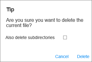
Now, a question arises: how do we manage the selection state of the checkbox? Conventionally, we manage the selection state within the State of the route page, and we might write code like this:
class _DialogRouteState extends State<DialogRoute> {
  bool withTree = false; // Checkbox selection state

  @override
  Widget build(BuildContext context) {
    return Column(
      children: <Widget>[
        ElevatedButton(
          child: Text("Dialog 2"),
          onPressed: () async {
            bool? delete = await showDeleteConfirmDialog2();
            if (delete == null) {
              print("Cancel deletion");
            } else {
              print("Also delete subdirectories: $delete");
            }
          },
        ),
      ],
    );
  }

  Future<bool?> showDeleteConfirmDialog2() {
    withTree = false; // Default checkbox not selected
    return showDialog<bool>(
      context: context,
      builder: (context) {
        return AlertDialog(
          title: Text("Prompt"),
          content: Column(
            crossAxisAlignment: CrossAxisAlignment.start,
            mainAxisSize: MainAxisSize.min,
            children: <Widget>[
              Text("Are you sure you want to delete the current file?"),
              Row(
                children: <Widget>[
                  Text("Also delete subdirectories?"),
                  Checkbox(
                    value: withTree,
                    onChanged: (bool value) {
                      // Rebuild UI when the checkbox selection state changes
                      setState(() {
                        // Update checkbox state
                        withTree = !withTree;
                      });
                    },
                  ),
                ],
              ),
            ],
          ),
          actions: <Widget>[
            TextButton(
              child: Text("Cancel"),
              onPressed: () => Navigator.of(context).pop(),
            ),
            TextButton(
              child: Text("Delete"),
              onPressed: () {
                // Perform delete operation
                Navigator.of(context).pop(withTree);
              },
            ),
          ],
        );
      },
    );
  }
}
However, when we run the above code, we find that the checkbox cannot be selected at all! Why is this the case? The reason is quite simple. We know that the setState method only rebuilds the subtree of the current context. However, our dialog is not built within the _DialogRouteState's build method but is constructed separately through showDialog, so calling setState in _DialogRouteState's context cannot affect the UI constructed by showDialog.
Additionally, we can understand this phenomenon from another perspective: as mentioned earlier, dialogs are also implemented via routes, meaning that the above code is essentially attempting to call setState in the parent route to update the child route, which is clearly not possible! In short, the root cause is that the context is incorrect. So, how can we make the checkbox clickable? Typically, there are three methods:
1. Extracting a StatefulWidget
Since the context is incorrect, a direct approach is to encapsulate the checkbox selection logic into a separate StatefulWidget, thereby managing the selection state within it. Let’s look at this approach; below is the implementation code:
// A checkbox component that manages its own selection state
class DialogCheckbox extends StatefulWidget {
  DialogCheckbox({
    Key? key,
    this.value,
    required this.onChanged,
  });

  final ValueChanged<bool?> onChanged;
  final bool? value;

  @override
  _DialogCheckboxState createState() => _DialogCheckboxState();
}

class _DialogCheckboxState extends State<DialogCheckbox> {
  bool? value;

  @override
  void initState() {
    value = widget.value;
    super.initState();
  }

  @override
  Widget build(BuildContext context) {
    return Checkbox(
      value: value,
      onChanged: (v) {
        // Emit the selection state through an event
        widget.onChanged(v);
        setState(() {
          // Update own selection state
          value = v;
        });
      },
    );
  }
}
Here is the code for popping up the dialog:
Future<bool?> showDeleteConfirmDialog3() {
  bool _withTree = false; // Record if the checkbox is selected
  return showDialog<bool>(
    context: context,
    builder: (context) {
      return AlertDialog(
        title: Text("Prompt"),
        content: Column(
          crossAxisAlignment: CrossAxisAlignment.start,
          mainAxisSize: MainAxisSize.min,
          children: <Widget>[
            Text("Are you sure you want to delete the current file?"),
            Row(
              children: <Widget>[
                Text("Also delete subdirectories?"),
                DialogCheckbox(
                  value: _withTree, // Default not selected
                  onChanged: (bool value) {
                    // Update selection state
                    _withTree = !_withTree;
                  },
                ),
              ],
            ),
          ],
        ),
        actions: <Widget>[
          TextButton(
            child: Text("Cancel"),
            onPressed: () => Navigator.of(context).pop(),
          ),
          TextButton(
            child: Text("Delete"),
            onPressed: () {
              // Return the selection state
              Navigator.of(context).pop(_withTree);
            },
          ),
        ],
      );
    },
  );
}
Finally, here’s how to use it:
ElevatedButton(
  child: Text("Dialog 3 (Checkbox Clickable)"),
  onPressed: () async {
    // Pop up the delete confirmation dialog and wait for user confirmation
    bool? deleteTree = await showDeleteConfirmDialog3();
    if (deleteTree == null) {
      print("Cancel deletion");
    } else {
      print("Also delete subdirectories: $deleteTree");
    }
  },
),
The results can be seen in Figure .
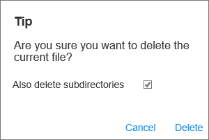
As observed, the checkbox can now be selected, and upon clicking "Cancel" or "Delete," the console will print the final confirmation state.
2. Using the StatefulBuilder Method
Although the above method solves the issue of updating the dialog state, it has a significant drawback: all components on the dialog that may change state must be encapsulated within a separate StatefulWidget that manages its own state. This not only complicates the code but also reduces reusability. Therefore, let’s consider whether there is a simpler approach. The previous method essentially places the dialog's state within the context of a StatefulWidget, which manages it internally. Is there a way to create a StatefulWidget context without needing to extract components separately?
Here, we can draw inspiration from the implementation of the Builder widget. As previously mentioned, the Builder widget can access the true context of its location. How is this achieved? Let’s take a look at its source code:
class Builder extends StatelessWidget {
  const Builder({
    Key? key,
    required this.builder,
  }) : assert(builder != null),
       super(key: key);
  final WidgetBuilder builder;

  @override
  Widget build(BuildContext context) => builder(context);
}
We can see that Builder merely extends StatelessWidget and, in its build method, retrieves the current context, delegating the build process to the builder callback. Thus, Builder effectively captures the context of StatelessWidget. Can we employ a similar method to acquire the context of StatefulWidget and delegate its build method? Let’s create a StatefulBuilder method to achieve this:
class StatefulBuilder extends StatefulWidget {
  const StatefulBuilder({
    Key? key,
    required this.builder,
  }) : assert(builder != null),
       super(key: key);

  final StatefulWidgetBuilder builder;

  @override
  _StatefulBuilderState createState() => _StatefulBuilderState();
}

class _StatefulBuilderState extends State<StatefulBuilder> {
  @override
  Widget build(BuildContext context) => widget.builder(context, setState);
}
The code is straightforward. StatefulBuilder acquires the context of the StatefulWidget and proxies its build process. We can now refactor the above code using StatefulBuilder (the changes are only in the DialogCheckbox section):
... // Omitted unrelated code
Row(
  children: <Widget>[
    Text("Delete subdirectories too?"),
    // Using StatefulBuilder to build the context of StatefulWidget
    StatefulBuilder(
      builder: (context, _setState) {
        return Checkbox(
          value: _withTree, // Default unchecked
          onChanged: (bool value) {
            //_setState method is effectively the setState method of this StatefulWidget,
            // which will call the builder method again
            _setState(() {
              // Update the selection state
              _withTree = !_withTree;
            });
          },
        );
      },
    ),
  ],
),
Essentially, this approach allows child components to notify the parent component (StatefulWidget) to rebuild itself to update the UI, which readers can understand by comparing the code. In fact, StatefulBuilder is a class provided in the Flutter SDK, and it operates on the same principle as Builder. It is crucial for readers to thoroughly understand both StatefulBuilder and Builder, as they are highly practical in Flutter.
3. A Clever Solution
Is there an even simpler solution? To confirm this, we need to clarify how the UI is updated. We know that after calling the setState method, the StatefulWidget is rebuilt. So what does the setState method do? Can we find a method from it? Following this thought process, let's examine the core source code of setState:
void setState(VoidCallback fn) {
  ... // Omitted unrelated code
  _element.markNeedsBuild();
}
We can see that setState calls the markNeedsBuild() method of the Element. As previously mentioned, Flutter is a reactive framework, and to update the UI, one simply needs to change the state and notify the framework that the page needs to be rebuilt. The markNeedsBuild() method marks the current Element object as "dirty." In every frame, Flutter will rebuild any Element object marked as "dirty."
Given this, is there a way to obtain the Element object of the internal UI of the dialog and mark it as "dirty"? The answer is yes! We can access the Element object through the Context. Regarding the relationship between Element and Context, we will delve deeper into this in the chapter on "Core Principles of Flutter." For now, simply understand that in the component tree, the context is essentially a reference to the Element object. With this knowledge, a solution becomes evident: we can update the checkbox using the following method:
Future<bool?> showDeleteConfirmDialog4() {
  bool _withTree = false;
  return showDialog<bool>(
    context: context,
    builder: (context) {
      return AlertDialog(
        title: Text("Prompt"),
        content: Column(
          crossAxisAlignment: CrossAxisAlignment.start,
          mainAxisSize: MainAxisSize.min,
          children: <Widget>[
            Text("Are you sure you want to delete the current file?"),
            Row(
              children: <Widget>[
                Text("Delete subdirectories too?"),
                Checkbox( // Still using the Checkbox component
                  value: _withTree,
                  onChanged: (bool value) {
                    // At this point, context is the root Element of the dialog UI.
                    // We can directly mark the corresponding Element of the dialog UI as dirty.
                    (context as Element).markNeedsBuild();
                    _withTree = !_withTree;
                  },
                ),
              ],
            ),
          ],
        ),
        actions: <Widget>[
          TextButton(
            child: Text("Cancel"),
            onPressed: () => Navigator.of(context).pop(),
          ),
          TextButton(
            child: Text("Delete"),
            onPressed: () {
              // Execute the delete operation
              Navigator.of(context).pop(_withTree);
            },
          ),
        ],
      );
    },
  );
}
After running the above code, the checkbox can be selected normally. Notice how we resolved the issue with just one line of code! Of course, the code above is not optimal because we only need to update the checkbox's state. Currently, the context we are using is the root context of the dialog, which will cause the entire dialog UI component to rebuild. Therefore, the best approach is to narrow down the "scope" of the context, meaning we should only mark the Checkbox's Element as dirty. The optimized code would be:
... // Omitted unrelated code
Row(
  children: <Widget>[
    Text("Delete subdirectories too?"),
    // Using Builder to get the context for building the Checkbox,
    // which is a common method to narrow the context's scope.
    Builder(
      builder: (BuildContext context) {
        return Checkbox(
          value: _withTree,
          onChanged: (bool value) {
            (context as Element).markNeedsBuild();
            _withTree = !_withTree;
          },
        );
      },
    ),
  ],
),
55.5 Other Types of Dialogs
1. Bottom Menu List
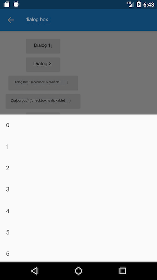
The showModalBottomSheet method can pop up a Material-style modal dialog featuring a bottom menu list, as shown in the example below:
// Pop up a bottom menu list modal dialog
Future<int?> _showModalBottomSheet() {
  return showModalBottomSheet<int>(
    context: context,
    builder: (BuildContext context) {
      return ListView.builder(
        itemCount: 30,
        itemBuilder: (BuildContext context, int index) {
          return ListTile(
            title: Text("$index"),
            onTap: () => Navigator.of(context).pop(index),
          );
        },
      );
    },
  );
}
Clicking the button will pop up this dialog:
ElevatedButton(
  child: Text("Show Bottom Menu List"),
  onPressed: () async {
    int type = await _showModalBottomSheet();
    print(type);
  },
),
The result after running is shown in Figure :
2. Loading Dialog
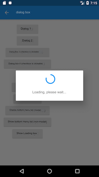
The loading dialog can actually be customized directly using showDialog + AlertDialog:
showLoadingDialog() {
  showDialog(
    context: context,
    barrierDismissible: false, // Do not close the dialog when clicking the overlay
    builder: (context) {
      return AlertDialog(
        content: Column(
          mainAxisSize: MainAxisSize.min,
          children: <Widget>[
            CircularProgressIndicator(),
            Padding(
              padding: const EdgeInsets.only(top: 26.0),
              child: Text("Loading, please wait..."),
            )
          ],
        ),
      );
    },
  );
}
The display effect is shown in Figure :
If the loading dialog is too wide and you want to customize its width, using just SizedBox or ConstrainedBox won't work because showDialog has already set a minimum width constraint for the dialog. As we discussed in Chapter 5 about "Size Limit Classes," we can use UnconstrainedBox to negate the width constraints set by showDialog, and then specify the width with SizedBox. The code is as follows:
... // Omitted unrelated code
UnconstrainedBox(
  constrainedAxis: Axis.vertical,
  child: SizedBox(
    width: 280,
    child: AlertDialog(
      content: Column(
        mainAxisSize: MainAxisSize.min,
        children: <Widget>[
          CircularProgressIndicator(value: .8,),
          Padding(
            padding: const EdgeInsets.only(top: 26.0),
            child: Text("Loading, please wait..."),
          )
        ],
      ),
    ),
  ),
);
After running this code, the effect is shown in Figure :

3. Calendar Picker
First, let's look at the Material-style calendar picker, as shown in Figure :
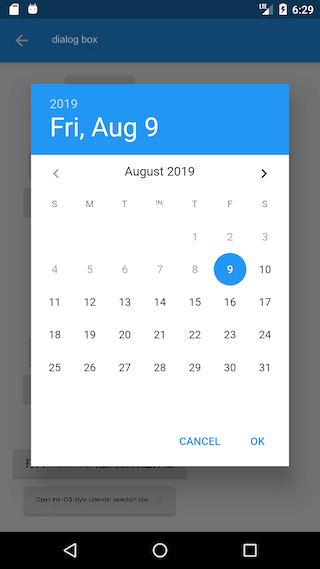
Implementation code:
Future<DateTime?> _showDatePicker1() {
  var date = DateTime.now();
  return showDatePicker(
    context: context,
    initialDate: date,
    firstDate: date,
    lastDate: date.add( // Future 30 days selectable
      Duration(days: 30),
    ),
  );
}
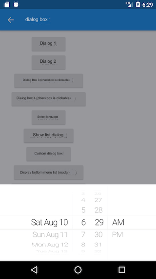
The iOS-style calendar picker requires the use of showCupertinoModalPopup method and CupertinoDatePicker component to implement:
Future<DateTime?> _showDatePicker2() {
  var date = DateTime.now();
  return showCupertinoModalPopup(
    context: context,
    builder: (ctx) {
      return SizedBox(
        height: 200,
        child: CupertinoDatePicker(
          mode: CupertinoDatePickerMode.dateAndTime,
          minimumDate: date,
          maximumDate: date.add(
            Duration(days: 30),
          ),
          maximumYear: date.year + 1,
          onDateTimeChanged: (DateTime value) {
            print(value);
          },
        ),
      );
    },
  );
}
The running effect is shown in Figure :
