74.1 CustomCheckbox
The default Checkbox component in Flutter does not allow for custom sizing. In this section, we will demonstrate how to create a CustomCheckbox component that supports customizable sizes by defining a RenderObject (rather than through composition). The desired effect of the CustomCheckbox is shown in Figure :

Two states: checked and unchecked.
Animation during state transitions.
Customizable appearance.
The definition of CustomCheckbox is as follows:
import 'dart:math';
import 'package:flutter/material.dart';
import 'package:flutter/rendering.dart';
import 'package:flutter/scheduler.dart';

class CustomCheckbox extends LeafRenderObjectWidget {
  const CustomCheckbox({
    Key? key,
    this.strokeWidth = 2.0,
    this.value = false,
    this.strokeColor = Colors.white,
    this.fillColor = Colors.blue,
    this.radius = 2.0,
    this.onChanged,
  }) : super(key: key);

  final double strokeWidth; // Width of the checkmark
  final Color strokeColor; // Color of the checkmark
  final Color? fillColor; // Fill color
  final bool value; // Checked state
  final double radius; // Corner radius
  final ValueChanged<bool>? onChanged; // Callback when the checked state changes

  @override
  RenderObject createRenderObject(BuildContext context) {
    return RenderCustomCheckbox(
      strokeWidth,
      strokeColor,
      fillColor ?? Theme.of(context).primaryColor,
      value,
      radius,
      onChanged,
    );
  }

  @override
  void updateRenderObject(context, RenderCustomCheckbox renderObject) {
    if (renderObject.value != value) {
      renderObject.animationStatus =
          value ? AnimationStatus.forward : AnimationStatus.reverse;
    }
    renderObject
      ..strokeWidth = strokeWidth
      ..strokeColor = strokeColor
      ..fillColor = fillColor ?? Theme.of(context).primaryColor
      ..radius = radius
      ..value = value
      ..onChanged = onChanged;
  }
}
The only thing to note in the code above is that in the updateRenderObject method, when the checked state changes, we update the animation status in the RenderObject. Specifically, when transitioning from unchecked to checked, we execute the forward animation; when transitioning from checked to unchecked, we execute the reverse animation.
Next, we need to implement RenderCustomCheckbox:
class RenderCustomCheckbox extends RenderBox {
  bool value;
  int pointerId = -1;
  double strokeWidth;
  Color strokeColor;
  Color fillColor;
  double radius;
  ValueChanged<bool>? onChanged;

  // Properties for scheduling animations
  double progress = 0; // Current animation progress
  int? _lastTimeStamp; // Last drawn timestamp
  // Animation duration
  Duration get duration => const Duration(milliseconds: 150);
  // Current animation status
  AnimationStatus _animationStatus = AnimationStatus.completed;
  set animationStatus(AnimationStatus v) {
    if (_animationStatus != v) {
      markNeedsPaint();
    }
    _animationStatus = v;
  }

  // Background animation duration ratio (background animation should complete in the first 40% of the time, followed by the checkmark animation)
  final double bgAnimationInterval = .4;

  RenderCustomCheckbox(this.strokeWidth, this.strokeColor, this.fillColor,
      this.value, this.radius, this.onChanged)
      : progress = value ? 1 : 0;

  @override
  void performLayout() {}  // Layout

  @override
  void paint(PaintingContext context, Offset offset) {
    Rect rect = offset & size;
    // Divide drawing into background (rectangle) and foreground (checkmark); first draw the background, then the checkmark
    _drawBackground(context, rect);
    _drawCheckMark(context, rect);
    // Schedule animation
    _scheduleAnimation();
  }

  // Draw background
  void _drawBackground(PaintingContext context, Rect rect) {}

  // Draw "checkmark"
  void _drawCheckMark(PaintingContext context, Rect rect) { }
  // Schedule animation
  void _scheduleAnimation() {}

  ... // Handle click events
}
#1. Implement Layout Algorithm
To allow users to customize width and height, our layout strategy is: if the parent component specifies fixed dimensions, use those; otherwise, default to 25:
@override
void performLayout() {
  size = constraints.constrain(
    constraints.isTight ? Size.infinite : Size(25, 25),
  );
}
#2. Draw CustomCheckbox
The key point is drawing the CustomCheckbox. For clarity, we will divide the drawing into background (rectangle) and foreground (checkmark). First, draw the background, then the checkmark. Two points to note:
We are drawing a frame during the animation, so we need to calculate what to draw based on the animation progress (
progress).When the CustomCheckbox transitions from unchecked to checked, we execute the forward animation; the value of
progresswill gradually change from 0 to 1. Since the background and foreground colors need to contrast, we will draw the foreground after the background. Therefore, we split the animation: the first 40% of the time is for the background, and the remaining 60% is for the checkmark.
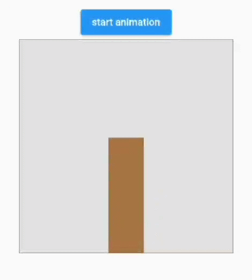
#1) Draw Background
Referring to Figure , we will first see how to draw the background:

When the state changes to checked, the rectangle gradually fills from the edges to the center until the Checkbox area is filled. When the state changes to unchecked, the fill gradually dissipates from the center to the edges until only the border remains.
Figure 10-7
The implementation idea is to initially fill the entire background rectangle area with blue, then draw a white rectangle on top, dynamically changing the size of the white rectangle based on animation progress. Fortunately, the Canvas API provides the functionality we need with drawDRRect, which allows us to specify inner and outer rectangles and draw the non-overlapping portion while setting corner radii. Below is the specific implementation:
void _drawBackground(PaintingContext context, Rect rect) {
  Color color = value ? fillColor : Colors.grey;
  var paint = Paint()
    ..isAntiAlias = true
    ..style = PaintingStyle.fill // Fill
    ..strokeWidth
    ..color = color;

  // We need to calculate the size of the rectangle for each frame; for this, we can directly use the rectangle interpolation method to determine the inner rectangle
  final outer = RRect.fromRectXY(rect, radius, radius);
  var rects = [
    rect.inflate(-strokeWidth),
    Rect.fromCenter(center: rect.center, width: 0, height: 0)
  ];
  // Adjust the inner rectangle size based on the animation progress
  var rectProgress = Rect.lerp(
    rects[0],
    rects[1],
    // Background animation executes in the first 40% of the time
    min(progress, bgAnimationInterval) / bgAnimationInterval,
  )!;
  final inner = RRect.fromRectXY(rectProgress, 0, 0);
  // Draw
  context.canvas.drawDRRect(outer, inner, paint);
}
#2) Draw Foreground
The foreground is a checkmark, formed by connecting three points. For simplicity, we will calculate fixed coordinates for the starting point and the middle bend based on the Checkbox size, then dynamically adjust the position of the third point in each frame to achieve the checkmark animation:
// Draw "checkmark"
void _drawCheckMark(PaintingContext context, Rect rect) {
  // Draw the foreground after the background
  if (progress > bgAnimationInterval) {

    // Determine the middle bend position
    final secondOffset = Offset(
      rect.left + rect.width / 2.5,
      rect.bottom - rect.height / 4,
    );
    // Position of the third point
    final lastOffset = Offset(
      rect.right - rect.width / 6,
      rect.top + rect.height / 4,
    );

    // Only interpolate the position of the third point
    final _lastOffset = Offset.lerp(
      secondOffset,
      lastOffset,
      (progress - bgAnimationInterval) / (1 - bgAnimationInterval),
    )!;

    // Connect the three points
    final path = Path()
      ..moveTo(rect.left + rect.width / 7, rect.top + rect.height / 2)
      ..lineTo(secondOffset.dx, secondOffset.dy)
      ..lineTo(_lastOffset.dx, _lastOffset.dy);

    final paint = Paint()
      ..isAntiAlias = true
      ..style = PaintingStyle.stroke
      ..color = strokeColor
      ..strokeWidth = strokeWidth;

    context.canvas.drawPath(path, paint..style = PaintingStyle.stroke);
  }
}
#3. Implement Animation
Finally, we need to make the UI dynamic. Reflecting on the previous chapter about animations, we realize that Flutter's animation framework relies on StatefulWidget, which explicitly or implicitly triggers updates when the state changes. However, our CustomCheckbox, defined through RenderObject, is not based on StatefulWidget, so how can we schedule animations? There are two approaches:
Wrap the CustomCheckbox in a StatefulWidget to reuse the animation methods previously introduced.
Custom animation scheduling.
The first method is familiar, so we won't elaborate further. The second method involves checking if the animation has ended after each frame is drawn. If the animation is still ongoing, we mark the current component as “needs repaint,” and then wait for the next frame:
void _scheduleAnimation() {
  if (_animationStatus != AnimationStatus.completed) {
    // This needs to execute before Flutter's current frame ends because we cannot mark the component as needing repaint during the drawing process
    SchedulerBinding.instance.addPostFrameCallback((Duration timeStamp) {
      if (_lastTimeStamp != null) {
        double delta = (timeStamp.inMilliseconds - _lastTimeStamp!) /
          duration.inMilliseconds;
        // If it's a reverse animation, the progress value should gradually decrease
        if (_animationStatus == AnimationStatus.reverse) {
          delta = -delta;
        }
        // Update animation progress
        progress = progress + delta;

        if (progress >= 1 || progress <= 0) {
          // Animation has completed
          _animationStatus = AnimationStatus.completed;
          progress = progress.clamp(0, 1);
        }
      }
      // Mark as needing repaint
      markNeedsPaint();
      _lastTimeStamp = timeStamp.inMilliseconds;
    });
  } else {
    _lastTimeStamp = null;
  }
}
#4. Handle Click Events
According to previous chapters on event handling, for a render object to handle events, it must pass hit testing. We need to add the following code:
// Must be set to true to ensure it passes hit testing
@override
bool hitTestSelf(Offset position) => true;

// This method is only called if the hit test is successful; we trigger the event when the finger is lifted
@override
void handleEvent(PointerEvent event, covariant BoxHitTestEntry entry) {
  if (event.down) {
    pointerId = event.pointer;
  } else if (pointerId == event.pointer) {
    // Trigger callback when the finger is lifted
    onChanged?.call(!value);
  }
}
74.2 Animation Scheduling Abstract: RenderObjectAnimationMixin
As we can see, scheduling animations within a RenderObject can be quite complex. To simplify this process, we abstracted an RenderObjectAnimationMixin, which can be reused for any other RenderObjects that require animation.
mixin RenderObjectAnimationMixin on RenderObject {
  double _progress = 0;
  int? _lastTimeStamp;

  // Animation duration; subclasses can override this
  Duration get duration => const Duration(milliseconds: 200);
  AnimationStatus _animationStatus = AnimationStatus.completed;

  // Set animation status
  set animationStatus(AnimationStatus v) {
    if (_animationStatus != v) {
      markNeedsPaint();
    }
    _animationStatus = v;
  }

  double get progress => _progress;
  set progress(double v) {
    _progress = v.clamp(0, 1);
  }

  @override
  void paint(PaintingContext context, Offset offset) {
    doPaint(context, offset); // Call subclass drawing logic
    _scheduleAnimation();
  }

  void _scheduleAnimation() {
    if (_animationStatus != AnimationStatus.completed) {
      SchedulerBinding.instance.addPostFrameCallback((Duration timeStamp) {
        if (_lastTimeStamp != null) {
          double delta = (timeStamp.inMilliseconds - _lastTimeStamp!) /
              duration.inMilliseconds;

          // In certain cases, multiple frame callbacks might be added in one frame, resulting in a zero interval between callbacks.
          // In such cases, we should continue requesting a redraw.
          if (delta == 0) {
            markNeedsPaint();
            return;
          }

          if (_animationStatus == AnimationStatus.reverse) {
            delta = -delta;
          }
          _progress += delta;
          if (_progress >= 1 || _progress <= 0) {
            _animationStatus = AnimationStatus.completed;
            _progress = _progress.clamp(0, 1);
          }
        }
        markNeedsPaint();
        _lastTimeStamp = timeStamp.inMilliseconds;
      });
    } else {
      _lastTimeStamp = null;
    }
  }

  // Subclasses implement drawing logic here
  void doPaint(PaintingContext context, Offset offset);
}
74.3 Complete Source Code of CustomCheckbox
The final complete source code of CustomCheckbox is as follows:
class CustomCheckbox extends LeafRenderObjectWidget {
  const CustomCheckbox({
    Key? key,
    this.strokeWidth = 2.0,
    this.value = false,
    this.strokeColor = Colors.white,
    this.fillColor = Colors.blue,
    this.radius = 2.0,
    this.onChanged,
  }) : super(key: key);

  final double strokeWidth; // Width of the checkmark
  final Color strokeColor; // Color of the checkmark
  final Color? fillColor; // Fill color
  final bool value; // Checked state
  final double radius; // Corner radius
  final ValueChanged<bool>? onChanged; // Callback when the checked state changes

  @override
  RenderObject createRenderObject(BuildContext context) {
    return RenderCustomCheckbox(
      strokeWidth,
      strokeColor,
      fillColor ?? Theme.of(context).primaryColor,
      value,
      radius,
      onChanged,
    );
  }

  @override
  void updateRenderObject(context, RenderCustomCheckbox renderObject) {
    if (renderObject.value != value) {
      renderObject.animationStatus =
          value ? AnimationStatus.forward : AnimationStatus.reverse;
    }
    renderObject
      ..strokeWidth = strokeWidth
      ..strokeColor = strokeColor
      ..fillColor = fillColor ?? Theme.of(context).primaryColor
      ..radius = radius
      ..value = value
      ..onChanged = onChanged;
  }
}

class RenderCustomCheckbox extends RenderBox with RenderObjectAnimationMixin {
  bool value;
  int pointerId = -1;
  double strokeWidth;
  Color strokeColor;
  Color fillColor;
  double radius;
  ValueChanged<bool>? onChanged;

  RenderCustomCheckbox(this.strokeWidth, this.strokeColor, this.fillColor,
      this.value, this.radius, this.onChanged) {
    progress = value ? 1 : 0;
  }

  @override
  bool get isRepaintBoundary => true;

  // Background animation duration ratio (the background animation must complete in the first 40% of the time, followed by the checkmark animation)
  final double bgAnimationInterval = .4;

  @override
  void doPaint(PaintingContext context, Offset offset) {
    Rect rect = offset & size;
    _drawBackground(context, rect);
    _drawCheckMark(context, rect);
  }

  void _drawBackground(PaintingContext context, Rect rect) {
    Color color = value ? fillColor : Colors.grey;
    var paint = Paint()
      ..isAntiAlias = true
      ..style = PaintingStyle.fill // Fill
      ..color = color;

    // We perform interpolation on the rectangle
    final outer = RRect.fromRectXY(rect, radius, radius);
    var rects = [
      rect.inflate(-strokeWidth),
      Rect.fromCenter(center: rect.center, width: 0, height: 0)
    ];
    var rectProgress = Rect.lerp(
      rects[0],
      rects[1],
      min(progress, bgAnimationInterval) / bgAnimationInterval,
    )!;

    final inner = RRect.fromRectXY(rectProgress, 0, 0);
    // Draw background
    context.canvas.drawDRRect(outer, inner, paint);
  }

  // Draw "checkmark"
  void _drawCheckMark(PaintingContext context, Rect rect) {
    // Draw foreground after the background
    if (progress > bgAnimationInterval) {

      // Determine the middle bend position
      final secondOffset = Offset(
        rect.left + rect.width / 2.5,
        rect.bottom - rect.height / 4,
      );
      // Position of the third point
      final lastOffset = Offset(
        rect.right - rect.width / 6,
        rect.top + rect.height / 4,
      );

      // We only interpolate the position of the third point
      final _lastOffset = Offset.lerp(
        secondOffset,
        lastOffset,
        (progress - bgAnimationInterval) / (1 - bgAnimationInterval),
      )!;

      // Connect the three points
      final path = Path()
        ..moveTo(rect.left + rect.width / 7, rect.top + rect.height / 2)
        ..lineTo(secondOffset.dx, secondOffset.dy)
        ..lineTo(_lastOffset.dx, _lastOffset.dy);

      final paint = Paint()
        ..isAntiAlias = true
        ..style = PaintingStyle.stroke
        ..color = strokeColor
        ..strokeWidth = strokeWidth;

      context.canvas.drawPath(path, paint..style = PaintingStyle.stroke);
    }
  }

  @override
  void performLayout() {
    // If the parent specifies fixed dimensions, use them; otherwise, default to 25
    size = constraints.constrain(
      constraints.isTight ? Size.infinite : const Size(25, 25),
    );
  }

  // Must be set to true to ensure it passes hit testing
  @override
  bool hitTestSelf(Offset position) => true;

  // This method is only called if the hit test is successful
  @override
  void handleEvent(PointerEvent event, covariant BoxHitTestEntry entry) {
    if (event.down) {
      pointerId = event.pointer;
    } else if (pointerId == event.pointer) {
      // Trigger onChange only if the finger is lifted within the component's bounds
      if (size.contains(event.localPosition)) {
        onChanged?.call(!value);
      }
    }
  }
}
Test Code
The following code creates three checkboxes of different sizes. Clicking any of them will synchronize the state of the other two checkboxes:
class CustomCheckboxTest extends StatefulWidget {
  const CustomCheckboxTest({Key? key}) : super(key: key);

  @override
  State<CustomCheckboxTest> createState() => _CustomCheckboxTestState();
}

class _CustomCheckboxTestState extends State<CustomCheckboxTest> {
  bool _checked = false;

  @override
  Widget build(BuildContext context) {
    return Center(
      child: Column(mainAxisAlignment: MainAxisAlignment.center,
        children: [
          CustomCheckbox2(
            value: _checked,
            onChanged: _onChange,
          ),
          Padding(
            padding: const EdgeInsets.all(18.0),
            child: SizedBox(
              width: 16,
              height: 16,
              child: CustomCheckbox(
                strokeWidth: 1,
                radius: 1,
                value: _checked,
                onChanged: _onChange,
              ),
            ),
          ),
          SizedBox(
            width: 30,
            height: 30,
            child: CustomCheckbox(
              strokeWidth: 3,
              radius: 3,
              value: _checked,
              onChanged: _onChange,
            ),
          ),
        ],
      ),
    );
  }

  void _onChange(value) {
    setState(() => _checked = value);
  }
}
74.4 Conclusion
This section demonstrated how to implement UI rendering, animation scheduling, and event handling through custom RenderObject. As can be seen, creating components using RenderObject is more complex than using composition, but it brings us closer to the essence of Flutter components.