The Material component library provides various button components such as ElevatedButton, TextButton, OutlinedButton, and others. All of these buttons are either directly or indirectly custom wrappers around the RawMaterialButton component, so most of their properties are the same as those of RawMaterialButton. When introducing each button, we first describe its default appearance, although most of the button appearances can be customized through their properties, which we will discuss later. Additionally, all buttons in the Material library share the following common traits:
When pressed, they all feature a "ripple animation" (also known as "ripple effect"), where a water-like wave animation spreads across the button.
They have an
onPressedproperty to set a click callback, which is triggered when the button is pressed. If no callback is provided, the button is disabled and will not respond to user interaction.
17.1 ElevatedButton
The ElevatedButton is a "floating" button, which by default has a shadow and a grey background. When pressed, the shadow becomes larger, as shown in Figure:
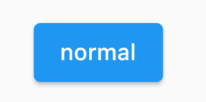
Using the ElevatedButton is very simple, for example:
ElevatedButton(
  child: Text("normal"),
  onPressed: () {},
);
17.2 TextButton
The TextButton is a text button with a transparent background and no shadow by default. When pressed, the background color appears, as shown in Figure:

Using the TextButton is also straightforward, as shown in the following code:
TextButton(
  child: Text("normal"),
  onPressed: () {},
)
17.3 OutlinedButton
The OutlinedButton has a default border, but no shadow and a transparent background. When pressed, the border color brightens, and both the background and a weak shadow appear, as shown in Figure:
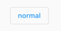
Using the OutlinedButton is also very simple, as shown in the following code:
OutlinedButton(
  child: Text("normal"),
  onPressed: () {},
)
17.4 IconButton
The IconButton is a clickable icon without text. By default, it has no background, but a background appears when clicked, as shown in Figure :
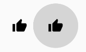
Here’s the code for it:
IconButton(
  icon: Icon(Icons.thumb_up),
  onPressed: () {},
)
17.5 Buttons with Icons
The ElevatedButton, TextButton, and OutlinedButton all have an icon constructor, which makes it easy to create buttons with icons, as shown in Figure :
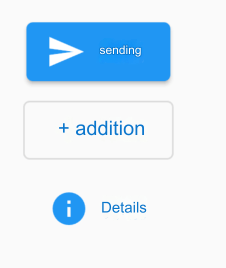
Here’s the code for them:
ElevatedButton.icon(
  icon: Icon(Icons.send),
  label: Text("Send"),
  onPressed: _onPressed,
),
OutlinedButton.icon(
  icon: Icon(Icons.add),
  label: Text("Add"),
  onPressed: _onPressed,
),
TextButton.icon(
  icon: Icon(Icons.info),
  label: Text("Details"),
  onPressed: _onPressed,
),