35.1 FittedBox
When a child component's size exceeds that of its parent component, Flutter will display an overflow warning and print an error log to the console unless handled properly. For example, the following code will cause an overflow:
Padding(
  padding: const EdgeInsets.symmetric(vertical: 30.0),
  child: Row(children: [Text('xx' * 30)]), // Text length exceeds the maximum width of the Row, causing overflow
)
The effect of running this code is shown in Figure :
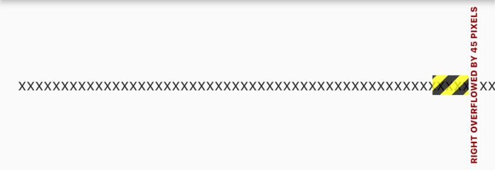
As seen, there is an overflow of 45 pixels on the right side.
The above is just an example. In practice, we often encounter situations where the size of child elements exceeds that of their parent containers. For instance, displaying a large image in a smaller space. According to Flutter’s layout protocol, the parent component will pass its maximum display space as constraints to the child component. The child component should adhere to the parent component’s constraints. If the child component’s original size exceeds the parent’s constrained area, it needs to be resized, cropped, or handled differently. Different components have specific ways to handle this. For example, the Text component will wrap text by default when its parent component has a fixed width but unlimited height.
What if we want the Text component to shrink its font size instead of wrapping when it exceeds the width of its parent? Another case might be when the parent component has fixed width and height, but we want the text to enlarge to fill the entire parent component’s space.
Essentially, these two questions are about how child components adapt to the space of their parent components. According to Flutter’s layout protocol, the adaptation algorithm should be implemented in the layout of the container or layout component. To facilitate developers in customizing adaptation rules, Flutter provides a FittedBox component, defined as follows:
const FittedBox({
  Key? key,
  this.fit = BoxFit.contain, // Adaptation method
  this.alignment = Alignment.center, // Alignment method
  this.clipBehavior = Clip.none, // Whether to clip
  Widget? child,
})
Adaptation Principle
FittedBox ignores the constraints passed by its parent when laying out its child component, allowing the child component to be infinitely large (i.e., the constraints passed to the child are (0 <= width <= double.infinity, 0 <= height <= double.infinity)).
After finishing the layout of the child component, FittedBox can obtain the child's actual size. Knowing the child’s actual size and its parent component’s constraints, FittedBox can display the child within its parent’s constraint range according to the specified adaptation method (defined in the BoxFit enumeration).
Let’s illustrate with a simple example:
Widget build(BuildContext context) {
  return Center(
    child: Column(
      children: [
        wContainer(BoxFit.none),
        Text('Wendux'),
        wContainer(BoxFit.contain),
        Text('Flutter China'),
      ],
    ),
  );
}

Widget wContainer(BoxFit boxFit) {
  return Container(
    width: 50,
    height: 50,
    color: Colors.red,
    child: FittedBox(
      fit: boxFit,
      // Child container exceeds parent container size
      child: Container(width: 60, height: 70, color: Colors.blue),
    ),
  );
}
The result of running this code is shown in Figure :
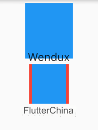
Since the parent Container is smaller than the child Container, when no adaptation method is specified, the child component is drawn according to its actual size. Therefore, the first blue area exceeds the parent component's space, and the red area is not visible. In the second case, we specified the adaptation method as BoxFit.contain, meaning it will scale according to the child component’s aspect ratio and occupy as much of the parent component’s space as possible. Since the child’s width and height are not the same, it will scale proportionally to fit the parent component.
It’s important to note that when no adaptation method is specified, although the size of the FittedBox child component exceeds the space of the FittedBox parent Container, FittedBox itself still has to adhere to the constraints passed from its parent. Thus, the final size of FittedBox is still 50×50, which is why the blue area overlaps with the text below it. In the layout space, the parent Container only occupies 50×50, and then the text is laid out right next to the Container. Since the child component's size exceeds its own, the final result is that the drawing area exceeds the Container, but the layout position is correct, hence the overlap occurs. If we do not want the blue area to exceed the parent component’s layout range, we can use ClipRect to clip the overflowing part:
ClipRect( // Clip the drawing content that exceeds the child component’s layout range
  child: Container(
    width: 50,
    height: 50,
    color: Colors.red,
    child: FittedBox(
      fit: boxFit,
      child: Container(width: 60, height: 70, color: Colors.blue),
    ),
  ),
);
Various adaptation rules for BoxFit are the same as the fix property specified for the Image. Readers can refer to the effects corresponding to various adaptation rules discussed when introducing the Image component.
35.2 Example: Single Line Scaling Layout
For example, if we have three data metrics that need to be displayed in a single line, wrapping would disrupt our page layout, so wrapping is unacceptable. Since the screen widths of different devices vary, and the data lengths also differ, there will be cases when the three data metrics cannot be displayed in a single line due to either excessively long data or narrow screens. Therefore, we want the components to be scaled appropriately to ensure they can fit in one line when they cannot be displayed otherwise. To achieve this, we wrote a test demo:
@override
Widget build(BuildContext context) {
  return Center(
    child: Column(
      children: [
        wRow(' 90000000000000000 '),
        FittedBox(child: wRow(' 90000000000000000 ')),
        wRow(' 800 '),
        FittedBox(child: wRow(' 800 ')),
      ]
      .map((e) => Padding(
            padding: EdgeInsets.symmetric(vertical: 20),
            child: e,
          ))
      .toList(),
    ),
  );
}

// Directly using Row
Widget wRow(String text) {
  Widget child = Text(text);
  child = Row(
    mainAxisAlignment: MainAxisAlignment.spaceEvenly,
    children: [child, child, child],
  );
  return child;
}
The result of running this code is shown in Figure :
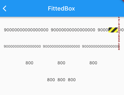
First, because we specified MainAxisAlignment.spaceEvenly for the main axis alignment of the Row, the remaining horizontal display space is evenly distributed between each child component.
When the number string is '90000000000000000', the combined length of the three numbers exceeds the screen width of the test device. If we use the Row directly, it overflows. However, when we wrap the Row in a FittedBox, the content scales down proportionally to fit on a single line, achieving the desired effect. But if the number string is shorter, like '800', the Row can display normally on its own. When wrapped in a FittedBox, the numbers also display correctly but get squeezed together, which is not what we want.
The reason for this is quite simple: when the main axis alignment is set to spaceEvenly, Row divides the available space between its children based on the constraints passed by its parent. If the maxWidth constraint is not infinite, Row will distribute the space evenly according to its children’s sizes. However, if maxWidth is infinite, Row will simply take the combined width of its children as its total width.
Returning to the example: when Row is not wrapped in a FittedBox, the parent constraint passed to Row has a maxWidth equal to the screen width, so Row's width is set to the screen width. When FittedBox wraps the Row, the maxWidth passed to Row is infinite (double.infinity), and Row's width is determined by the total width of its children.
To see the constraints passed from the parent to the child component, we can use LayoutLogPrint from the previous chapter:
LayoutLogPrint(tag: 1, child: wRow('800')),
FittedBox(child: LayoutLogPrint(tag: 2, child: wRow('800'))),
The console logs are as follows:
flutter: 1: BoxConstraints(0.0<=w<=396.0, 0.0<=h<=Infinity)
flutter: 2: BoxConstraints(unconstrained)
We’ve identified the problem, and the solution is straightforward: we need to ensure that the FittedBox passes a maxWidth constraint equal to the screen width to its child element. To achieve this, we can create a custom SingleLineFittedBox to replace FittedBox, as shown below:
class SingleLineFittedBox extends StatelessWidget {
  const SingleLineFittedBox({Key? key, this.child}) : super(key: key);
  final Widget? child;

  @override
  Widget build(BuildContext context) {
    return LayoutBuilder(
      builder: (_, constraints) {
        return FittedBox(
          child: ConstrainedBox(
            constraints: constraints.copyWith(
              maxWidth: constraints.maxWidth, // Use screen width for maxWidth
            ),
            child: child,
          ),
        );
      },
    );
  }
}
Now, modify the test code as follows:
wRow('90000000000000000'),
SingleLineFittedBox(child: wRow('90000000000000000')),
wRow('800'),
SingleLineFittedBox(child: wRow('800')),
The result after running it is shown in Figure :
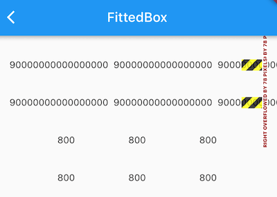
The number string '800' now displays correctly, but the Row wrapped in SingleLineFittedBox with '90000000000000000' still overflows! The reason is simple: by setting maxWidth to the screen width in SingleLineFittedBox, we achieve the same result as without SingleLineFittedBox—Row receives a maxWidth equal to the screen width. So, essentially, we made no progress. However, don’t give up! We are just one step away from success. With a slight modification, we can achieve the desired outcome. Here’s the updated code:
class SingleLineFittedBox extends StatelessWidget {
  const SingleLineFittedBox({Key? key, this.child}) : super(key: key);
  final Widget? child;

  @override
  Widget build(BuildContext context) {
    return LayoutBuilder(
      builder: (_, constraints) {
        return FittedBox(
          child: ConstrainedBox(
            constraints: constraints.copyWith(
              minWidth: constraints.maxWidth,
              maxWidth: double.infinity,
            ),
            child: child,
          ),
        );
      },
    );
  }
}
The code is simple. We set the minWidth constraint to the screen width, forcing Row to adhere to its parent’s constraint. This ensures that Row's width is at least equal to the screen width, preventing the components from being squeezed together. Meanwhile, we set maxWidth to infinite, allowing the layout to handle cases where the total length of the numbers exceeds the screen width.
After running the updated code, as shown in Figure :
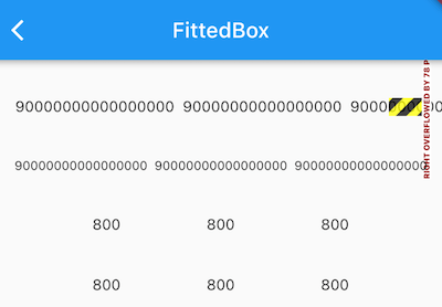
You’ll see that both long and short numbers now display correctly in our SingleLineFittedBox. Problem solved! We’ve successfully added another component to our library.
![[GoLang] Which Major Companies Are Using Go Language?](/static/upload/image/20241127/1732697416551367.jpg)
