ListView is one of the most commonly used scrollable widgets. It can arrange all child widgets linearly in one direction, and it also supports lazy loading of list items (only creating them when needed).
39.1 Default Constructor
Let's take a look at the default constructor of ListView:
ListView({
  // Common scrollable widget parameters
  Axis scrollDirection = Axis.vertical,
  bool reverse = false,
  ScrollController? controller,
  bool? primary,
  ScrollPhysics? physics,
  EdgeInsetsGeometry? padding,

  // Parameters shared by all ListView constructors
  double? itemExtent,
  Widget? prototypeItem, // List item prototype, explained later
  bool shrinkWrap = false,
  bool addAutomaticKeepAlives = true,
  bool addRepaintBoundaries = true,
  double? cacheExtent, // Pre-rendered area length

  // List of child widgets
  List<Widget> children = const <Widget>[],
})
The parameters are divided into two groups: the first group contains the common parameters for scrollable widgets, which we have already discussed in the first section of this chapter, so we won’t repeat them here. The second group contains parameters shared by all ListView constructors (there are multiple constructors for ListView). Let’s focus on these parameters:
itemExtent: If this parameter is not null, it forces the "length" of each child to be the value of
itemExtent. The "length" here refers to the size of the child widget in the scrolling direction. For example, if the scroll direction is vertical,itemExtentrepresents the height of the child widget; if the scroll direction is horizontal,itemExtentrepresents the width of the child widget. SpecifyingitemExtentinListViewprovides better performance compared to allowing the child widgets to determine their own size. This is because, whenitemExtentis specified, the scroll system can know the list's length in advance without recalculating it every time a child widget is built, which is especially important when the scroll position changes frequently (since the scroll system would otherwise need to frequently calculate the list's height).prototypeItem: If all list items have the same length but you don't know the exact value, you can specify one list item, called the
prototypeItem. After specifyingprototypeItem, the scrollable widget will calculate its length along the main axis during layout. This allows it to know the length of all list items along the main axis, similar to specifyingitemExtent. Therefore, usingprototypeItemalso results in better performance. Note thatitemExtentandprototypeItemare mutually exclusive and cannot be specified together.shrinkWrap: This property determines whether the
ListViewshould be sized based on the total length of its child widgets. The default value isfalse. By default,ListViewwill take up as much space as possible in the scroll direction. WhenListViewis inside a container with unbounded dimensions (in the scroll direction),shrinkWrapmust be set totrue.addAutomaticKeepAlives: This property will be explained in detail when we introduce the
PageViewwidget.addRepaintBoundaries: This property determines whether each list item (child widget) should be wrapped inside a
RepaintBoundary. You can think ofRepaintBoundaryas a "paint boundary," and wrapping list items in it helps avoid unnecessary repaints. However, if the cost of repainting a list item is minimal (such as with a color block or a short piece of text), not adding aRepaintBoundarycan be more efficient (the reasons for this will be explained later in the chapter on Flutter's rendering principles). If the list item itself manages whether it needs aRepaintBoundary, this parameter should be set tofalse.
Note: These parameters are not unique to ListView. They may also appear in other scrollable widgets introduced later in this chapter, and their meanings will remain the same.
The default constructor has a children parameter, which accepts a list of widgets (List<Widget>). This method is suitable for situations where the number of child widgets is small and known in advance. Otherwise, you should use ListView.builder to dynamically build list items as needed.
Note: Even though all the children are passed to ListView at once, the child widgets are still loaded (built, laid out, and painted) only when needed. In other words, a ListView constructed using the default constructor also follows the Sliver-based lazy loading model.
Here is an example:
ListView(
  shrinkWrap: true,
  padding: const EdgeInsets.all(20.0),
  children: <Widget>[
    const Text('I'm dedicating every day to you'),
    const Text('Domestic life was never quite my style'),
    const Text('When you smile, you knock me out, I fall apart'),
    const Text('And I thought I was so smart'),
  ],
);
As shown, although the list created using the default constructor is also lazily loaded, we still need to create the widgets in advance, and they will only be laid out and painted when actually needed.
39.2 ListView.builder
ListView.builder is suitable for scenarios where the number of list items is large or uncertain. Let’s look at the key parameters of ListView.builder:
ListView.builder({
  // ListView common parameters omitted
  ...
  required IndexedWidgetBuilder itemBuilder,
  int itemCount,
  ...
})itemBuilder: This is the item builder, which is of type
IndexedWidgetBuilderand returns a widget. When the list is scrolled to a particular index position, this builder will be called to construct the list item.itemCount: The number of list items. If set to null, the list is infinite.
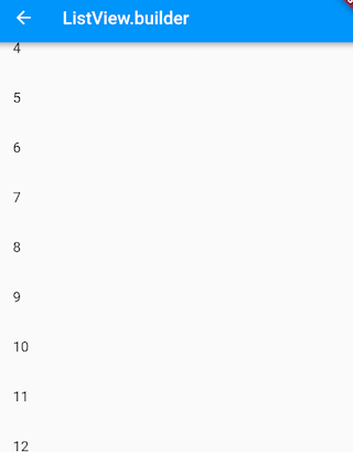
Here’s an example:
ListView.builder(
  itemCount: 100,
  itemExtent: 50.0, // Force height to 50.0
  itemBuilder: (BuildContext context, int index) {
    return ListTile(title: Text("$index"));
  },
);
The result is shown in Figure .
39.3 ListView.separated
ListView.separated allows you to insert a separator widget between generated list items. It has an additional separatorBuilder parameter, which is a separator widget builder.
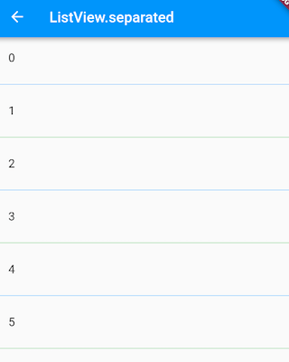
Let’s look at an example where odd-numbered rows have a blue underline, and even-numbered rows have a green underline:
class ListView3 extends StatelessWidget {
  @override
  Widget build(BuildContext context) {
    // Predefine divider widgets for reuse.
    Widget divider1 = Divider(color: Colors.blue);
    Widget divider2 = Divider(color: Colors.green);

    return ListView.separated(
      itemCount: 100,
      // Item builder
      itemBuilder: (BuildContext context, int index) {
        return ListTile(title: Text("$index"));
      },
      // Separator builder
      separatorBuilder: (BuildContext context, int index) {
        return index % 2 == 0 ? divider1 : divider2;
      },
    );
  }
}
The result is shown in Figure .
39.4 Fixed Height List
As mentioned earlier, specifying itemExtent or prototypeItem provides better performance. Therefore, if we know that all list items have the same height, it is strongly recommended to specify either itemExtent or prototypeItem. Let’s look at an example:
class FixedExtentList extends StatelessWidget {
  const FixedExtentList({Key? key}) : super(key: key);

  @override
  Widget build(BuildContext context) {
    return ListView.builder(
      prototypeItem: ListTile(title: Text("1")),
      // itemExtent: 56,
      itemBuilder: (context, index) {
        // LayoutLogPrint is a custom widget that prints the constraints provided by the parent widget during layout.
        return LayoutLogPrint(
          tag: index,
          child: ListTile(title: Text("$index")),
        );
      },
    );
  }
}
Since all the list items are ListTile widgets with the same height, but we don’t know what that height is, we specify a prototypeItem. After running, the console output is:
flutter: 0: BoxConstraints(w=428.0, h=56.0)
flutter: 1: BoxConstraints(w=428.0, h=56.0)
flutter: 2: BoxConstraints(w=428.0, h=56.0)
...
As we can see, the height of each ListTile is 56, so we could also specify itemExtent as 56. However, I still recommend using prototypeItem because it allows the list to continue working correctly even if the layout of the list items changes (as long as all items have the same height).
If we don’t specify itemExtent or prototypeItem in this example, the console log would show:
flutter: 0: BoxConstraints(w=428.0, 0.0 <= h <= Infinity)
flutter: 1: BoxConstraints(w=428.0, 0.0 <= h <= Infinity)
flutter: 2: BoxConstraints(w=428.0, 0.0 <= h <= Infinity)
...
This shows that the list doesn’t know the exact height of the list items, and the height constraints become 0.0 to Infinity.
39.5 ListView Principle
ListView internally combines Scrollable, Viewport, and Sliver. It's important to note:
The list item components in ListView are all RenderBox, not Sliver—this is key.
There is only one Sliver in a ListView, and the logic for on-demand loading of list items is implemented in the Sliver.
By default, the Sliver in ListView is a SliverList. If
itemExtentis specified, it will use SliverFixedExtentList. If theprototypeItemproperty is not empty, it will use SliverPrototypeExtentList. Regardless of which one is used, they all implement the on-demand loading model for child components.
39.6 Example: Infinite Scrolling List
Suppose we need to fetch batches of data asynchronously from a data source and display them using a ListView. When we scroll to the end of the list, we determine whether to fetch more data. If more data is needed, it will be fetched and a loading indicator is shown at the bottom of the list. Once the data is successfully retrieved, it will be inserted into the list. If no more data is required, we display a "No more data" message at the bottom. Here's the code:
import 'package:flutter/material.dart';
import 'package:english_words/english_words.dart';
import 'package:flutter/rendering.dart';

class InfiniteListView extends StatefulWidget {
  @override
  _InfiniteListViewState createState() => _InfiniteListViewState();
}

class _InfiniteListViewState extends State<InfiniteListView> {
  static const loadingTag = "##loading##"; // Footer marker
  var _words = <String>[loadingTag];

  @override
  void initState() {
    super.initState();
    _retrieveData();
  }

  @override
  Widget build(BuildContext context) {
    return ListView.separated(
      itemCount: _words.length,
      itemBuilder: (context, index) {
        // If it's the footer
        if (_words[index] == loadingTag) {
          // If there are less than 100 items, continue fetching data
          if (_words.length - 1 < 100) {
            // Fetch data
            _retrieveData();
            // Show loading indicator while fetching
            return Container(
              padding: const EdgeInsets.all(16.0),
              alignment: Alignment.center,
              child: SizedBox(
                width: 24.0,
                height: 24.0,
                child: CircularProgressIndicator(strokeWidth: 2.0),
              ),
            );
          } else {
            // No more data to fetch after 100 items
            return Container(
              alignment: Alignment.center,
              padding: EdgeInsets.all(16.0),
              child: Text(
                "No more data",
                style: TextStyle(color: Colors.grey),
              ),
            );
          }
        }
        // Display word list item
        return ListTile(title: Text(_words[index]));
      },
      separatorBuilder: (context, index) => Divider(height: .0),
    );
  }

  void _retrieveData() {
    Future.delayed(Duration(seconds: 2)).then((e) {
      setState(() {
        // Rebuild the list
        _words.insertAll(
          _words.length - 1,
          // Generate 20 words each time
          generateWordPairs().take(20).map((e) => e.asPascalCase).toList(),
        );
      });
    });
  }
}
After running, the effect is shown in Figures
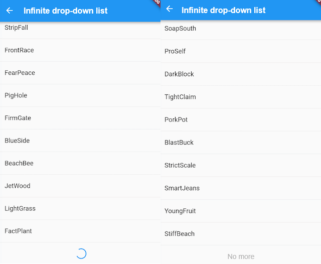
The code is straightforward, and you can understand it by referring to the comments. There's no need for further explanation. It’s worth noting that the _retrieveData() function simulates fetching data asynchronously from a data source. We use the generateWordPairs() method from the english_words package to generate 20 words at a time.
Adding a Fixed List Header
Many times, we need to add a fixed header to a list. For instance, we may want to implement a product list with a "Product List" title at the top of the list. The desired effect is shown in Figure 6-7.
Following our previous approach, we write the following code:
@override
Widget build(BuildContext context) {
  return Column(children: <Widget>[
    ListTile(title: Text("Product List")),
    ListView.builder(itemBuilder: (BuildContext context, int index) {
      return ListTile(title: Text("$index"));
    }),
  ]);
}
However, when running this, we don’t get the expected result; instead, an exception is triggered:
Error caught by rendering library, thrown during performResize().Vertical viewport was given unbounded height ...
From the error message, we can see that the ListView's height boundary is undefined, so the solution is clear: we need to specify the ListView's boundary. Let's use SizedBox to set the height of the list and see if it works:
... // Omitted irrelevant code
SizedBox(
  height: 400, // Set list height to 400
  child: ListView.builder(
    itemBuilder: (BuildContext context, int index) {
      return ListTile(title: Text("$index"));
    },
  ),
),
...
After running, the result is shown in Figure .
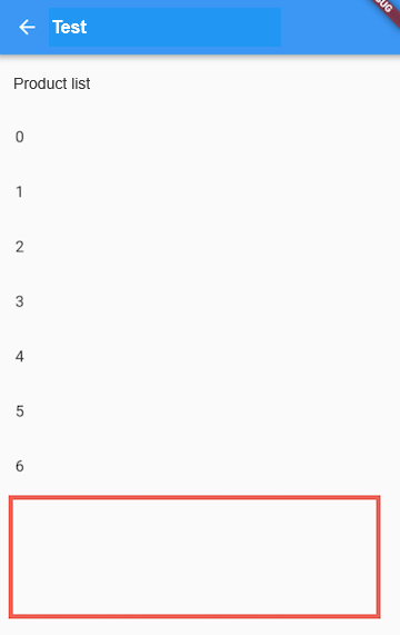
You can see that the exception no longer occurs, and the list is displayed, but the phone screen height is greater than 400, leaving some blank space at the bottom. If we want the list to fill the screen except for the header, how should we do it? A straightforward approach would be to calculate the screen height dynamically, subtracting the status bar, navigation bar, and header height from it. The code is as follows:
... // Omitted irrelevant code
SizedBox(
  // According to Material design, the heights of the status bar, navigation bar, and ListTile are 24, 56, and 56, respectively
  height: MediaQuery.of(context).size.height - 24 - 56 - 56,
  child: ListView.builder(itemBuilder: (BuildContext context, int index) {
    return ListTile(title: Text("$index"));
  }),
)
...
The result is shown in Figure.
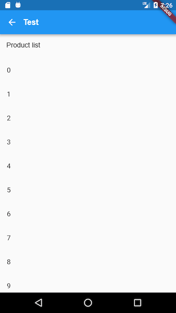
We have achieved the desired effect, but this approach is not elegant. If the page layout changes, for example, if the header layout adjusts and changes the header height, we would need to recalculate the remaining space. Is there a way to make the ListView automatically stretch to fill the remaining screen space? Of course! The answer is Flex. As introduced earlier, in a flexible layout, we can use Expanded to automatically stretch the size of components, and since Column is a subclass of Flex, we can directly use Column + Expanded to achieve this. Here’s the code:
@override
Widget build(BuildContext context) {
  return Column(children: <Widget>[
    ListTile(title: Text("Product List")),
    Expanded(
      child: ListView.builder(itemBuilder: (BuildContext context, int index) {
        return ListTile(title: Text("$index"));
      }),
    ),
  ]);
}
39.7 Summary
This section mainly introduced the common usage and key points of ListView, but it didn’t cover the ListView.custom method, which requires implementing a SliverChildDelegate to generate list item components for ListView. For more details, please refer to the API documentation.


