Composing UI Components in Flutter
In Flutter, page UIs are typically composed of low-level components. When we need to encapsulate some common components, we should first consider whether we can achieve this through the composition of other components. If possible, composition should be prioritized, as directly assembling existing components is usually simpler, more flexible, and more efficient.
70.1 Example: Custom Gradient Button
1. Implementing GradientButton
The buttons in the Flutter Material component library do not support gradient backgrounds by default. To create a gradient background button, we will define a GradientButton component that needs to support the following features:
Background gradient color
Ripple effect when pressed
Support for rounded corners
Let’s first take a look at the final effect we want to achieve (Figure):
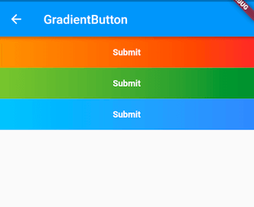
We can use DecoratedBox to support gradient background colors and rounded corners, and InkWell to provide the ripple effect when pressed. Therefore, we can implement GradientButton by composing DecoratedBox and InkWell, as shown in the following code:
import 'package:flutter/material.dart';

class GradientButton extends StatelessWidget {
  const GradientButton({
    Key? key,
    this.colors,
    this.width,
    this.height,
    this.onPressed,
    this.borderRadius,
    required this.child,
  }) : super(key: key);

  // Gradient color array
  final List<Color>? colors;

  // Button width and height
  final double? width;
  final double? height;
  final BorderRadius? borderRadius;

  // Click callback
  final GestureTapCallback? onPressed;

  final Widget child;

  @override
  Widget build(BuildContext context) {
    ThemeData theme = Theme.of(context);

    // Ensure the colors array is not empty
    List<Color> _colors =
        colors ?? [theme.primaryColor, theme.primaryColorDark];

    return DecoratedBox(
      decoration: BoxDecoration(
        gradient: LinearGradient(colors: _colors),
        borderRadius: borderRadius,
      ),
      child: Material(
        type: MaterialType.transparency,
        child: InkWell(
          splashColor: _colors.last,
          highlightColor: Colors.transparent,
          borderRadius: borderRadius,
          onTap: onPressed,
          child: ConstrainedBox(
            constraints: BoxConstraints.tightFor(height: height, width: width),
            child: Center(
              child: Padding(
                padding: const EdgeInsets.all(8.0),
                child: DefaultTextStyle(
                  style: const TextStyle(fontWeight: FontWeight.bold),
                  child: child,
                ),
              ),
            ),
          ),
        ),
      ),
    );
  }
}
As seen, GradientButton is composed of DecoratedBox, Padding, Center, InkWell, and other components. Of course, the above code is just a sample; as a button, it is not complete—for instance, it lacks a disabled state. Readers can enhance it as needed. For convenience, I have encapsulated a more complete GradientButton and added it to the flukit component library, which readers can use directly after importing the flukit library.
2. Using GradientButton
import 'package:flutter/material.dart';
import '../widgets/index.dart';

class GradientButtonRoute extends StatefulWidget {
  const GradientButtonRoute({Key? key}) : super(key: key);

  @override
  _GradientButtonRouteState createState() => _GradientButtonRouteState();
}

class _GradientButtonRouteState extends State<GradientButtonRoute> {
  @override
  Widget build(BuildContext context) {
    return Column(
      mainAxisSize: MainAxisSize.min,
      children: <Widget>[
        GradientButton(
          colors: const [Colors.orange, Colors.red],
          height: 50.0,
          child: const Text("Submit"),
          onPressed: onTap,
        ),
        GradientButton(
          height: 50.0,
          colors: [Colors.lightGreen, Colors.green.shade700],
          child: const Text("Submit"),
          onPressed: onTap,
        ),
        GradientButton(
          height: 50.0,
          colors: [Colors.lightBlue.shade300, Colors.blueAccent],
          child: const Text("Submit"),
          onPressed: onTap,
        ),
      ],
    );
  }

  onTap() {
    print("button click");
  }
}
70.2 Summary
Defining components through composition is not different from writing UIs as we have done previously. However, when extracting standalone components, we need to consider code standards, such as using the required keyword for necessary parameters and checking for null or setting default values for optional parameters in specific scenarios. This is important because users often may not understand the internal details of the component. To ensure robust code, we need to accommodate or provide error messages when users incorrectly utilize the component (using the assert function).
