Custom Animation Transition Components
For convenience in expression, we define components that execute transition animations when their widget properties change as "animation transition components." A prominent feature of these components is that they internally manage an AnimationController. As we know, to allow users to customize properties such as animation curves, durations, and directions, previous animation encapsulation methods usually require users to provide an AnimationController object. However, this necessitates manual management of the AnimationController, increasing complexity. Therefore, if we can also encapsulate the AnimationController, it would significantly improve the usability of animation components.
68.1 Custom Animation Transition Component
We will implement an AnimatedDecoratedBox that can execute a transition animation when the decoration property changes from an old state to a new state. Based on previous knowledge, we implemented the AnimatedDecoratedBox1 component:
class AnimatedDecoratedBox1 extends StatefulWidget {
  const AnimatedDecoratedBox1({
    Key? key,
    required this.decoration,
    required this.child,
    this.curve = Curves.linear,
    required this.duration,
    this.reverseDuration,
  }) : super(key: key);

  final BoxDecoration decoration;
  final Widget child;
  final Duration duration;
  final Curve curve;
  final Duration? reverseDuration;

  @override
  _AnimatedDecoratedBox1State createState() => _AnimatedDecoratedBox1State();
}

class _AnimatedDecoratedBox1State extends State<AnimatedDecoratedBox1>
    with SingleTickerProviderStateMixin {
  @protected
  AnimationController get controller => _controller;
  late AnimationController _controller;

  Animation<double> get animation => _animation;
  late Animation<double> _animation;

  late DecorationTween _tween;

  @override
  Widget build(BuildContext context) {
    return AnimatedBuilder(
      animation: _animation,
      builder: (context, child) {
        return DecoratedBox(
          decoration: _tween.animate(_animation).value,
          child: child,
        );
      },
      child: widget.child,
    );
  }

  @override
  void initState() {
    super.initState();
    _controller = AnimationController(
      duration: widget.duration,
      reverseDuration: widget.reverseDuration,
      vsync: this,
    );
    _tween = DecorationTween(begin: widget.decoration);
    _updateCurve();
  }

  void _updateCurve() {
    _animation = CurvedAnimation(parent: _controller, curve: widget.curve);
  }

  @override
  void didUpdateWidget(AnimatedDecoratedBox1 oldWidget) {
    super.didUpdateWidget(oldWidget);
    if (widget.curve != oldWidget.curve) _updateCurve();
    _controller.duration = widget.duration;
    _controller.reverseDuration = widget.reverseDuration;
    // Executing transition animation
    if (widget.decoration != (_tween.end ?? _tween.begin)) {
      _tween
        ..begin = _tween.evaluate(_animation)
        ..end = widget.decoration;

      _controller
        ..value = 0.0
        ..forward();
    }
  }

  @override
  void dispose() {
    _controller.dispose();
    super.dispose();
  }
}
Next, we will use AnimatedDecoratedBox1 to implement a background color transition from blue to red upon button click:
Color _decorationColor = Colors.blue;
var duration = Duration(seconds: 1);
// ... // omitted unrelated code
AnimatedDecoratedBox1(
  duration: duration,
  decoration: BoxDecoration(color: _decorationColor),
  child: TextButton(
    onPressed: () {
      setState(() {
        _decorationColor = Colors.red;
      });
    },
    child: const Text(
      "AnimatedDecoratedBox",
      style: TextStyle(color: Colors.white),
    ),
  ),
)
The effect before the click is shown in Figure, and after clicking, a frame from the transition process is shown in Figure 2:
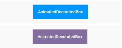
After clicking, the button's background color transitions from blue to red. Figure 9-9 shows a frame from the transition process, which appears slightly purple; the background will ultimately become red after the entire transition animation completes.
Although the above code achieves the desired functionality, it is relatively complex. Upon further consideration, we can see that the management of the AnimationController and the Tween update code can be abstracted. If we encapsulate these common logics into a base class, then to implement animation transition components, we only need to inherit from these base classes and customize our specific code (such as the build method for each frame of the animation). This would simplify the code.
To facilitate developers in creating animation transition components, Flutter provides an ImplicitlyAnimatedWidget abstract class that extends StatefulWidget, along with a corresponding ImplicitlyAnimatedWidgetState class that manages the AnimationController. Developers only need to inherit from ImplicitlyAnimatedWidget and ImplicitlyAnimatedWidgetState to encapsulate animations. Below, we demonstrate how to implement this.
We will implement it in two steps:
-
Inherit from the
ImplicitlyAnimatedWidgetclass.
class AnimatedDecoratedBox extends ImplicitlyAnimatedWidget {
  const AnimatedDecoratedBox({
    Key? key,
    required this.decoration,
    required this.child,
    Curve curve = Curves.linear,
    required Duration duration,
  }) : super(
          key: key,
          curve: curve,
          duration: duration,
        );
  final BoxDecoration decoration;
  final Widget child;

  @override
  _AnimatedDecoratedBoxState createState() {
    return _AnimatedDecoratedBoxState();
  }
}
The properties curve, duration, and reverseDuration are already defined in ImplicitlyAnimatedWidget. As seen, the AnimatedDecoratedBox class is not much different from a regular class inheriting from StatefulWidget.
-
The State class inherits from
AnimatedWidgetBaseState(which inherits fromImplicitlyAnimatedWidgetState).
class _AnimatedDecoratedBoxState
    extends AnimatedWidgetBaseState<AnimatedDecoratedBox> {
  late DecorationTween _decoration;

  @override
  Widget build(BuildContext context) {
    return DecoratedBox(
      decoration: _decoration.evaluate(animation),
      child: widget.child,
    );
  }

  @override
  void forEachTween(TweenVisitor<dynamic> visitor) {
    _decoration = visitor(
      _decoration,
      widget.decoration,
      (value) => DecorationTween(begin: value),
    ) as DecorationTween;
  }
}
We can see that we have implemented the build and forEachTween methods. During the animation execution, the build method is called for each frame (the call logic is in ImplicitlyAnimatedWidgetState), so in the build method, we need to construct the state of the DecoratedBox for each frame, calculating the decoration state for each frame using _decoration.evaluate(animation), where animation is the object defined in the base class ImplicitlyAnimatedWidgetState. The _decoration is a custom DecorationTween object. The question now is when it gets assigned.
To answer this, we need to understand when _decoration needs to be assigned. We know _decoration is a Tween, and its primary role is to define the animation's start (begin) and end states (end). For AnimatedDecoratedBox, the end state is the value passed by the user, while the start state is uncertain and can be of two scenarios:
-
When
AnimatedDecoratedBoxbuilds for the first time, it sets its decoration value as the starting state, i.e.,_decorationisDecorationTween(begin: decoration). -
When the
decorationofAnimatedDecoratedBoxupdates, the starting state is_decoration.animate(animation), meaning_decorationisDecorationTween(begin: _decoration.animate(animation), end: decoration).
The purpose of forEachTween is clear now: it is used to update the initial values of the Tween and will be called in both scenarios. Developers only need to override this method and update the Tween's starting state values within it. The update logic is hidden in the visitor callback, and we just need to call it with the correct parameters. The visitor method signature is as follows:
Tween<T> visitor(
   Tween<T> tween, // Current tween, null on first call
   T targetValue, // End state
   TweenConstructor<T> constructor, // Tween constructor, called in the above three scenarios to update tween
);
As we can see, by inheriting from ImplicitlyAnimatedWidget and ImplicitlyAnimatedWidgetState, we can quickly implement the encapsulation of animation transition components, significantly simplifying the code compared to a manual implementation.
68.2 Predefined Animation Transition Widgets in Flutter
The Flutter SDK provides a variety of predefined animation transition widgets that function similarly to the AnimatedDecoratedBox. These are listed in Table 9-1:
| Widget Name | Functionality |
|---|---|
AnimatedPadding
|
Transitions to a new state when the padding changes. |
AnimatedPositioned
|
Used with a Stack, transitions to a new state when the positioned state changes.
|
AnimatedOpacity
|
Transitions to a new state when the opacity changes. |
AnimatedAlign
|
Transitions to a new state when the alignment changes. |
AnimatedContainer
|
Transitions to a new state when the Container properties change.
|
AnimatedDefaultTextStyle
|
When the text style changes, the text components that inherit the style will dynamically transition to the new style. |
Table 9-1: Predefined Animation Transition Widgets in Flutter
Next, let's look at an example to experience how these predefined animation transition widgets work:
import 'package:flutter/material.dart';

class AnimatedWidgetsTest extends StatefulWidget {
  const AnimatedWidgetsTest({Key? key}) : super(key: key);

  @override
  _AnimatedWidgetsTestState createState() => _AnimatedWidgetsTestState();
}

class _AnimatedWidgetsTestState extends State<AnimatedWidgetsTest> {
  double _padding = 10;
  var _align = Alignment.topRight;
  double _height = 100;
  double _left = 0;
  Color _color = Colors.red;
  TextStyle _style = const TextStyle(color: Colors.black);
  Color _decorationColor = Colors.blue;
  double _opacity = 1;

  @override
  Widget build(BuildContext context) {
    var duration = const Duration(milliseconds: 400);
    return SingleChildScrollView(
      child: Column(
        children: <Widget>[
          ElevatedButton(
            onPressed: () {
              setState(() {
                _padding = 20;
              });
            },
            child: AnimatedPadding(
              duration: duration,
              padding: EdgeInsets.all(_padding),
              child: const Text("AnimatedPadding"),
            ),
          ),
          SizedBox(
            height: 50,
            child: Stack(
              children: <Widget>[
                AnimatedPositioned(
                  duration: duration,
                  left: _left,
                  child: ElevatedButton(
                    onPressed: () {
                      setState(() {
                        _left = 100;
                      });
                    },
                    child: const Text("AnimatedPositioned"),
                  ),
                )
              ],
            ),
          ),
          Container(
            height: 100,
            color: Colors.grey,
            child: AnimatedAlign(
              duration: duration,
              alignment: _align,
              child: ElevatedButton(
                onPressed: () {
                  setState(() {
                    _align = Alignment.center;
                  });
                },
                child: const Text("AnimatedAlign"),
              ),
            ),
          ),
          AnimatedContainer(
            duration: duration,
            height: _height,
            color: _color,
            child: TextButton(
              onPressed: () {
                setState(() {
                  _height = 150;
                  _color = Colors.blue;
                });
              },
              child: const Text(
                "AnimatedContainer",
                style: TextStyle(color: Colors.white),
              ),
            ),
          ),
          AnimatedDefaultTextStyle(
            child: GestureDetector(
              child: const Text("hello world"),
              onTap: () {
                setState(() {
                  _style = const TextStyle(
                    color: Colors.blue,
                    decorationStyle: TextDecorationStyle.solid,
                    decorationColor: Colors.blue,
                  );
                });
              },
            ),
            style: _style,
            duration: duration,
          ),
          AnimatedOpacity(
            opacity: _opacity,
            duration: duration,
            child: TextButton(
              style: ButtonStyle(
                  backgroundColor: MaterialStateProperty.all(Colors.blue)),
              onPressed: () {
                setState(() {
                  _opacity = 0.2;
                });
              },
              child: const Text(
                "AnimatedOpacity",
                style: TextStyle(color: Colors.white),
              ),
            ),
          ),
          AnimatedDecoratedBox1(
            duration: Duration(
                milliseconds: _decorationColor == Colors.red ? 400 : 2000),
            decoration: BoxDecoration(color: _decorationColor),
            child: Builder(builder: (context) {
              return TextButton(
                onPressed: () {
                  setState(() {
                    _decorationColor = _decorationColor == Colors.blue
                        ? Colors.red
                        : Colors.blue;
                  });
                },
                child: const Text(
                  "AnimatedDecoratedBox toggle",
                  style: TextStyle(color: Colors.white),
                ),
              );
            }),
          )
        ].map((e) {
          return Padding(
            padding: const EdgeInsets.symmetric(vertical: 16),
            child: e,
          );
        }).toList(),
      ),
    );
  }
}
After running the code, the result will look like Figure :
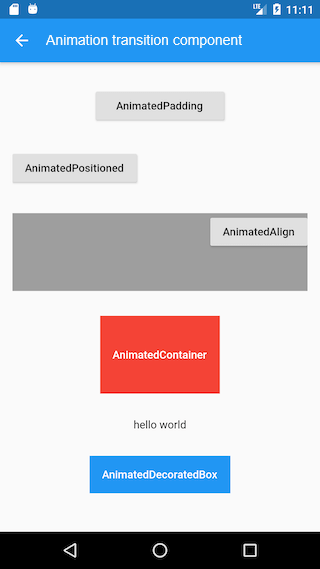
Readers can click on the respective widgets to observe the actual running effects.
