The TabBarView is a layout component provided by the Material widget library, often used in conjunction with the TabBar.
45.1 TabBarView
TabBarView encapsulates PageView, and its constructor is straightforward:
TabBarView({
  Key? key,
  required this.children, // The tab pages
  this.controller, // TabController
  this.physics,
  this.dragStartBehavior = DragStartBehavior.start,
})
The TabController is used to monitor and control page switching in TabBarView, often in coordination with TabBar. If no controller is specified, it will search up the widget tree and use the nearest DefaultTabController.
45.2 TabBar
The TabBar serves as the navigation header for TabBarView, as shown in Figure .

TabBar has numerous configuration parameters that allow you to define its style, including many properties for customizing the indicator and label. For example, in the figure above, the label represents the text of each tab, while the indicator is the white underline beneath "History."
const TabBar({
  Key? key,
  required this.tabs, // The tabs to be created
  this.controller,
  this.isScrollable = false, // Whether the tabs are scrollable
  this.padding,
  this.indicatorColor, // Color of the indicator, default is a 2px underline
  this.automaticIndicatorColorAdjustment = true,
  this.indicatorWeight = 2.0, // Height of the indicator
  this.indicatorPadding = EdgeInsets.zero, // Padding of the indicator
  this.indicator, // Custom indicator
  this.indicatorSize, // Indicator size: can be tab length or label length
  this.labelColor,
  this.labelStyle,
  this.labelPadding,
  this.unselectedLabelColor,
  this.unselectedLabelStyle,
  this.mouseCursor,
  this.onTap,
  ...
})
TabBar is usually positioned at the bottom of the AppBar. It can also receive a TabController. If you want TabBar to synchronize with TabBarView, both must use the same TabController. Be aware that the number of children in TabBar and TabBarView must match for proper linkage. If no controller is specified, it will look for the nearest DefaultTabController in the widget tree. Additionally, we need to create the tabs and pass them through the tabs parameter. Tabs can be any widget, though the Material widget library includes a built-in Tab component, which we typically use:
const Tab({
  Key? key,
  this.text, // Text of the tab
  this.icon, // Icon of the tab
  this.iconMargin = const EdgeInsets.only(bottom: 10.0),
  this.height,
  this.child, // Custom widget
})
Note that the text and child properties are mutually exclusive and cannot be used simultaneously.
45.3 Example
Let’s look at an example:
class TabViewRoute1 extends StatefulWidget {
  @override
  _TabViewRoute1State createState() => _TabViewRoute1State();
}

class _TabViewRoute1State extends State<TabViewRoute1> with SingleTickerProviderStateMixin {
  late TabController _tabController;
  List tabs = ["News", "History", "Images"];

  @override
  void initState() {
    super.initState();
    _tabController = TabController(length: tabs.length, vsync: this);
  }

  @override
  Widget build(BuildContext context) {
    return Scaffold(
      appBar: AppBar(
        title: Text("App Name"),
        bottom: TabBar(
          controller: _tabController,
          tabs: tabs.map((e) => Tab(text: e)).toList(),
        ),
      ),
      body: TabBarView( // Construct the TabBarView
        controller: _tabController,
        children: tabs.map((e) {
          return KeepAliveWrapper(
            child: Container(
              alignment: Alignment.center,
              child: Text(e, textScaleFactor: 5),
            ),
          );
        }).toList(),
      ),
    );
  }

  @override
  void dispose() {
    // Dispose of resources
    _tabController.dispose();
    super.dispose();
  }
}
When run, the output looks like Figure :
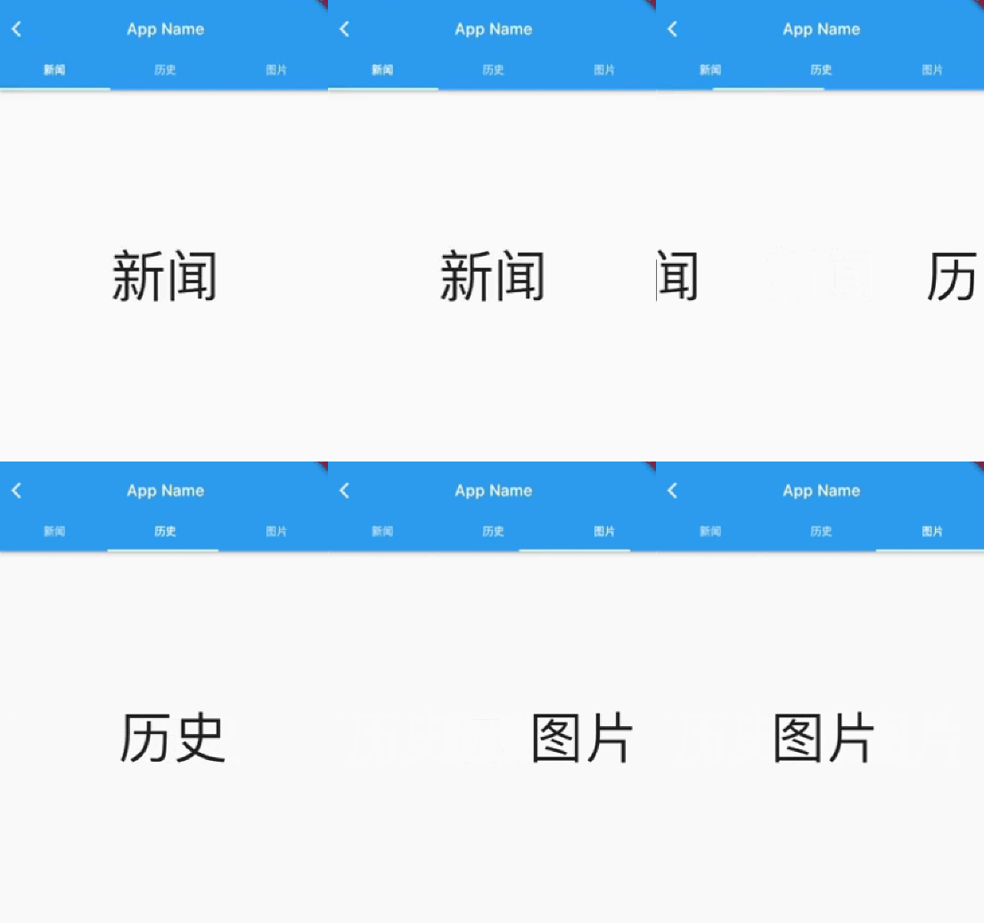
When you swipe through the pages, the top tabs move along, and when you tap on a tab, the page switches accordingly. To enable the interaction between TabBar and TabBarView, we explicitly created a TabController. Since TabController requires a TickerProvider (via the vsync parameter), we mixed in SingleTickerProviderStateMixin. Because TabController performs animations and holds resources, we must dispose of it when the page is destroyed.
Overall, creating a TabController can be complex. In practice, when TabBar and TabBarView need to interact, it’s common to create a DefaultTabController as their parent component. This allows them to search up the widget tree at runtime and use the specified DefaultTabController. Here’s a revised version:
class TabViewRoute2 extends StatelessWidget {
  @override
  Widget build(BuildContext context) {
    List tabs = ["News", "History", "Images"];
    return DefaultTabController(
      length: tabs.length,
      child: Scaffold(
        appBar: AppBar(
          title: Text("App Name"),
          bottom: TabBar(
            tabs: tabs.map((e) => Tab(text: e)).toList(),
          ),
        ),
        body: TabBarView( // Construct the TabBarView
          children: tabs.map((e) {
            return KeepAliveWrapper(
              child: Container(
                alignment: Alignment.center,
                child: Text(e, textScaleFactor: 5),
              ),
            );
          }).toList(),
        ),
      ),
    );
  }
}
As you can see, we no longer need to manually manage the controller’s lifecycle, provide a SingleTickerProviderStateMixin, or manage any other state, so a StatefulWidget is no longer necessary, making the implementation much simpler.
Page Caching
Since TabBarView encapsulates PageView, you can refer to the PageView section for details on caching pages.
