33.1 Container
We have used the Container component multiple times in previous examples. In this section, we will take a closer look at the Container component. The Container is a composite container class that does not correspond to a specific RenderObject itself. Instead, it is a multi-functional container that combines other components such as DecoratedBox, ConstrainedBox, Transform, Padding, and Align. With just a Container, you can implement scenarios that require decoration, transformation, and constraints all at once. Here is the definition of Container:
Container({
  this.alignment,
  this.padding, // Inner padding, part of the decoration scope
  Color color, // Background color
  Decoration decoration, // Background decoration
  Decoration foregroundDecoration, // Foreground decoration
  double width, // Width of the container
  double height, // Height of the container
  BoxConstraints constraints, // Size constraints for the container
  this.margin, // Outer margin, not part of the decoration scope
  this.transform, // Transformation
  this.child,
  ...
})
Most of the properties of Container have been introduced while discussing other containers, so they won’t be repeated here. However, there are two important points to clarify:
The size of the container can be specified either through the
widthandheightproperties or throughconstraints. If both are present,widthandheighttake precedence. Internally,Containergenerates constraints based onwidthandheight.The
coloranddecorationproperties are mutually exclusive. If both are set, an error will occur! In fact, when thecolorproperty is specified, adecorationis automatically created within theContainer.
33.2 Example
We’ll use a Container to create a card as shown in Figure :
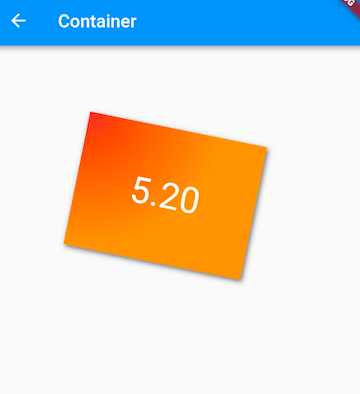
Here’s the implementation code:
Container(
  margin: EdgeInsets.only(top: 50.0, left: 120.0),
  constraints: BoxConstraints.tightFor(width: 200.0, height: 150.0), // Card size
  decoration: BoxDecoration(  // Background decoration
    gradient: RadialGradient( // Radial gradient background
      colors: [Colors.red, Colors.orange],
      center: Alignment.topLeft,
      radius: .98,
    ),
    boxShadow: [
      // Card shadow
      BoxShadow(
        color: Colors.black54,
        offset: Offset(2.0, 2.0),
        blurRadius: 4.0,
      ),
    ],
  ),
  transform: Matrix4.rotationZ(.2), // Skew transformation for the card
  alignment: Alignment.center, // Center align the text within the card
  child: Text(
    // Card text
    "5.20", style: TextStyle(color: Colors.white, fontSize: 40.0),
  ),
)
You can see that Container integrates the functionalities of several other components. By inspecting the source code of Container, it’s easy to observe that it is a combination of many of the components we’ve discussed earlier. In Flutter, the Container component exemplifies the idea of composition over inheritance.
33.3 Padding and Margin
Next, let’s explore the difference between the margin and padding properties of the Container component:
Container(
  margin: EdgeInsets.all(20.0), // Outer margin
  color: Colors.orange,
  child: Text("Hello world!"),
),
Container(
  padding: EdgeInsets.all(20.0), // Inner padding
  color: Colors.orange,
  child: Text("Hello world!"),
),
The result is shown in Figure :
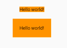
As you can see, the margin’s whitespace is outside the container, while the padding’s whitespace is inside the container. This difference is important to remember. In fact, both margin and padding within a Container are implemented using the Padding component. The code above is equivalent to:
Padding(
  padding: EdgeInsets.all(20.0),
  child: DecoratedBox(
    decoration: BoxDecoration(color: Colors.orange),
    child: Text("Hello world!"),
  ),
),
DecoratedBox(
  decoration: BoxDecoration(color: Colors.orange),
  child: Padding(
    padding: const EdgeInsets.all(20.0),
    child: Text("Hello world!"),
  ),
),