34.1 Clipping Widgets
Flutter provides several clipping widgets to clip components:
| Clipping Widget | Default Behavior |
|---|---|
| ClipOval | Clips a square child into a circle or a rectangular child into an ellipse. |
| ClipRRect | Clips a child into a rounded rectangle. |
| ClipRect | Clips the overflowed content of a child that exceeds the layout space. |
| ClipPath | Clips according to a custom path. |
Let’s look at an example:
import 'package:flutter/material.dart';

class ClipTestRoute extends StatelessWidget {
  @override
  Widget build(BuildContext context) {
    // Avatar
    Widget avatar = Image.asset("imgs/avatar.png", width: 60.0);
    return Center(
      child: Column(
        children: <Widget>[
          avatar, // No clipping
          ClipOval(child: avatar), // Clipped to a circle
          ClipRRect( // Clipped to a rounded rectangle
            borderRadius: BorderRadius.circular(5.0),
            child: avatar,
          ),
          Row(
            mainAxisAlignment: MainAxisAlignment.center,
            children: <Widget>[
              Align(
                alignment: Alignment.topLeft,
                widthFactor: .5, // Set the width to half of the original, the other half will overflow
                child: avatar,
              ),
              Text("Hello World", style: TextStyle(color: Colors.green),)
            ],
          ),
          Row(
            mainAxisAlignment: MainAxisAlignment.center,
            children: <Widget>[
              ClipRect( // Clip the overflowed part
                child: Align(
                  alignment: Alignment.topLeft,
                  widthFactor: .5, // Set the width to half of the original
                  child: avatar,
                ),
              ),
              Text("Hello World", style: TextStyle(color: Colors.green))
            ],
          ),
        ],
      ),
    );
  }
}
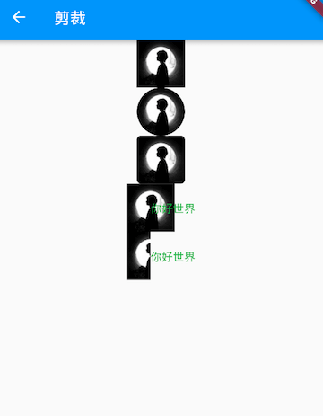
The result is shown in Figure :

The comments in the example code are detailed, so no further explanation is needed here. However, it's worth noting the last two Row widgets. By setting widthFactor to 0.5 through Align, the image’s actual width becomes 60 × 0.5, which is half of the original width. However, the overflowed part of the image will still be displayed, causing the first "Hello World" text to overlap with the other part of the image. To clip the overflow, we use ClipRect in the second Row to remove the overflowed part.
34.2 Custom Clipping (CustomClipper)
If we want to clip a specific area of the child component, for instance, if we only want to extract the middle 40 × 30 pixel area of the image in the above example, how can we do that? In this case, we can use CustomClipper to define the clipping area. Here’s how we can do it:
First, define a custom CustomClipper:
class MyClipper extends CustomClipper<Rect> {
  @override
  Rect getClip(Size size) => Rect.fromLTWH(10.0, 15.0, 40.0, 30.0);

  @override
  bool shouldReclip(CustomClipper<Rect> oldClipper) => false;
}
The getClip() method is used to get the clipping area. Since the image size is 60 × 60, we return the clipping area as Rect.fromLTWH(10.0, 15.0, 40.0, 30.0), which represents a 40 × 30 pixel region in the center of the image.
The shouldReclip() method determines whether the clipping needs to be recalculated. If the clipping area does not change in the application, return false to avoid unnecessary performance overhead. If the clipping area changes (for example, when animating the clipping area), return true to recalculate the clipping.
Next, we use ClipRect to apply the custom clipping. To make the image's actual size visible, we set a red background:
DecoratedBox(
  decoration: BoxDecoration(
    color: Colors.red
  ),
  child: ClipRect(
    clipper: MyClipper(), // Use the custom clipper
    child: avatar
  ),
)
The result is shown in Figure :

We can see that the clipping is successful, but the size of the image remains 60 × 60 (the red area). This is because the component's size is determined during the layout phase, and the clipping occurs during the painting phase, so it does not affect the size of the component. This is similar to the principle of Transform.
ClipPath can clip components along a custom path. It requires a custom CustomClipper<Path> clipper, which is defined similarly to the MyClipper class. The getClip method should return a Path instead of a Rect, and we won't go into further detail here.


