In this section, we will introduce how to draw text and perform off-screen rendering by implementing a watermark component.
In practical scenarios, watermarks usually need to cover the entire screen. If full coverage is not necessary, it can typically be achieved using a combination of components. This section mainly discusses watermarks that need to cover the entire screen.
76.1 Watermark Component: WaterMark
We can achieve the desired functionality by drawing a "unit watermark" and allowing it to repeat in the background of the watermark component. Thus, we can directly use DecoratedBox, which has background image repeating capabilities. Once the repetition issue is resolved, the main question is how to draw the unit watermark. To allow for flexible extensions, we define a watermark painter interface. This way, we can provide some commonly used painter implementations to satisfy most scenarios, while developers with custom needs can implement their own painters.
Below is the definition of the watermark component WaterMark:
class WaterMark extends StatefulWidget {
  WaterMark({
    Key? key,
    this.repeat = ImageRepeat.repeat,
    required this.painter,
  }) : super(key: key);

  /// Unit watermark painter
  final WaterMarkPainter painter;

  /// Repetition method for the unit watermark
  final ImageRepeat repeat;

  @override
  State<WaterMark> createState() => _WaterMarkState();
}
Now, let’s look at the implementation of the State:
class _WaterMarkState extends State<WaterMark> {
  late Future<MemoryImage> _memoryImageFuture;

  @override
  void initState() {
    // Cache is a promise
    _memoryImageFuture = _getWaterMarkImage();
    super.initState();
  }

  @override
  Widget build(BuildContext context) {
    return SizedBox.expand( // Watermark as large as possible
      child: FutureBuilder(
        future: _memoryImageFuture,
        builder: (BuildContext context, AsyncSnapshot snapshot) {
          if (snapshot.connectionState != ConnectionState.done) {
            // If the unit watermark is not yet drawn, return an empty Container
            return Container();
          } else {
            // If the unit watermark is drawn, render the watermark
            return DecoratedBox(
              decoration: BoxDecoration(
                image: DecorationImage(
                  image: snapshot.data, // Background image, i.e., the unit watermark image we drew
                  repeat: widget.repeat, // Specify repetition method
                  alignment: Alignment.topLeft,
                ),
              ),
            );
          }
        },
      ),
    );
  }

  @override
  void didUpdateWidget(WaterMark oldWidget) {
   ... // To be implemented
  }

  // Off-screen draw unit watermark and cache the result as an image
  Future<MemoryImage> _getWaterMarkImage() async {
    ... // To be implemented
  }

  @override
  void dispose() {
   ... // To be implemented
  }
}
We use DecoratedBox to implement the background image repetition. At initialization, we start off-screen drawing of the unit watermark and cache the result in a MemoryImage. Since off-screen drawing is an asynchronous task, we can simply cache the Future. It is important to note that when the component is rebuilt, if the painter configuration changes, we need to redraw the unit watermark and cache the new drawing result:
@Override
void didUpdateWidget(WaterMark oldWidget) {
  // If the painter has changed (type or configuration), redraw the watermark
  if (widget.painter.runtimeType != oldWidget.painter.runtimeType ||
      widget.painter.shouldRepaint(oldWidget.painter)) {
    // Release the previous cache first
    _memoryImageFuture.then((value) => value.evict());
    // Redraw and cache
    _memoryImageFuture = _getWaterMarkImage();
  }
  super.didUpdateWidget(oldWidget);
}
Note that before redrawing the unit watermark, we need to clear the old watermark cache. The cache can be cleared by calling the evict method of MemoryImage. Additionally, when the component is unmounted, we should also release the cache:
@Override
void dispose() {
  // Release the image cache
  _memoryImageFuture.then((value) => value.evict());
  super.dispose();
}
Next, we need to redraw the unit watermark by calling the _getWaterMarkImage() method. This method is responsible for off-screen drawing of the unit watermark and caching the drawing result as an image. Let’s look at its implementation.
Off-Screen Drawing
The off-screen drawing code is as follows:
// Off-screen draw unit watermark and save the drawing result as an image cache
Future<MemoryImage> _getWaterMarkImage() async {
  // Create a Canvas for off-screen drawing; details and principles can be found in Section 14.5 of this book.
  final recorder = ui.PictureRecorder();
  final canvas = Canvas(recorder);
  // Draw the unit watermark and get its size
  final size = widget.painter.paintUnit(
    canvas,
    MediaQueryData.fromWindow(ui.window).devicePixelRatio,
  );
  final picture = recorder.endRecording();
  // Export the unit watermark as an image and cache it
  final img = await picture.toImage(size.width.ceil(), size.height.ceil());
  final byteData = await img.toByteData(format: ui.ImageByteFormat.png);
  final pngBytes = byteData!.buffer.asUint8List();
  return MemoryImage(pngBytes);
}
We manually create a Canvas and a PictureRecorder to achieve off-screen drawing. To briefly introduce the functionality of PictureRecorder: when Canvas API is called, a series of drawing instructions are generated. These drawing instructions must be executed to obtain the drawing result. PictureRecorder acts as a drawing instruction recorder, capable of recording all drawing instructions during a specific period. By calling recorder.endRecording(), we can obtain the recorded drawing instructions, which return a Picture object. This object carries the drawing instructions and has a toImage method that executes these instructions to obtain the drawn pixel result (a ui.Image object). Subsequently, we can convert the pixel result to PNG format data and cache it in MemoryImage.
76.2 Unit Watermark Painter
Now, let’s see how to draw the unit watermark. First, let’s look at the definition of the watermark painter interface:
/// Define the watermark painter
abstract class WaterMarkPainter {
  /// Draw "unit watermark"; the complete watermark consists of repeating unit watermarks.
  /// The return value is the size occupied by the "unit watermark."
  /// [devicePixelRatio]: Since the final content needs to be saved as an image, it needs to be enlarged based on the screen's DPR to prevent distortion.
  Size paintUnit(Canvas canvas, double devicePixelRatio);

  /// Whether to repaint
  bool shouldRepaint(covariant WaterMarkPainter oldPainter) => true;
}
The definition is simple, consisting of two functions:
paintUnit: Used to draw the unit watermark. It's important to note that the size of many UI elements can only be obtained during drawing and cannot be known in advance. Therefore,paintUnitmust return the size information of the unit watermark after completing its drawing task, which will be used when exporting as an image.shouldRepaint: Returns true when the painter's state changes and affects the appearance of the unit watermark; otherwise, it returns false. If true, it triggers a repaint of the unit watermark. This is called in thedidUpdateWidgetmethod of_WaterMarkState. Readers can refer to the source code for a better understanding.
76.3 Text Watermark Painter
Next, we will implement a text watermark painter that can draw a segment of text, allowing us to specify the text style and rotation angle.
/// Text watermark painter
class TextWaterMarkPainter extends WaterMarkPainter {
  TextWaterMarkPainter({
    Key? key,
    double? rotate,
    EdgeInsets? padding,
    TextStyle? textStyle,
    required this.text,
  })  : assert(rotate == null || rotate >= -90 && rotate <= 90),
        rotate = rotate ?? 0,
        padding = padding ?? const EdgeInsets.all(10.0),
        textStyle = textStyle ?? TextStyle(
          color: Color.fromARGB(20, 0, 0, 0),
          fontSize: 14,
        );

  double rotate; // The angle of text rotation, in degrees
  TextStyle textStyle; // Text style
  EdgeInsets padding; // Text padding
  String text; // Text

  @override
  Size paintUnit(Canvas canvas, double devicePixelRatio) {
   // 1. Draw the text first
   // 2. Apply rotation and padding
  }

  @override
  bool shouldRepaint(TextWaterMarkPainter oldPainter) {
   ... // To be implemented
  }
}
The drawing process in paintUnit consists of two steps:
Draw the text
Apply rotation and padding
Drawing the Text
The process of drawing text involves three steps:
Create a
ParagraphBuilder, referred to asbuilder.Use
builder.addto add the string to be drawn.Construct the text and perform layout, as the size of the text can only be determined after layout.
Call
canvas.drawParagraphto draw the text.
The specific code is as follows:
import 'dart:ui' as ui;
...
 @override
 Size paintUnit(Canvas canvas, double devicePixelRatio) {
    // Scale some values in text style based on screen devicePixelRatio
    final _textStyle = _handleTextStyle(textStyle, devicePixelRatio);
    final _padding = padding * devicePixelRatio;

    // Build the text paragraph
    final builder = ui.ParagraphBuilder(_textStyle.getParagraphStyle(
      textDirection: textDirection,
      textAlign: TextAlign.start,
      textScaleFactor: devicePixelRatio,
    ));

    // Add the text and style to be drawn
    builder
      ..pushStyle(_textStyle.getTextStyle()) // textStyle is ui.TextStyle
      ..addText(text);

    // After layout, we can know the space occupied by the text
    ui.Paragraph paragraph = builder.build()
      ..layout(ui.ParagraphConstraints(width: double.infinity));

    // Actual width occupied by the text
    final textWidth = paragraph.longestLine.ceilToDouble();
    // Actual height occupied by the text
    final fontSize = paragraph.height;

    ... // Omit code related to applying rotation and padding

    // Draw the text
    canvas.drawParagraph(paragraph, Offset.zero);
  }

  TextStyle _handleTextStyle(double devicePixelRatio) {
    var style = textStyle;
    double _scale(attr) => attr == null ? 1.0 : devicePixelRatio;
    return style.apply(
      decorationThicknessFactor: _scale(style.decorationThickness),
      letterSpacingFactor: _scale(style.letterSpacing),
      wordSpacingFactor: _scale(style.wordSpacing),
      heightFactor: _scale(style.height),
    );
  }
As you can see, the process of drawing text is quite complex. To simplify this, Flutter provides a dedicated text drawing painter called TextPainter. We can modify the code above using TextPainter:
// Build the text painter
TextPainter painter = TextPainter(
  textDirection: TextDirection.ltr,
  textScaleFactor: devicePixelRatio,
);
// Add the text and style
painter.text = TextSpan(text: text, style: _textStyle);
// Perform layout for the text
painter.layout();

// Actual width occupied by the text
final textWidth = painter.width;
// Actual height occupied by the text
final textHeight = painter.height;

... // Omit code related to applying rotation and padding

// Draw the text
painter.paint(canvas, Offset.zero);
While the amount of code hasn't decreased much, it has become clearer.
Additionally, TextPainter is useful in practice when we want to know the width and height of a Text widget in advance, for example:
Widget wTextPainterTest() {
    // We want to know the size of the Text widget in advance
    Text text = Text('flutter@wendux', style: TextStyle(fontSize: 18));
    // Use TextPainter to measure
    TextPainter painter = TextPainter(textDirection: TextDirection.ltr);
    // Pass the text and style to the TextPainter
    painter.text = TextSpan(text: text.data, style: text.style);
    // Start layout measurement; we can obtain the text size after calling layout
    painter.layout();
    // Custom component AfterLayout can get the size of child components after layout is finished; we use it to verify
    // whether the text size measured by TextPainter is correct
    return AfterLayout(
      callback: (RenderAfterLayout value) {
        // Output logs
        print('text size(painter): ${painter.size}');
        print('text size(after layout): ${value.size}');
      },
      child: text,
    );
}
From the logs, we can see that the text size measured by TextPainter matches the actual occupied size.
Applying Rotation and Padding
Applying the rotation effect is relatively simple, but the challenge is that the space occupied by the text changes after rotation. Therefore, we need to dynamically calculate the size of the space occupied by the text after it has been rotated. Assuming it is rotated clockwise by rotate degrees, we can refer to the layout diagram in Figure:
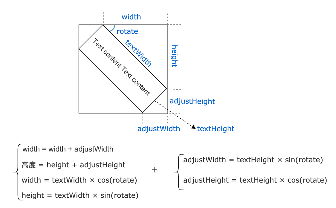
We can use the formula above to calculate the final width and height. Doesn’t it feel like the trigonometry we learned in high school is finally coming in handy? Note that the formula above does not consider padding, which is simpler to handle. Here’s the code:
@Override
Size paintUnit(Canvas canvas, double devicePixelRatio) {
    ... // Omitted
    // Actual width occupied by the text
    final textWidth = painter.width;
    // Actual height occupied by the text
    final textHeight = painter.height;

    // Convert degrees to radians
    final radians = math.pi * rotate / 180;

    // Use trigonometric functions to calculate the position and size after rotation
    final orgSin = math.sin(radians);
    final sin = orgSin.abs();
    final cos = math.cos(radians).abs();

    final width = textWidth * cos;
    final height = textWidth * sin;
    final adjustWidth = fontSize * sin;
    final adjustHeight = fontSize * cos;

    // Why do we need to translate? Explained below
    if (orgSin >= 0) { // Positive rotation angle
      canvas.translate(
        adjustWidth + padding.left,
        padding.top,
      );
    } else { // Negative rotation angle
      canvas.translate(
        padding.left,
        height + padding.top,
      );
    }
    canvas.rotate(radians);
    // Draw the text
    painter.paint(canvas, Offset.zero);
    // Return the actual space occupied by the watermark unit (including padding)
    return Size(
      width + adjustWidth + padding.horizontal,
      height + adjustHeight + padding.vertical,
    );
}
Note that before rotation, we perform a translation operation on the canvas. If we do not translate, some content may move outside the canvas after rotation, as shown in Figure :
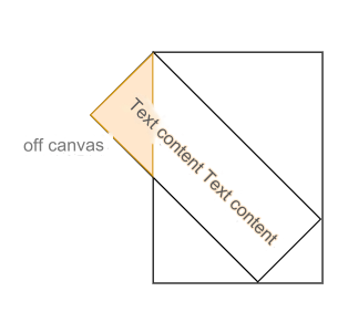
Next, let's implement the shouldRepaint method:
@Override
bool shouldRepaint(TextWaterMarkPainter oldPainter) {
  return oldPainter.rotate != rotate ||
      oldPainter.text != text ||
      oldPainter.padding != padding ||
      oldPainter.textDirection != textDirection ||
      oldPainter.textStyle != textStyle;
}
Changes to these properties will affect the watermark UI, so a repaint is required.
Testing
@Override
Widget build(BuildContext context) {
  return wTextWaterMark();
}

Widget wTextWaterMark() {
  return Stack(
    children: [
      wPage(),
      IgnorePointer(
        child: WaterMark(
          painter: TextWaterMarkPainter(
            text: 'Flutter China @wendux',
            textStyle: TextStyle(
              fontSize: 15,
              fontWeight: FontWeight.w200,
              color: Colors.black38, // To make the watermark clearer, use a darker color
            ),
            rotate: -20, // Rotate -20 degrees
          ),
        ),
      ),
    ],
  );
}

Widget wPage() {
  return Center(
    child: ElevatedButton(
      child: const Text('Button'),
      onPressed: () => print('tab'),
    ),
  );
}
... // Omit unrelated code
After running, the effect is shown in Figure :
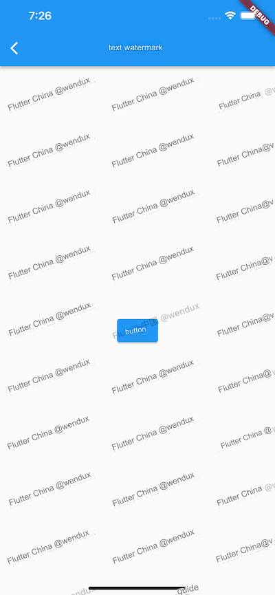
76.4 Unit Watermark Painter – Staggered Text Watermark
Watermarks with staggered effects are quite common, as shown in Figure :
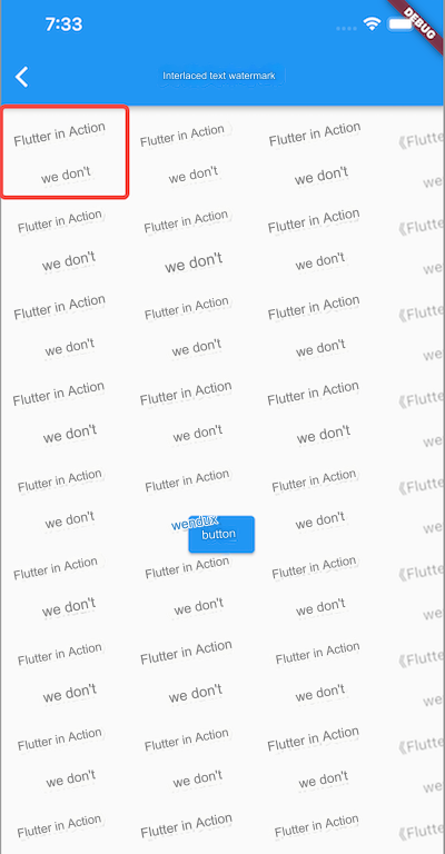
To achieve such an effect, we can follow the previous idea and simply draw the unit watermark as the red box outlines in the image. Notice that this unit watermark differs from the previous TextWaterMarkPainter in that while TextWaterMarkPainter can only draw a single text, we now need to draw two texts stacked vertically with an offset.
How can we implement this? One might think of adding logic to the paintUnit method of TextWaterMarkPainter, but this would lead to two issues:
The configuration parameters for
TextWaterMarkPainterwould become more complex.The
paintUnitmethod is already complex, and adding more code would increase future understanding and maintenance costs.
Instead of modifying TextWaterMarkPainter, we can use the proxy pattern by creating a new WaterMarkPainter that calls the methods of TextWaterMarkPainter.
/// Staggered Text Watermark Painter can combine two text watermarks
/// either horizontally or vertically, achieving a staggered effect
/// by specifying different paddings for the second text watermark.
class StaggerTextWaterMarkPainter extends WaterMarkPainter {
  StaggerTextWaterMarkPainter({
    required this.text,
    this.padding1,
    this.padding2 = const EdgeInsets.all(30),
    this.rotate,
    this.textStyle,
    this.staggerAxis = Axis.vertical,
    String? text2,
  }) : text2 = text2 ?? text;

  String text; // First text
  String text2; // Second text; defaults to the same as the first if not specified
  double? rotate; // Rotation angle
  ui.TextStyle? textStyle; // Text style
  EdgeInsets? padding1; // Padding for the first text
  EdgeInsets padding2; // Padding for the second text
  Axis staggerAxis; // Direction of text arrangement

  @override
  Size paintUnit(Canvas canvas, double devicePixelRatio) {
    final TextWaterMarkPainter painter = TextWaterMarkPainter(
      text: text,
      padding: padding1,
      rotate: rotate ?? 0,
      textStyle: textStyle,
    );
    canvas.save(); // Save canvas state before drawing
    final size1 = painter.paintUnit(canvas, devicePixelRatio); // Draw first text
    canvas.restore(); // Restore canvas state

    bool vertical = staggerAxis == Axis.vertical;
    canvas.translate(vertical ? 0 : size1.width, vertical ? size1.height : 0); // Translate canvas for second text
    painter
      ..padding = padding2
      ..text = text2; // Set second text and its padding
    final size2 = painter.paintUnit(canvas, devicePixelRatio); // Draw second text
    // Return total size occupied by both texts
    return Size(
      vertical ? math.max(size1.width, size2.width) : size1.width + size2.width,
      vertical ? size1.height + size2.height : math.max(size1.height, size2.height),
    );
  }

  @override
  bool shouldRepaint(StaggerTextWaterMarkPainter oldPainter) {
    return oldPainter.rotate != rotate ||
        oldPainter.text != text ||
        oldPainter.text2 != text2 ||
        oldPainter.staggerAxis != staggerAxis ||
        oldPainter.padding1 != padding1 ||
        oldPainter.padding2 != padding2 ||
        oldPainter.textDirection != textDirection ||
        oldPainter.textStyle != textStyle;
  }
}
Three important points to note about the code:
Call
canvas.save()before drawing the first text to save the canvas state, restoring it before drawing the second text.The texts can be arranged either horizontally or vertically, affecting the total size of the watermark unit.
The staggered offset is specified through
padding2.
Testing
Running the following code will produce the effect shown :
Widget wStaggerTextWaterMark() {
  return Stack(
    children: [
      wPage(),
      IgnorePointer(
        child: WaterMark(
          painter: StaggerTextWaterMarkPainter(
            text: '《Flutter实战》',
            text2: 'wendux',
            textStyle: TextStyle(
              color: Colors.black38,
            ),
            padding2: EdgeInsets.only(left: 40), // Offset second text to the right by 40
            rotate: -10,
          ),
        ),
      ),
    ],
  );
}
76.5 Applying Offset to the Watermark
The two text watermark painters can specify padding for unit watermarks, but what if we want to apply an offset effect to the entire watermark component? For instance, we want to achieve the effect shown in Figure , where the entire background of the WaterMark is shifted 30 pixels to the left, causing only part of the first column's watermark text to be visible.
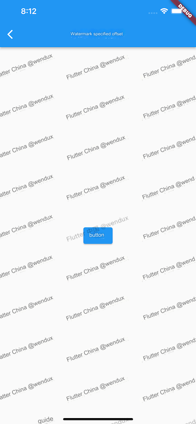
First, we cannot apply the offset in the text watermark painter because it draws unit watermarks; if the unit watermark only displays part of the text, each repeated area will also only show part of the text. Therefore, we need to apply an offset to the entire WaterMark background. One might think of using the Transform widget for this, and indeed we can try it out.
Transform.translate(
  offset: Offset(-30, 0), // Shift left by 30 pixels
  child: WaterMark(
    painter: TextWaterMarkPainter(
      text: 'Flutter China @wendux',
      textStyle: TextStyle(
        color: Colors.black38,
      ),
      rotate: -20,
    ),
  ),
),
Running this will produce the effect shown in Figure :
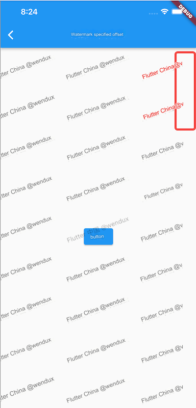
While the overall shift is noticeable, a blank space appears on the right. This happens because the WaterMark occupies the same width as the screen, so its drawing area matches the screen's dimensions. The Transform.translate essentially shifts the drawing origin to the left by 30 pixels, creating that blank space.
If we could make the WaterMark's drawing area exceed the screen width by 30 pixels, we could resolve this issue. This idea is correct; the WaterMark background is drawn using a DecoratedBox, but we cannot modify the drawing logic of DecoratedBox. Copying and modifying the DecoratedBox code would lead to significant maintenance costs, so directly altering it is not advisable.
Solution 1: Using a Scrollable Component to Apply Offset
Most components' drawing areas match their layout sizes. Can we force the WaterMark to be wider than the screen by 30 pixels? Yes, scrollable components work on this principle! We can specify the WaterMark's width to be 30 pixels larger than the screen width, wrapped in a SingleChildScrollView:
Widget wTextWaterMarkWithOffset() {
  return Stack(
    children: [
      wPage(),
      IgnorePointer(
        child: LayoutBuilder(builder: (context, constraints) {
          return SingleChildScrollView(
            scrollDirection: Axis.horizontal,
            child: Transform.translate(
              offset: Offset(-30, 0),
              child: SizedBox(
                width: constraints.maxWidth + 30, // Make width 30 pixels larger
                height: constraints.maxHeight,
                child: WaterMark(
                  painter: TextWaterMarkPainter(
                    text: 'Flutter China @wendux',
                    textStyle: TextStyle(
                      color: Colors.black38,
                    ),
                    rotate: -20,
                  ),
                ),
              ),
            ),
          );
        }),
      ),
    ],
  );
}
This code achieves the desired effect .
Note that since the SingleChildScrollView is wrapped in an IgnorePointer, it will not receive events, thus avoiding interference from user scrolling.
We know that SingleChildScrollView internally creates Scrollable and Viewport objects, and in this scenario, SingleChildScrollView won't respond to events, making the creation of Scrollable redundant. We need to explore a more optimal solution.
2. Solution Two: Using FittedBox to Apply Offset
Can we first cancel the constraints imposed by the parent widget on the child widget using UnconstrainedBox, and then specify that the WaterMark width is 30 pixels longer than the screen width using SizedBox? For example:
LayoutBuilder(
  builder: (_, constraints) {
    return UnconstrainedBox( // Cancel constraints on child size
      alignment: Alignment.topRight,
      child: SizedBox(
        // Specify that WaterMark width is 30 pixels longer than the screen width
        width: constraints.maxWidth + 30,
        height: constraints.maxHeight,
        child: WaterMark(...),
      ),
    );
  },
),
Running this will produce the effect shown in Figure :
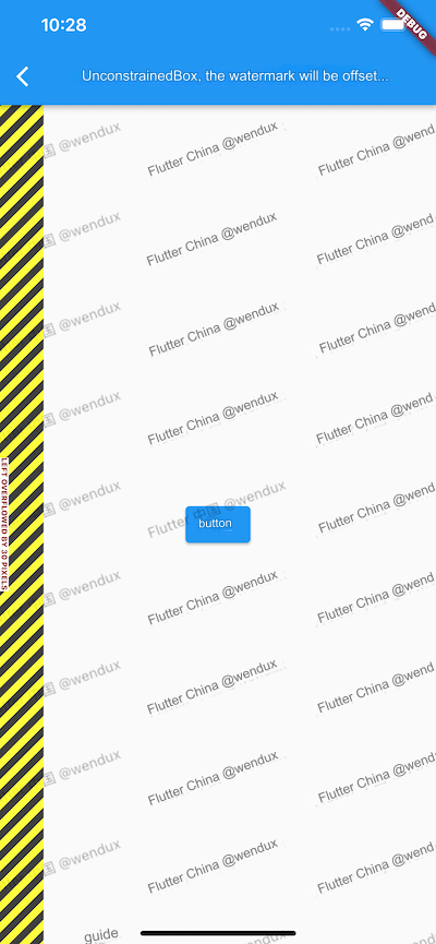
We see an overflow warning on the left. This happens because, although UnconstrainedBox can remove constraints when laying out its child (allowing the child to be infinitely large), UnconstrainedBox itself is still constrained by its parent. If UnconstrainedBox grows larger than its parent due to the child, it results in an overflow.
If there were no overflow warning, we would have already achieved the desired offset effect! The principle behind the offset is that we specified right alignment. When the child’s right edge aligns with the parent’s right edge, the excess 30 pixels will fall outside the parent’s left boundary, thus achieving our expected effect. We know that in Release mode, overflow indicators are not drawn because their rendering logic is inside an assert function, like so:
// Display the overflow indicator.
assert(() {
  paintOverflowIndicator(context, offset, _overflowContainerRect, _overflowChildRect);
  return true;
}());
Therefore, there wouldn’t be any issue with the above code in Release mode. However, we should avoid this method since the presence of a warning indicates that the overflow of the UnconstrainedBox child is not the intended behavior.
After clarifying the reason, our solution approach is to cancel constraints without allowing the component size to exceed the parent’s space. The FittedBox component we introduced in earlier chapters can cancel the parent’s constraints on the child while allowing the child to adapt to the size of the FittedBox parent, which fits our needs. Let’s modify the code:
LayoutBuilder(
  builder: (_, constraints) {
    return FittedBox( // FittedBox cancels the parent’s constraints on the child
      alignment: Alignment.topRight, // Use alignment to achieve the shift effect
      fit: BoxFit.none, // Do not apply any fitting
      child: SizedBox(
        // Specify that WaterMark width is 30 pixels longer than the screen width
        width: constraints.maxWidth + 30,
        height: constraints.maxHeight,
        child: WaterMark(
          painter: TextWaterMarkPainter(
            text: 'Flutter China @wendux',
            textStyle: TextStyle(
              color: Colors.black38,
            ),
            rotate: -20,
          ),
        ),
      ),
    );
  },
),
Running this will achieve our expected effect (see Figure 10-14).
The primary use case for FittedBox is to apply scaling or stretching to the child to fit the parent’s space. However, in this scenario, we aren’t utilizing that functionality (as we specified BoxFit.none), so it feels a bit excessive. Is there a more suitable component to solve this problem? Yes, the answer is OverflowBox!
3. Solution Three: Using OverflowBox to Apply Offset
OverflowBox, like UnconstrainedBox, can cancel the parent’s constraints on the child. However, unlike UnconstrainedBox, OverflowBox does not change size based on the child’s size; its size only depends on its parent’s constraints (constrained to constraints.biggest). It will be as large as possible while still meeting the parent’s constraints. We can wrap the WaterMark component in a TranslateWithExpandedPaintingArea component:
class TranslateWithExpandedPaintingArea extends StatelessWidget {
  const TranslateWithExpandedPaintingArea({
    Key? key,
    required this.offset,
    this.clipBehavior = Clip.none,
    this.child,
  }) : super(key: key);

  final Widget? child;
  final Offset offset;
  final Clip clipBehavior;

  @override
  Widget build(BuildContext context) {
    return LayoutBuilder(
      builder: (context, constraints) {
        final dx = offset.dx.abs();
        final dy = offset.dy.abs();

        Widget widget = OverflowBox(
          // Increase child width and height by the specified offset
          minWidth: constraints.minWidth + dx,
          maxWidth: constraints.maxWidth + dx,
          minHeight: constraints.minHeight + dy,
          maxHeight: constraints.maxHeight + dy,
          alignment: Alignment(
            // Different alignment for different directions of offset
            offset.dx <= 0 ? 1 : -1,
            offset.dy <= 0 ? 1 : -1,
          ),
          child: child,
        );
        // Clip the part that exceeds the layout space
        if (clipBehavior != Clip.none) {
          widget = ClipRect(clipBehavior: clipBehavior, child: widget);
        }
        return widget;
      },
    );
  }
}
Three important points about the code:
It dynamically adjusts the child’s width and height based on the user-specified offset.
The alignment of the
OverflowBoxis adjusted according to the specified offset. For example, when shifting left, theOverflowBoxmust align to the right so that the overflow is on the left, achieving the desired effect. If we align to the left instead, the overflow will be on the right, which is not what we want.The default behavior is for overflow content to be displayed. In this case, since the watermark component’s size is the same as the remaining visible space on the screen, the overflowed part won’t be visible. However, if we set a smaller size for the watermark component, we can see the overflowed content. Therefore, we define a clipping configuration parameter so that users can decide whether to apply clipping based on their actual situation.
So, the final code would be:
Widget wTextWaterMarkWithOffset2() {
  return Stack(
    children: [
      wPage(),
      IgnorePointer(
        child: TranslateWithExpandedPaintingArea(
          offset: Offset(-30, 0),
          child: WaterMark(
            painter: TextWaterMarkPainter(
              text: 'Flutter China @wendux',
              textStyle: TextStyle(
                color: Colors.black38,
              ),
              rotate: -20,
            ),
          ),
        ),
      ),
    ],
  );
}
Running this will achieve our expected effect.

