38.1 Introduction
The SingleChildScrollView is similar to the ScrollView in Android; it can only accept a single child widget. Its definition is as follows:
SingleChildScrollView({
  this.scrollDirection = Axis.vertical, // Scrolling direction, default is vertical
  this.reverse = false,
  this.padding,
  bool primary,
  this.physics,
  this.controller,
  this.child,
})
In addition to the general properties of scrollable widgets that we discussed in the previous section, the key point here is the primary property. It indicates whether to use the default PrimaryScrollController in the widget tree (which is already included in the MaterialApp component tree). When the scrolling direction is vertical (i.e., when scrollDirection is set to Axis.vertical) and no controller is specified, primary defaults to true.
It’s important to note that the SingleChildScrollView should typically only be used when the content is not expected to exceed the screen height by too much. This is because SingleChildScrollView does not support the Sliver-based lazy loading model. If the viewport is expected to contain a lot more content than what fits on the screen, using SingleChildScrollView will be very expensive in terms of performance. In such cases, scrollable widgets that support the Sliver lazy loading model, like ListView, should be used instead.
38.2 Example
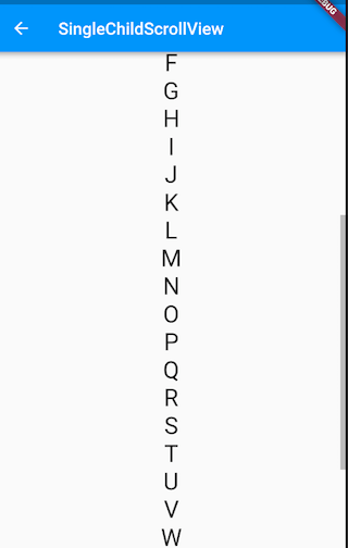
Below is an example that displays the uppercase letters A-Z in a vertical direction. Since the vertical space will exceed the screen height, we use SingleChildScrollView:
class SingleChildScrollViewTestRoute extends StatelessWidget {
  @override
  Widget build(BuildContext context) {
    String str = "ABCDEFGHIJKLMNOPQRSTUVWXYZ";
    return Scrollbar( // Show a progress bar
      child: SingleChildScrollView(
        padding: EdgeInsets.all(16.0),
        child: Center(
          child: Column(
            // Dynamically create a List<Widget>
            children: str.split("")
              // Display each letter with a Text widget, scaling the font size by 2
              .map((c) => Text(c, textScaleFactor: 2.0,))
              .toList(),
          ),
        ),
      ),
    );
  }
}
The result is shown in Figure :
