37.1 Sliver Layout Model
In Section 4.2, we introduced that Flutter has two layout models:
The box model layout based on
RenderBox.The list layout based on
Sliver(RenderSliver), which supports lazy loading.
Previously, we focused on components using the box model layout. In this chapter, we will focus on components using the Sliver layout.
Scrollable components often have a large number of child components, which could result in a significant total height. If all the child components were built at once, it would be very expensive! To address this, Flutter introduces the concept of a "Sliver" (meaning "slice" or "fragment"), which can contain one or more child components. The main function of a Sliver is to load child components and determine the layout and rendering information for each one. When a Sliver can contain multiple child components, it usually implements a lazy-loading model.
Slivers are only built when they appear in the viewport, a model referred to as "the lazy-loading list model based on Sliver". Many scrollable components in Flutter support this lazy-loading model based on Sliver, such as ListView and GridView, but there are also components that do not support this model, such as SingleChildScrollView.
Convention: If we refer to a component as a Sliver later on, it means the component uses the Sliver layout model. Similarly, when we say a component is a RenderBox, we mean it uses the box layout model, not that it is an instance of the RenderBox class.
In Flutter, scrollable components are primarily composed of three parts: Scrollable, Viewport, and Sliver:
Scrollable: Handles the scroll gestures and determines the scroll offset. It builds theViewportwhen the scroll offset changes.Viewport: The visible area of the list, i.e., the part of the list that is visible on the screen.Sliver: The elements displayed within the viewport.
The layout process is as follows:
Scrollablelistens to user scroll events and constructs a newViewportbased on the updated scroll offset.Viewportpasses the current viewport information and configuration to theSliverviaSliverConstraints.The
Sliverlazily builds and lays out its child components (RenderBox), confirming its own position and rendering information, which are stored in aSliverGeometryobject.
For example, consider a ListView that fills the screen and contains 100 list items (all RenderBox), with each item having the same height. The structure is shown in Figure :
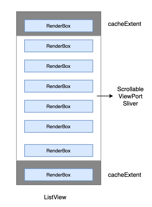
In the figure, the white area represents the device screen, which is the space occupied by the Scrollable, Viewport, and Sliver. These three components overlap in terms of the space they occupy, and their parent-child relationship is: Sliver is the child of Viewport, and Viewport is the child of Scrollable. Note that the ListView only has one Sliver, which implements lazy loading and layout for the child components (list items).
The gray areas at the top and bottom represent the cacheExtent, which indicates the height of the pre-rendered region. It’s important to note that this is outside the visible area. When a RenderBox enters this region, even though it is not yet visible on the screen, it is constructed in advance. Pre-rendering ensures smoother performance when the content enters the Viewport. The default value for cacheExtent is 250. When building a scrollable list, we can specify this value, which is ultimately passed to the Viewport.
37.2 Scrollable
Scrollable handles scroll gestures, determines the scroll offset, and builds the Viewport based on changes to the scroll offset. Let’s look at some key properties:
Scrollable({
  ...
  this.axisDirection = AxisDirection.down,
  this.controller,
  this.physics,
  required this.viewportBuilder, // discussed later
})axisDirection: The direction of scrolling.physics: This property takes aScrollPhysicsobject, which determines how the scrollable component responds to user interactions, such as continuing an animation after the user lifts their finger or how the component behaves when reaching the scroll boundaries. By default, Flutter uses differentScrollPhysicsobjects depending on the platform, applying different effects. For instance, on iOS, when scrolling reaches the boundary, a bounce effect occurs, while on Android, there is a glow effect. If you want the same effect across all platforms, you can explicitly specify aScrollPhysics. The Flutter SDK provides two subclasses ofScrollPhysicsthat can be used directly:ClampingScrollPhysics: The list cannot continue scrolling when it reaches the boundary, typically used on Android withGlowingOverscrollIndicator(the component that implements the glow effect).BouncingScrollPhysics: The elastic effect on iOS.controller: This property accepts aScrollControllerobject. The primary function ofScrollControlleris to control the scroll position and listen for scroll events. By default, there is aPrimaryScrollControllerin the widget tree. If a scrollable component in the subtree does not explicitly specify a controller and theprimaryproperty istrue(which it is by default), the scrollable component will use thisPrimaryScrollController. This mechanism allows the parent component to control the scroll behavior of scrollable components in the subtree. For example,Scaffolduses this mechanism to implement the "tap to scroll to top" functionality in iOS. We will coverScrollControllerin detail in Section 6.4.viewportBuilder: A callback that constructs theViewport. When the user scrolls,Scrollablecalls this callback to build a newViewport, passing anoffsetparameter of typeViewportOffset, which describes the portion of content that should be displayed in theViewport. Rebuilding theViewportis not expensive because theViewportitself is just a widget, containing configuration information. When theViewportchanges, the correspondingRenderViewportupdates its information without being completely rebuilt.
Main Axis and Cross Axis
In the context of scrollable components, the scrolling direction is usually referred to as the main axis, and the non-scrolling direction as the cross axis. Since scrollable components usually scroll vertically by default, the main axis typically refers to the vertical direction, with the horizontal axis as the cross axis. The same applies in reverse for horizontal scroll views.
37.3 Viewport
The Viewport is fairly simple; its function is to render the Sliver that needs to be displayed within the current viewport.
Viewport({
  Key? key,
  this.axisDirection = AxisDirection.down,
  this.crossAxisDirection,
  this.anchor = 0.0,
  required ViewportOffset offset, // the user’s scroll offset
  this.center, // The starting point for rendering, typically the first element
  this.cacheExtent, // Pre-rendering region
  this.cacheExtentStyle = CacheExtentStyle.pixel,
  this.clipBehavior = Clip.hardEdge,
  List<Widget> slivers = const <Widget>[], // List of Slivers to display
})
Key points to note:
offset: This parameter is passed to theViewportbyScrollablewhen it constructs theViewport. It describes the portion of content that should be displayed in theViewport.cacheExtentandcacheExtentStyle:CacheExtentStyleis an enum with two values:pixelandviewport. WhencacheExtentStyleis set topixel, the value ofcacheExtentrepresents the exact pixel length of the pre-rendered region. When set toviewport, the value ofcacheExtentis a multiplier representing how manyViewportlengths should be pre-rendered. The final pixel length of the pre-rendered region is the product ofcacheExtentand theViewport's length. This is useful when each list item occupies the entireViewport, as thecacheExtentvalue then represents the number of pages to cache before and after.
37.4 Sliver
The main purpose of a Sliver is to build and layout its child components as needed. For instance, the Sliver of a ListView must implement lazy loading for its child components (list items), constructing and rendering them only when they enter the pre-rendering area.
The render object corresponding to Sliver is RenderSliver. RenderSliver and RenderBox share the common trait of inheriting from the RenderObject class, but they differ in the layout constraints. RenderBox receives BoxConstraints from its parent component during layout, which contains maximum width and height constraints. On the other hand, RenderSliver receives SliverConstraints from its parent (typically a list) during layout. The layout protocol for Sliver will be introduced in detail at the end of this chapter.
37.5 Common Configurations for Scrollable Components
Almost all scrollable components allow specifying scrollDirection (the main axis for scrolling), reverse (whether to scroll in reverse), controller, physics, and cacheExtent during construction. These properties are ultimately passed to the corresponding Scrollable and Viewport. These attributes can be considered common properties for scrollable components, so we will not reiterate them when introducing specific scrollable components later.
reverse determines whether the scrolling direction is opposite to the reading direction. For instance, if scrollDirection is Axis.horizontal (i.e., horizontal scrolling) and the reading direction is left-to-right (depending on the locale, such as Arabic being right-to-left), when reverse is set to true, the scrolling direction will be from right to left.
37.6 ScrollController
All scrollable components have a controller property, through which we can specify a ScrollController to control the scrolling of the component. For instance, you can use a ScrollController to synchronize scrolling across multiple components. Since ScrollController needs to work together with scrollable components, we will cover it in detail after introducing ListView in this chapter.
37.7 Child Component Caching
Lazy loading of child components is beneficial in most cases, but it can have side effects in certain situations. For example, consider a page composed of a ListView, where we want to display a block of content at the top of the page. The data for this content needs to be fetched from the network every time the page is opened. To achieve this, we implement a Header component, which is a StatefulWidget. The network request is made in its initState, and then it is set as the first child of the ListView.
Now, here's the problem: because ListView lazily loads its child components, if the Header scrolls out of the pre-rendered area of the Viewport, it will be destroyed. When it re-enters the Viewport, it will be rebuilt, triggering the network request again, which is not what we want. Our expectation is that the Header should be cached without being destroyed.
To address this, scrollable components provide a general solution for caching child components, allowing developers to cache specific child boundaries. We will cover this in detail in a later section.
37.8 Scrollbar
The Scrollbar is a Material-style scroll indicator (scroll bar). To add a scrollbar to a scrollable component, simply wrap the scrollable component in a Scrollbar widget, as shown below:
Scrollbar(
  child: SingleChildScrollView(
    ...
  ),
);
Both Scrollbar and CupertinoScrollbar determine the position of the scroll bar by listening for scroll notifications. We will cover scroll notifications in detail in the final section of this chapter.
CupertinoScrollbar
The CupertinoScrollbar is an iOS-style scroll bar. If you are using Scrollbar, it will automatically switch to CupertinoScrollbar on iOS.
37.9 Summary
In this section, we introduced Flutter's Sliver-based lazy-loading list layout. In the following sections, we will introduce commonly used scrollable components (such as ListView, GridView, CustomScrollView, etc.), then cover the ScrollController, and finally, demonstrate how to create a custom Sliver with an example.
