Size-limiting containers are used to restrict the size of a container. Flutter provides several such containers, including ConstrainedBox, SizedBox, UnconstrainedBox, AspectRatio, etc. This section will introduce some commonly used ones.
23.1 Flutter's Layout Model
Flutter has two layout models:
Box Model Layout based on
RenderBox.Sliver Layout based on
Sliver(RenderSliver), which is used for lazy-loading lists.
While the two models differ slightly in details, their overall processes are similar, as follows:
The parent widget passes constraints down to the child widget.
The child widget determines its size based on the constraints and informs the parent. Note that the child's size must adhere to the constraints set by the parent.
The parent widget determines the child's position relative to itself and decides its own size (usually based on the child's size).
For example, if a parent widget passes the constraint "maximum width and height cannot exceed 100, and minimum width and height is 0" to the child, and the child is set to 200x200, the child's final size will be 100x100, because it must first comply with the parent's constraints, and then apply its own size within that range.
In this section, we'll focus on the box model layout. The Sliver layout model will be discussed in the chapter on scrollable widgets. Box model layout widgets have two key characteristics:
The rendering objects corresponding to these widgets all inherit from the
RenderBoxclass. If we mention a component being aRenderBoxin this book, it means it's based on the box model layout, not that the component is an instance of theRenderBoxclass.During the layout process, the constraint information passed from the parent to the child is described by the
BoxConstraintsclass.
23.2 BoxConstraints
BoxConstraints is the constraint information passed from the parent rendering object to the child rendering object in the box model layout process. It contains information about the maximum and minimum width and height. The child's size needs to stay within these constraints. The default constructor for BoxConstraints is as follows:
const BoxConstraints({
  this.minWidth = 0.0,       // Minimum width
  this.maxWidth = double.infinity, // Maximum width
  this.minHeight = 0.0,      // Minimum height
  this.maxHeight = double.infinity, // Maximum height
})
It has four properties. BoxConstraints also defines some convenient constructors to quickly create specific constraints, such as BoxConstraints.tight(Size size), which generates fixed width and height constraints, or BoxConstraints.expand(), which creates constraints that fill as much space as possible. There are other useful constructors as well, which you can explore in the class definition. We'll discuss constraints further when diving into layout principles, but for now, it's enough to know that the parent component uses BoxConstraints to describe the available space for its child component.
Convention: To describe things concisely, if we say a widget "doesn't constrain" or "removes constraints" from its child, we mean the maximum width and height are set to infinity, and the minimum width and height are set to 0. In such cases, the child can determine its size freely based on its own needs.
Now, let's introduce some commonly used components that limit the size of child widgets through constraints.
23.3 ConstrainedBox
ConstrainedBox is used to apply additional constraints to its child. For example, if you want the minimum height of a child widget to be 80 pixels, you can use the following constraint: const BoxConstraints(minHeight: 80.0).
Example
Let's first define a redBox, which is a red-colored box without specifying width or height:
Widget redBox = DecoratedBox(
  decoration: BoxDecoration(color: Colors.red),
);
We can then create a red container with a minimum height of 50 and a width as large as possible:
ConstrainedBox(
  constraints: BoxConstraints(
    minWidth: double.infinity, // Width as large as possible
    minHeight: 50.0 // Minimum height of 50 pixels
  ),
  child: Container(
    height: 5.0,
    child: redBox,
  ),
)
The result is shown in Figure.
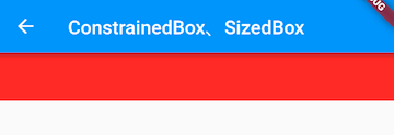
As you can see, although we set the height of the Container to 5 pixels, the final height is 50 pixels. This is because the ConstrainedBox's minimum height constraint took effect. If we set the Container height to 80 pixels, the final height would also be 80 pixels, since the ConstrainedBox only restricts the minimum height in this example and does not limit the maximum height.
23.4 SizedBox
SizedBox is used to set a fixed width and height for its child, like this:
SizedBox(
  width: 80.0,
  height: 80.0,
  child: redBox,
)
The result is shown in Figure .

In fact, SizedBox is simply a custom version of ConstrainedBox. The code above is equivalent to:
ConstrainedBox(
  constraints: BoxConstraints.tightFor(width: 80.0, height: 80.0),
  child: redBox,
)
And BoxConstraints.tightFor(width: 80.0, height: 80.0) is equivalent to:
BoxConstraints(
  minHeight: 80.0, maxHeight: 80.0,
  minWidth: 80.0, maxWidth: 80.0
)
Both ConstrainedBox and SizedBox are rendered by RenderConstrainedBox. We can see that the createRenderObject() method of both ConstrainedBox and SizedBox returns a RenderConstrainedBox object:
@override
RenderConstrainedBox createRenderObject(BuildContext context) {
  return RenderConstrainedBox(
    additionalConstraints: ...,
  );
}
23.5 Multiple Constraints
What happens when a widget has multiple parent ConstrainedBox constraints? Which one takes effect? Let’s look at an example:
ConstrainedBox(
  constraints: BoxConstraints(minWidth: 60.0, minHeight: 60.0), // Parent
  child: ConstrainedBox(
    constraints: BoxConstraints(minWidth: 90.0, minHeight: 20.0), // Child
    child: redBox,
  ),
)
In the example above, both the parent and child ConstrainedBox have different constraints. The result is shown in Figure .

The final result is a width of 90 and a height of 60. In this case, the child ConstrainedBox's minWidth takes effect, while the minHeight of the parent ConstrainedBox is applied. From this example alone, we cannot yet deduce a clear rule. Let’s swap the parent and child constraints:
ConstrainedBox(
  constraints: BoxConstraints(minWidth: 90.0, minHeight: 20.0), // Parent
  child: ConstrainedBox(
    constraints: BoxConstraints(minWidth: 60.0, minHeight: 60.0), // Child
    child: redBox,
  ),
)
The result is shown in Figure .

The result remains a width of 90 and a height of 60, but now the minWidth from the parent ConstrainedBox takes effect, and the minHeight from the child ConstrainedBox is applied.
From the above examples, we can deduce that when there are multiple constraints, for both minWidth and minHeight, the larger value from the parent or child is chosen. This ensures that parent and child constraints do not conflict.
Question: What would the strategy be for handling multiple maxWidth and maxHeight constraints?
23.6 UnconstrainedBox
While child widgets must always follow the constraints of their parent widget, this only applies when they are in a direct parent-child relationship. For instance, if component A has component B as its child, and B has component C as its child, C must follow B's constraints, and B must follow A's constraints. However, A's constraints will not directly apply to C unless B passes them down. Using this principle, we can create a B component that:
Does not constrain C during layout (allowing C to be any size).
Allows C to determine its own size based on the actual space it occupies.
Determines its own size based on both the parent's constraints and the size of its child.
This B component is the UnconstrainedBox widget, meaning its child is not constrained and can determine its size independently. Although this component is rarely used directly, it can be helpful for "removing" multiple constraints. Let’s look at the following code:
ConstrainedBox(
  constraints: BoxConstraints(minWidth: 60.0, minHeight: 100.0),  // Parent
  child: UnconstrainedBox( // "Removes" parent constraints
    child: ConstrainedBox(
      constraints: BoxConstraints(minWidth: 90.0, minHeight: 20.0), // Child
      child: redBox,
    ),
  ),
)
If the UnconstrainedBox was not present, according to the multi-constraint rule mentioned earlier, the final red box would have a size of 90x100. However, the UnconstrainedBox “removes” the parent ConstrainedBox constraints, so the red box is rendered according to the child ConstrainedBox constraints, with a size of 90x20, as shown in Figure .
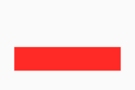
However, note that the UnconstrainedBox doesn’t truly remove the parent constraints. In the example above, although the red box is 90x20, there is still an 80-pixel blank space above it. This means that the parent constraint's minHeight (100.0) still applies, but it does not affect the size of the child widget. Instead, the parent ConstrainedBox applies to the UnconstrainedBox, while the red box is only affected by the child ConstrainedBox. This is an important point to remember.
Is there a way to completely remove the parent ConstrainedBox constraints?
The answer is no! Remember that a child widget must always follow its parent’s constraints. Therefore, when defining a reusable component, if you specify constraints for the child, be aware that the child cannot violate those constraints.
In practice, when using SizedBox or ConstrainedBox to set fixed width and height for a child, but it doesn’t take effect, it's almost certain that a parent component has already imposed constraints! For example, in the Material Design component library’s AppBar (navigation bar), when using SizedBox to specify the size of a loading button, the following code does not work:
AppBar(
  title: Text(title),
  actions: <Widget>[
    SizedBox(
      width: 20,
      height: 20,
      child: CircularProgressIndicator(
        strokeWidth: 3,
        valueColor: AlwaysStoppedAnimation(Colors.white70),
      ),
    )
  ],
)
The result is shown in Figure .

We see that the loading button on the right hasn’t changed size! This is because the AppBar has already imposed constraints on the actions button. To customize the loading button’s size, we need to use UnconstrainedBox to “remove” the parent constraints:
AppBar(
  title: Text(title),
  actions: <Widget>[
    UnconstrainedBox(
      child: SizedBox(
        width: 20,
        height: 20,
        child: CircularProgressIndicator(
          strokeWidth: 3,
          valueColor: AlwaysStoppedAnimation(Colors.white70),
        ),
      ),
    )
  ],
)
Now it works, as shown in Figure .

Using Center or Align in place of UnconstrainedBox would also work, and we’ll explain why in later chapters on layout principles.
Note that while UnconstrainedBox can remove constraints from its child during layout (allowing the child to be any size), the UnconstrainedBox itself is still subject to its parent’s constraints. If the child inside the UnconstrainedBox grows too large and exceeds the parent’s constraints, it will cause an overflow error. For example:
Column(
  children: <Widget>[
    UnconstrainedBox(
      alignment: Alignment.topLeft,
      child: Padding(
        padding: const EdgeInsets.all(16),
        child: Row(children: [Text('xx' * 30)]),
      ),
    ),
  ],
)
The result is shown in Figure .
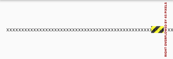
The text overflows the screen width.
23.7 Other Constraint Containers
In addition to the size-limiting containers mentioned above, there are others, such as AspectRatio, which sets the child widget’s aspect ratio, LimitedBox, which restricts the maximum width and height, and FractionallySizedBox, which sets the child widget’s size as a fraction of the parent’s size. Since these containers are relatively straightforward to use, we won’t go into further detail. You can explore them on your own.
