Layered layout is similar to absolute positioning in the Web or Frame layout in Android, where child components can position themselves based on their distance from the four corners of the parent container. Layered layout allows child components to stack in the order they are declared in the code. In Flutter, absolute positioning is achieved using the Stack and Positioned components. Stack allows child components to be stacked, while Positioned is used to position child components relative to the four corners of the Stack.
27.1 Stack
The Stack component is defined as follows:
Stack({
  this.alignment = AlignmentDirectional.topStart,
  this.textDirection,
  this.fit = StackFit.loose,
  this.clipBehavior = Clip.hardEdge,
  List<Widget> children = const <Widget>[],
})alignment: This parameter determines how to align child components that are not positioned (i.e., not usingPositioned) or are only partially positioned. Partial positioning here refers to when a child is positioned along only one axis. For example, if a child is positioned usingleftorright, it's positioned along the horizontal axis;toporbottompositions it along the vertical axis. If any positioning property is specified on one axis, the child is considered positioned along that axis.textDirection: Like inRowandWrap, this determines the reference system for alignment. For example, iftextDirectionis set toTextDirection.ltr,alignment.startrefers to the left andalignment.endrefers to the right, which is the left-to-right order. If set toTextDirection.rtl,alignment.startrefers to the right andalignment.endrefers to the left, which is right-to-left order.fit: This parameter determines how unpositioned children should fit within theStack.StackFit.loosemeans the child will take up its own size, whileStackFit.expandmeans it will expand to fit the size of theStack.clipBehavior: This property determines how to clip the parts of the children that extend outside theStack. TheClipenum defines various clipping methods.Clip.hardEdgemeans direct clipping without applying anti-aliasing. More information can be found in the source code comments.
27.2 Positioned
The default constructor for Positioned is as follows:
const Positioned({
  Key? key,
  this.left,
  this.top,
  this.right,
  this.bottom,
  this.width,
  this.height,
  required Widget child,
})left,top,right, andbottomrepresent the distance from the respective side of theStack.widthandheightare used to specify the width and height of the positioned element. Note that the meaning ofwidthandheightinPositionedis slightly different from their use elsewhere. Here, they are used in combination withleft,top,right, andbottomto position the component. For example, on the horizontal axis, you can only specify two out of the three properties (left,right,width). Ifleftandwidthare specified,rightwill automatically be calculated as(left + width). Specifying all three will cause an error. The same principle applies to the vertical axis.
27.3 Example
In the following example, we demonstrate the features of Stack and Positioned by positioning several Text components:
// Use ConstrainedBox to ensure the Stack occupies the full screen
ConstrainedBox(
  constraints: BoxConstraints.expand(),
  child: Stack(
    alignment: Alignment.center,  // Specify alignment for unpositioned or partially positioned widgets
    children: <Widget>[
      Container(
        child: Text("Hello world", style: TextStyle(color: Colors.white)),
        color: Colors.red,
      ),
      Positioned(
        left: 18.0,
        child: Text("I am Jack"),
      ),
      Positioned(
        top: 18.0,
        child: Text("Your friend"),
      ),
    ],
  ),
);
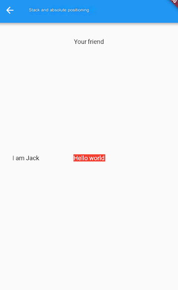
The result is shown in Figure :
In this example:
The first
Textcomponent ("Hello world") does not specify any positioning, and thealignmentvalue is set toAlignment.center, so it is centered within theStack.The second
Textcomponent ("I am Jack") specifies only horizontal positioning (left), making it partially positioned. Vertically, it follows thealignmentsetting, meaning it is centered along the vertical axis.The third
Textcomponent ("Your friend") follows a similar principle but is centered horizontally as it only specifies vertical positioning (top).
Now, let’s add a fit property to the Stack and rearrange the child components:
Stack(
  alignment: Alignment.center,
  fit: StackFit.expand,  // Unpositioned widgets will take up the entire Stack space
  children: <Widget>[
    Positioned(
      left: 18.0,
      child: Text("I am Jack"),
    ),
    Container(
      child: Text("Hello world", style: TextStyle(color: Colors.white)),
      color: Colors.red,
    ),
    Positioned(
      top: 18.0,
      child: Text("Your friend"),
    ),
  ],
);
The result is shown in Figure :
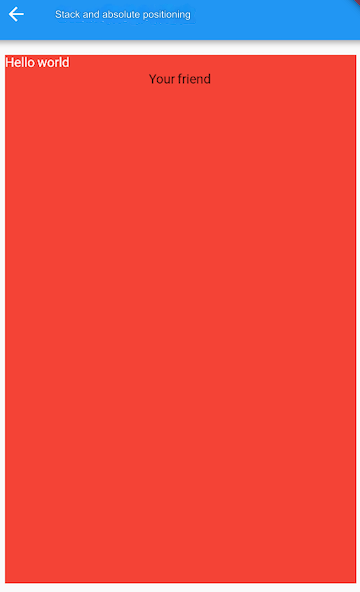
As you can see, because the second Text component is unpositioned, the fit property causes it to take up the entire space of the Stack. Since Stack children are stacked on top of each other, the first Text component is covered by the second, and the third is displayed on top.
