67.1 AnimatedSwitcher
1. Introduction
In practical development, we often encounter scenarios where UI elements need to be switched, such as tab switches or route transitions. To enhance the user experience, an animation is typically specified during these transitions to make them feel smooth. The Flutter SDK provides several commonly used transition components, such as PageView and TabView, but these components do not cover all use cases. Therefore, the Flutter SDK offers an AnimatedSwitcher component, which defines a general abstraction for UI transitions.
AnimatedSwitcher can simultaneously add show and hide animations to its new and old child elements. In other words, when the child elements of AnimatedSwitcher change, it animates the old element out and the new element in. Let’s take a look at the definition of AnimatedSwitcher:
const AnimatedSwitcher({
  Key? key,
  this.child,
  required this.duration, // Duration of the new child's show animation
  this.reverseDuration, // Duration of the old child's hide animation
  this.switchInCurve = Curves.linear, // Animation curve for the new child's show
  this.switchOutCurve = Curves.linear, // Animation curve for the old child's hide
  this.transitionBuilder = AnimatedSwitcher.defaultTransitionBuilder, // Animation builder
  this.layoutBuilder = AnimatedSwitcher.defaultLayoutBuilder, // Layout builder
})
When the child of AnimatedSwitcher changes (due to a different type or key), the old child will perform a hide animation while the new child will perform a show animation. The type of animation executed is determined by the transitionBuilder parameter, which accepts an AnimatedSwitcherTransitionBuilder type builder defined as follows:
typedef AnimatedSwitcherTransitionBuilder = Widget Function(Widget child, Animation<double> animation);
This builder binds animations to the old and new child elements during the switch:
The animation bound to the old child will run in reverse.
The animation bound to the new child will run forward.
This effectively binds animations to both the new and old children. The default value of AnimatedSwitcher is AnimatedSwitcher.defaultTransitionBuilder:
Widget defaultTransitionBuilder(Widget child, Animation<double> animation) {
  return FadeTransition(
    opacity: animation,
    child: child,
  );
}
This means that by default, AnimatedSwitcher will apply “fade out” and “fade in” animations to the old and new children, respectively.
2. Example
Let’s look at an example: implementing a counter where, during each increment, the old number shrinks and hides while the new number grows and shows. Here’s the code:
import 'package:flutter/material.dart';

class AnimatedSwitcherCounterRoute extends StatefulWidget {
   const AnimatedSwitcherCounterRoute({Key? key}) : super(key: key);

   @override
   _AnimatedSwitcherCounterRouteState createState() => _AnimatedSwitcherCounterRouteState();
 }

 class _AnimatedSwitcherCounterRouteState extends State<AnimatedSwitcherCounterRoute> {
   int _count = 0;

   @override
   Widget build(BuildContext context) {
     return Center(
       child: Column(
         mainAxisAlignment: MainAxisAlignment.center,
         children: <Widget>[
           AnimatedSwitcher(
             duration: const Duration(milliseconds: 500),
             transitionBuilder: (Widget child, Animation<double> animation) {
               // Execute scale animation
               return ScaleTransition(child: child, scale: animation);
             },
             child: Text(
               '$_count',
               // Use specified key, different keys are considered different Texts to trigger the animation
               key: ValueKey<int>(_count),
               style: Theme.of(context).textTheme.headline4,
             ),
           ),
           ElevatedButton(
             child: const Text('+1',),
             onPressed: () {
               setState(() {
                 _count += 1;
               });
             },
           ),
         ],
       ),
     );
   }
 }
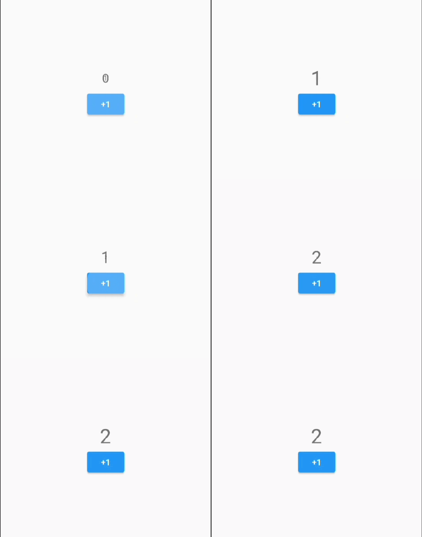
When the example code runs, clicking the “+1” button will cause the original number to gradually shrink until it hides, while the new number will gradually enlarge, as shown in Figure.

In the figure above, after the first click of the “+1” button, “0” is gradually shrinking while “1” is gradually enlarging.
Note: The new and old children of AnimatedSwitcher must have different keys if they are of the same type.
3. Implementation Principles of AnimatedSwitcher
In fact, the implementation principles of AnimatedSwitcher are relatively straightforward. Based on how AnimatedSwitcher is used, we can infer its basic functionality. To achieve the animation of switching between new and old children, we need to clarify two questions:
When does the animation occur?
How do we execute animations for the new and old children?
From the usage of AnimatedSwitcher, we see that when the child changes (i.e., when the key or type of the child widget differs), the build method is called again, and the animation begins.
We can implement AnimatedSwitcher by inheriting from StatefulWidget. The specific approach involves checking in the didUpdateWidget callback whether the new and old children have changed. If they have changed, we perform a reverse animation for the old child and a forward animation for the new child. Here’s a portion of the core pseudo-code for the implementation of AnimatedSwitcher:
Widget _widget;
void didUpdateWidget(AnimatedSwitcher oldWidget) {
  super.didUpdateWidget(oldWidget);
  // Check if the new and old children have changed (if keys and types are equal, return true, meaning no change)
  if (Widget.canUpdate(widget.child, oldWidget.child)) {
    // No change in child...
  } else {
    // Child has changed, create a Stack to apply animations to both the new and old children
    _widget = Stack(
      alignment: Alignment.center,
      children: [
        // Old child applies FadeTransition
        FadeTransition(
         opacity: _controllerOldAnimation,
         child: oldWidget.child,
        ),
        // New child applies FadeTransition
        FadeTransition(
         opacity: _controllerNewAnimation,
         child: widget.child,
        ),
      ]
    );
    // Execute reverse exit animation for old child
    _controllerOldAnimation.reverse();
    // Execute forward enter animation for new child
    _controllerNewAnimation.forward();
  }
}

// Build method
Widget build(BuildContext context) {
  return _widget;
}
The pseudo-code above shows the core logic behind the implementation of AnimatedSwitcher. Of course, the actual implementation is more complex, allowing for custom entrance and exit transition animations, as well as layout changes during animations. Here, we simplify the explanation to give readers a clear view of the main implementation ideas. For the specific implementation, readers can refer to the source code of AnimatedSwitcher.
Additionally, the Flutter SDK also provides an AnimatedCrossFade component, which can also switch between two child elements, executing fade in and fade out animations. Unlike AnimatedSwitcher, which switches between new and old values of a single child element, AnimatedCrossFade is designed for two separate child elements. The implementation principle of AnimatedCrossFade is also straightforward and similar to that of AnimatedSwitcher, so it will not be elaborated further. Interested readers can view its source code.
67.2 Advanced Usage of AnimatedSwitcher
Suppose we want to implement an animation similar to route transitions: the old page slides out to the left, while the new page slides in from the right. If we try to use AnimatedSwitcher, we quickly realize a problem: it doesn’t work! We might write code like the following:
AnimatedSwitcher(
  duration: Duration(milliseconds: 200),
  transitionBuilder: (Widget child, Animation<double> animation) {
    var tween = Tween<Offset>(begin: Offset(1, 0), end: Offset(0, 0));
    return SlideTransition(
      child: child,
      position: tween.animate(animation),
    );
  },
  // ... // omitted
)
What’s wrong with the above code? As we mentioned earlier, when the child of AnimatedSwitcher switches, the new child performs a forward animation, while the old child performs a reverse animation. So, the actual effect is that the new child slides in from the right, but the old child exits to the right instead of the left. This makes sense because, without special handling, the forward and reverse animations of the same animation are simply opposite (symmetric).
So, does this mean we can’t use AnimatedSwitcher? Certainly not! If we think about the issue, the root cause is that the forward and reverse animations of the same Animation are symmetric. Therefore, if we can break this symmetry, we can achieve the desired effect. Let’s encapsulate a MySlideTransition, which customizes the reverse animation to slide out from the left. Here’s the code:
class MySlideTransition extends AnimatedWidget {
  const MySlideTransition({
    Key? key,
    required Animation<Offset> position,
    this.transformHitTests = true,
    required this.child,
  }) : super(key: key, listenable: position);

  final bool transformHitTests;
  final Widget child;

  @override
  Widget build(BuildContext context) {
    final position = listenable as Animation<Offset>;
    Offset offset = position.value;
    if (position.status == AnimationStatus.reverse) {
      offset = Offset(-offset.dx, offset.dy);
    }
    return FractionalTranslation(
      translation: offset,
      transformHitTests: transformHitTests,
      child: child,
    );
  }
}
When calling it, simply replace SlideTransition with MySlideTransition:
AnimatedSwitcher(
  duration: Duration(milliseconds: 200),
  transitionBuilder: (Widget child, Animation<double> animation) {
    var tween = Tween<Offset>(begin: Offset(1, 0), end: Offset(0, 0));
    return MySlideTransition(
      child: child,
      position: tween.animate(animation),
    );
  },
  // ... // omitted
)
In the figure, "0" slides out from the left while "1" slides in from the right. We can see that we have achieved an animation similar to route transitions in a clever way. In fact, Flutter’s route transitions are also implemented using AnimatedSwitcher.
67.3 SlideTransitionX
In the above example, we implemented a "left out, right in" animation. What if we want to achieve "left in, right out," "top in, bottom out," or "bottom in, top out"? Of course, we could modify the code individually for each animation, but this would require defining a separate "Transition" for each, which is cumbersome. This section will encapsulate a general SlideTransitionX to implement these "in and out animations," as shown below:
class SlideTransitionX extends AnimatedWidget {
  SlideTransitionX({
    Key? key,
    required Animation<double> position,
    this.transformHitTests = true,
    this.direction = AxisDirection.down,
    required this.child,
  }) : super(key: key, listenable: position) {
    switch (direction) {
      case AxisDirection.up:
        _tween = Tween(begin: const Offset(0, 1), end: const Offset(0, 0));
        break;
      case AxisDirection.right:
        _tween = Tween(begin: const Offset(-1, 0), end: const Offset(0, 0));
        break;
      case AxisDirection.down:
        _tween = Tween(begin: const Offset(0, -1), end: const Offset(0, 0));
        break;
      case AxisDirection.left:
        _tween = Tween(begin: const Offset(1, 0), end: const Offset(0, 0));
        break;
    }
  }

  final bool transformHitTests;
  final Widget child;
  final AxisDirection direction;
  late final Tween<Offset> _tween;

  @override
  Widget build(BuildContext context) {
    final position = listenable as Animation<double>;
    Offset offset = _tween.evaluate(position);
    if (position.status == AnimationStatus.reverse) {
      switch (direction) {
        case AxisDirection.up:
          offset = Offset(offset.dx, -offset.dy);
          break;
        case AxisDirection.right:
          offset = Offset(-offset.dx, offset.dy);
          break;
        case AxisDirection.down:
          offset = Offset(offset.dx, -offset.dy);
          break;
        case AxisDirection.left:
          offset = Offset(-offset.dx, offset.dy);
          break;
      }
    }
    return FractionalTranslation(
      translation: offset,
      transformHitTests: transformHitTests,
      child: child,
    );
  }
}
Now, if we want to implement various "slide in and out animations," it becomes very easy—just pass different direction values. For example, to achieve "top in, bottom out," we would do:
AnimatedSwitcher(
  duration: Duration(milliseconds: 200),
  transitionBuilder: (Widget child, Animation<double> animation) {
    var tween = Tween<Offset>(begin: Offset(1, 0), end: Offset(0, 0));
    return SlideTransitionX(
      child: child,
      direction: AxisDirection.down, // top in, bottom out
      position: animation,
    );
  },
  // ... // omitted remaining code
)
After running this, as shown in Figure :

In the figure, "0" slides out from the bottom while "1" slides in from the top. Readers can try different values for the direction in SlideTransitionX to see the effects.
67.4 Summary
In this section, we learned about the detailed usage of AnimatedSwitcher and introduced methods to break the symmetry of AnimatedSwitcher animations. We can see that AnimatedSwitcher is very useful in scenarios where new and old UI elements need to be switched.


