The so-called linear layout refers to arranging child components either horizontally or vertically. In Flutter, linear layouts are implemented using Row and Column, similar to the LinearLayout control in Android. Both Row and Column inherit from Flex, which will be discussed in detail in the section on flexible layouts.
24.1 Main Axis and Cross Axis
For linear layouts, there is a distinction between the main axis and the cross axis. If the layout is horizontal, the main axis is the horizontal direction, and the cross axis is the vertical direction. If the layout is vertical, the main axis is vertical, and the cross axis is horizontal. In a linear layout, two enumerations define alignment: MainAxisAlignment and CrossAxisAlignment, which represent alignment along the main axis and cross axis, respectively.
24.2 Row
Row arranges its child widgets horizontally. The definition is as follows:
Row({
  ...
  TextDirection textDirection,
  MainAxisSize mainAxisSize = MainAxisSize.max,
  MainAxisAlignment mainAxisAlignment = MainAxisAlignment.start,
  VerticalDirection verticalDirection = VerticalDirection.down,
  CrossAxisAlignment crossAxisAlignment = CrossAxisAlignment.center,
  List<Widget> children = const <Widget>[],
})textDirection: Specifies the layout order of child components in the horizontal direction (left-to-right or right-to-left). By default, it follows the current locale (e.g., left-to-right for Chinese or English, and right-to-left for Arabic).
mainAxisSize: Determines the amount of space the Row occupies along the main axis (horizontal). The default is MainAxisSize.max, which means the Row will occupy as much horizontal space as possible, regardless of the actual width of its child widgets. MainAxisSize.min means the Row will occupy only as much space as its child widgets need.
mainAxisAlignment: Defines how child components are aligned within the horizontal space occupied by the Row. If mainAxisSize is MainAxisSize.min, this property is meaningless. When mainAxisSize is MainAxisSize.max, MainAxisAlignment.start aligns child widgets at the start of the text direction (left for TextDirection.ltr, right for TextDirection.rtl), while MainAxisAlignment.end aligns them at the opposite side. MainAxisAlignment.center centers the children.
verticalDirection: Defines the alignment direction along the cross axis (vertical). The default is VerticalDirection.down, meaning from top to bottom.
crossAxisAlignment: Specifies the alignment of child widgets along the vertical axis. The height of the Row equals the height of the tallest child widget. This property works similarly to MainAxisAlignment but refers to the cross axis and is based on verticalDirection.
children: An array of child widgets.
Example:
Read the following code and imagine what the output will be:
Column(
  // Test Row alignment, eliminating the default center alignment of Column
  crossAxisAlignment: CrossAxisAlignment.start,
  children: <Widget>[
    Row(
      mainAxisAlignment: MainAxisAlignment.center,
      children: <Widget>[
        Text("hello world"),
        Text("I am Jack"),
      ],
    ),
    Row(
      mainAxisSize: MainAxisSize.min,
      mainAxisAlignment: MainAxisAlignment.center,
      children: <Widget>[
        Text("hello world"),
        Text("I am Jack"),
      ],
    ),
    Row(
      mainAxisAlignment: MainAxisAlignment.end,
      textDirection: TextDirection.rtl,
      children: <Widget>[
        Text("hello world"),
        Text("I am Jack"),
      ],
    ),
    Row(
      crossAxisAlignment: CrossAxisAlignment.start,
      verticalDirection: VerticalDirection.up,
      children: <Widget>[
        Text("hello world", style: TextStyle(fontSize: 30.0),),
        Text("I am Jack"),
      ],
    ),
  ],
);
The actual result is shown in Figure :
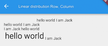
Explanation:
The first Row is simple, with center alignment by default.
The second Row, with mainAxisSize.min, makes the Row's width equal to the combined width of the two Text widgets, making alignment irrelevant, so they are displayed from left to right.
In the third Row, textDirection is set to TextDirection.rtl, so child widgets are arranged from right to left. Here, MainAxisAlignment.end aligns them to the left, so the result is the same as in the figure.
The fourth Row tests vertical alignment. The two Text widgets have different font sizes and heights. We set verticalDirection to VerticalDirection.up (bottom to top), and crossAxisAlignment.start aligns the children at the bottom.
24.3 Column
Column arranges its child widgets vertically. Its parameters are the same as those for Row, except the layout direction is vertical, and the main axis and cross axis are reversed. Let’s look at an example:
import 'package:flutter/material.dart';

class CenterColumnRoute extends StatelessWidget {
  @override
  Widget build(BuildContext context) {
    return Column(
      crossAxisAlignment: CrossAxisAlignment.center,
      children: <Widget>[
        Text("hi"),
        Text("world"),
      ],
    );
  }
}
The result is shown in Figure :
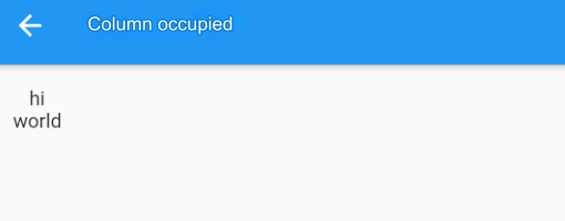
Explanation:
We haven’t specified the mainAxisSize for the Column, so the default MainAxisSize.max is used, meaning the Column will occupy as much vertical space as possible, filling the screen height.
The crossAxisAlignment property is set to CrossAxisAlignment.center, so the children are horizontally aligned in the center of the Column. The total width is determined by the widest child, in this case, Text("world"), so Text("hi") is centered horizontally in relation to Text("world").
Row and Column occupy as much space as possible in their respective main axes, but their cross-axis lengths depend on the size of their largest child. To center the two text widgets in the middle of the screen, you can:
Set the Column's width to the screen width. This can be achieved using ConstrainedBox or SizedBox, as demonstrated below:
ConstrainedBox(
  constraints: BoxConstraints(minWidth: double.infinity),
  child: Column(
    crossAxisAlignment: CrossAxisAlignment.center,
    children: <Widget>[
      Text("hi"),
      Text("world"),
    ],
  ),
);
By setting minWidth to double.infinity, the Column will occupy as much width as possible.
Use the Center widget, which will be explained later.
24.4 Special Cases
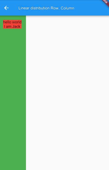
If a Row is nested inside another Row, or a Column inside another Column, only the outermost Row or Column will occupy as much space as possible. The inner Row or Column will only occupy the space needed for its actual size. Let’s use Column as an example:
Container(
  color: Colors.green,
  child: Padding(
    padding: const EdgeInsets.all(16.0),
    child: Column(
      crossAxisAlignment: CrossAxisAlignment.start,
      mainAxisSize: MainAxisSize.max, // Effective, outer Column takes full screen height
      children: <Widget>[
        Container(
          color: Colors.red,
          child: Column(
            mainAxisSize: MainAxisSize.max, // Ineffective, inner Column takes only its actual height
            children: <Widget>[
              Text("hello world"),
              Text("I am Jack"),
            ],
          ),
        )
      ],
    ),
  ),
);
The result is shown in Figure :
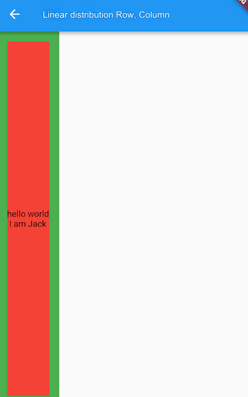
To make the inner Column fill the outer Column, use the Expanded widget:
Expanded(
  child: Container(
    color: Colors.red,
    child: Column(
      mainAxisAlignment: MainAxisAlignment.center, // Vertically centered alignment
      children: <Widget>[
        Text("hello world"),
        Text("I am Jack"),
      ],
    ),
  ),
);
The result is shown in Figure :
We’ll cover Expanded in detail in the section on flexible layouts.
