19.1 Introduction
The Material component library provides Material-styled switches (Switch) and checkboxes (Checkbox). Although both inherit from StatefulWidget, they do not maintain their selected states internally. Instead, the parent widget manages the selected state. When the Switch or Checkbox is clicked, their onChanged callback is triggered, allowing us to handle the logic for state changes. Here's a simple example:
class SwitchAndCheckBoxTestRoute extends StatefulWidget {
  @override
  _SwitchAndCheckBoxTestRouteState createState() => _SwitchAndCheckBoxTestRouteState();
}

class _SwitchAndCheckBoxTestRouteState extends State<SwitchAndCheckBoxTestRoute> {
  bool _switchSelected = true;  // Maintain the state of the switch
  bool _checkboxSelected = true; // Maintain the state of the checkbox

  @override
  Widget build(BuildContext context) {
    return Column(
      children: <Widget>[
        Switch(
          value: _switchSelected,  // Current state
          onChanged: (value) {
            // Rebuild the page
            setState(() {
              _switchSelected = value;
            });
          },
        ),
        Checkbox(
          value: _checkboxSelected,
          activeColor: Colors.red,  // Color when checked
          onChanged: (value) {
            setState(() {
              _checkboxSelected = value;
            });
          },
        ),
      ],
    );
  }
}
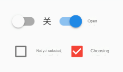
In the code above, since we need to maintain the selected state of the Switch and Checkbox, the SwitchAndCheckBoxTestRoute class inherits from StatefulWidget. In the build method, a Switch and a Checkbox are built with both initially set to the selected state. When the user clicks on them, the state is toggled, and setState() is called to notify the Flutter framework to rebuild the UI. The result is shown in Figure.
19.2 Properties and Appearance
The properties of Switch and Checkbox are relatively simple, and you can refer to the API documentation for more details. Both have an activeColor property to set the color when activated. As for size, currently, the size of the Checkbox is fixed and cannot be customized, while the Switch allows customization of the width, but the height is fixed. It's also worth mentioning that Checkbox has a tristate property, which indicates whether it has three states. Its default value is false, meaning the checkbox has two states: "selected" and "unselected," corresponding to true and false. If tristate is set to true, the value can have an additional null state. Feel free to test this.
19.3 Notes
From Switch and Checkbox, we can observe that while they are associated with a state (whether selected or not), they do not maintain the state themselves. Instead, the parent widget manages the state and is notified when the user interacts with them. This is logical because the selected state of the Switch and Checkbox is typically tied to user data, which isn't private to the widget. When creating custom components, we should also consider which state management approach is most appropriate.
