48.1 NestedScrollView
In the previous section, we learned that CustomScrollView can only combine Slivers. If there are child components that are also scrollable (embedded through SliverToBoxAdapter) and their scroll directions are consistent, it won't work properly. To solve this problem, Flutter provides a NestedScrollView component, which is designed to coordinate two scrollable components. Let’s take a look at its definition:
const NestedScrollView({
... // Omitted common properties for scrollable components
// Header and sliver builder
required this.headerSliverBuilder,
// Can accept any scrollable component
required this.body,
this.floatHeaderSlivers = false,
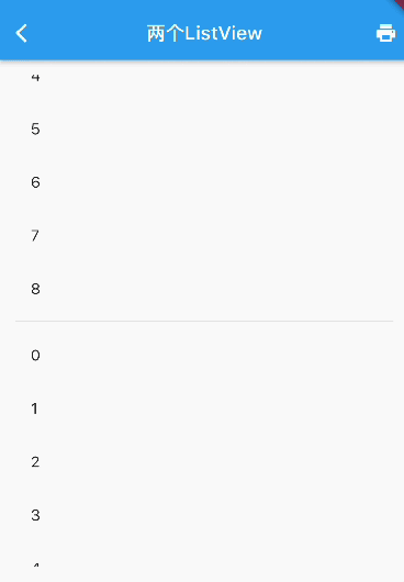
})Let’s look at a simple example. The final effect we need to achieve is as shown in Figure :

The page consists of three parts:
At the top is an
AppBarthat provides navigation and should be fixed at the top.Below the
AppBaris aSliverListthat can contain any number of list items; for demonstration, we specify 5 list items.At the bottom is a
ListView.
The expected effect is that the scrolling of the SliverList and the ListView below can be unified (so that when scrolling the ListView, only the ListView responds, but the entire page behaves as a whole in the vertical direction). The implementation code is as follows:
Material(
  child: NestedScrollView(
    headerSliverBuilder: (BuildContext context, bool innerBoxIsScrolled) {
      // Returns a Sliver array to the outer scrollable component.
      return <Widget>[
        SliverAppBar(
          title: const Text('Nested ListView'),
          pinned: true, // Fixed at the top
          forceElevated: innerBoxIsScrolled,
        ),
        buildSliverList(5), // Build a sliver list
      ];
    },
    body: ListView.builder(
      padding: const EdgeInsets.all(8),
      physics: const ClampingScrollPhysics(), // Important
      itemCount: 30,
      itemBuilder: (BuildContext context, int index) {
        return SizedBox(
          height: 50,
          child: Center(child: Text('Item $index')),
        );
      },
    ),
  ),
);
Logically, NestedScrollView divides the scrollable components into header and body parts. The header can be thought of as the outer scrollable component (outer scroll view), and we can consider this scrollable component as CustomScrollView, which means it can only accept Slivers. We build a Sliver list for the outer scrollable component using headerSliverBuilder; whereas the body part can accept any scrollable component, which is referred to as the inner scrollable component (inner scroll view).
In Flutter's source code comments and documentation, the concepts of outer and inner are used to refer to the external and internal scrollable components, respectively.
48.2 Principles of NestedScrollView
The structure diagram of NestedScrollView is shown in Figure :

Here are a few explanations:
The entire
NestedScrollViewis aCustomScrollView(in fact, it is a subclass ofCustomScrollView).Both the header and body are Slivers of
CustomScrollView. Note that while the body is aRenderBox, it will be wrapped as a Sliver.CustomScrollViewlogically divides all of its child Slivers into header and body parts: the header is the front part, and the body is the back part.When the body is a scrollable component, it and
CustomScrollViewboth have a Scrollable. Since the body is insideCustomScrollView, it is referred to as the inner scrollable component, whileCustomScrollViewis the outer scrollable component. Since the header part is a Sliver, it does not have an independent Scrollable; instead, its scrolling is controlled by the Scrollable ofCustomScrollView. Therefore, to differentiate, the header can be called the outer scrollable component (this is the convention in Flutter documentation).The core function of
NestedScrollViewis to coordinate the scrolling of the outer and inner scrollable components through a coordinator, allowing for smooth and unified scrolling effects. The implementation principle of the coordinator is to assign a controller to both the inner and outer scrollable components and to coordinate their scrolling through these two controllers.
In summary, there are two points to note when using NestedScrollView:
Ensure that the physics of the inner scrollable component (body) is set to
ClampingScrollPhysics. For example, when the above example runs on iOS, if theListViewis not set toClampingScrollPhysics, users will experience a bounce effect when quickly scrolling to the top. This will create a disconnection between theListViewand the header (the scrolling effects are not unified), so it needs to be set. However, if there is only aSliverAppBarin the header, it should not be added, because theSliverAppBaris fixed at the top, and when theListViewscrolls to the top, there will no longer be elements to continue scrolling down, so the bounce effect is expected in this case.The inner scrollable component (body) should not have a controller or primary set, as the controller is already specified in the coordinator of
NestedScrollView. If it is reset, the coordinator will become ineffective.
48.3 SliverAppBar
In the previous section, we used SliverAppBar, but did not introduce it in detail, as its most common usage scenario is as a header for NestedScrollView. Therefore, we will introduce it in this section.
SliverAppBar is the Sliver version of AppBar, and most of its parameters are the same. However, SliverAppBar has some unique functionalities. Here are some specific configurations of SliverAppBar:
const SliverAppBar({
  this.collapsedHeight, // Height when collapsed
  this.expandedHeight, // Height when expanded
  this.pinned = false, // Whether it is fixed
  this.floating = false, // Whether it is floating
  this.snap = false, // This parameter is effective only when floating
  bool forceElevated, // Whether to always show a shadow below the navigation bar
  ...
})
SliverAppBar can be collapsed and expanded with user scrolling in NestedScrollView, so we need to specify the heights for both collapsed and expanded states.
When pinned is true, SliverAppBar will be fixed at the top of NestedScrollView, behaving consistently with the pinned feature of SliverPersistentHeader.
Floating and Snap: When floating is true, SliverAppBar will not be fixed to the top. When the user scrolls up to the top, SliverAppBar will also slide out of the visible window. When the user scrolls in the opposite direction, if snap is true, SliverAppBar will immediately return to the top of the screen, no matter how far it has slid out of the screen. However, if snap is false, SliverAppBar will only return to the top of the screen when it reaches the boundary of downward scrolling. This is similar to the floating property of SliverPersistentHeader, but differs in that SliverPersistentHeader does not have a snap parameter. When its floating is true, the effect is equivalent to both floating and snap being true in SliverAppBar.
We can see that some parameters of SliverAppBar are quite similar to SliverPersistentHeader, as SliverAppBar internally contains a SliverPersistentHeader component to implement the fixed and floating effects.
Let’s look at an example:
class SnapAppBar extends StatelessWidget {
const SnapAppBar({Key? key}) : super(key: key);
@override
Widget build(BuildContext context) {
return Scaffold(
body: NestedScrollView(
headerSliverBuilder: (BuildContext context, bool innerBoxIsScrolled) {
return <Widget>[
// Implement snap effect
SliverAppBar(
floating: true,
snap: true,
expandedHeight: 200,
forceElevated: innerBoxIsScrolled,
flexibleSpace: FlexibleSpaceBar(
background: Image.asset(
"./imgs/sea.png",
fit: BoxFit.cover,
),
),
),
];
},
body: Builder(builder: (BuildContext context) {
return CustomScrollView(
slivers: <Widget>[
buildSliverList(100)
],
);
}),
),
);
}
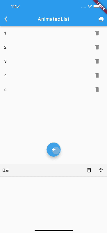
}When run, the effect is shown in Figure :

When we slide to the top and then reverse scroll slightly, the SliverAppBar will return to the top of the screen. However, there is an issue: as shown in the red circle in the image, we find that the SliverAppBar, upon returning to the screen, obscures items 0 to 4 in the list! According to normal interaction logic, it should not obscure them. When scrolling down, users want to see the content above, but the SliverAppBar suddenly returns to the screen and precisely obscures the content above, forcing users to scroll down a bit more. This creates a poor user experience.
To solve this problem, one immediate thought is that when the SliverAppBar is returning to the screen, the list items below should also slide down correspondingly, which would solve the issue. However, we encountered a problem when trying to implement this: whether we want to listen for the header's scroll information or control the body's scroll, we need to use the controllers of the outer and inner scrollable components. However, the holder of the controller is the coordinator of NestedScrollView, which is difficult to access. Even if we can access it (through context), it is still the internal logic of NestedScrollView, and we should not interfere with it externally. This violates the principle of separation of concerns and is intrusive. The Flutter developers recognized this point, so they provided a standard solution. Let's take a look at how to solve it, and then explain it. We modify the above code:
class SnapAppBar extends StatelessWidget {
  const SnapAppBar({Key? key}) : super(key: key);

  @override
  Widget build(BuildContext context) {
    return Scaffold(
      body: NestedScrollView(
        headerSliverBuilder: (BuildContext context, bool innerBoxIsScrolled) {
          return <Widget>[
            SliverOverlapAbsorber(
              handle: NestedScrollView.sliverOverlapAbsorberHandleFor(context),
              sliver: SliverAppBar(
                floating: true,
                snap: true,
                expandedHeight: 200,
                flexibleSpace: FlexibleSpaceBar(
                  background: Image.asset(
                    "./imgs/sea.png",
                    fit: BoxFit.cover,
                  ),
                ),
                forceElevated: innerBoxIsScrolled,
              ),
            ),
          ];
        },
        body: Builder(builder: (BuildContext context) {
          return CustomScrollView(
            slivers: <Widget>[
              SliverOverlapInjector(
                handle: NestedScrollView.sliverOverlapAbsorberHandleFor(context),
              ),
              buildSliverList(100)
            ],
          );
        }),
      ),
    );
  }
}
After running the code, the problem is solved, and I won't post images here. It’s important to note that two parts have changed compared to the previous code:
The
SliverAppBaris wrapped inSliverOverlapAbsorber, which is used to obtain the length of the area that theSliverAppBarobscures in the inner scrollable component when it returns. This length is the overlap length.In the body, a
SliverOverlapInjectoris inserted at the front of theSliverlist ofCustomScrollView, which applies the overlap length obtained fromSliverOverlapAbsorberto the inner scrollable component. This way, when theSliverAppBarreturns, the inner scrollable component will also slide down correspondingly.
Both SliverOverlapAbsorber and SliverOverlapInjector accept a handle, which is passed as NestedScrollView.sliverOverlapAbsorberHandleFor(context). The names are quite long! But don’t be intimidated; the handle is the communication bridge between SliverOverlapAbsorber and SliverOverlapInjector, which transmits the overlap length.
This is the standard solution provided by NestedScrollView. While it may not appear very elegant intuitively, I, as a developer of NestedScrollView, have yet to think of a better approach. Fortunately, this is a standard solution, and if needed, you can copy the code directly.
In fact, when snap is true, it is only necessary to wrap the SliverAppBar in a SliverOverlapAbsorber, without needing to add a SliverOverlapInjector to CustomScrollView, because in this case, SliverOverlapAbsorber will automatically absorb the overlap to adjust its layout height to the actual height of SliverAppBar. Therefore, when the header's height changes, it will automatically push the body down (the header and body belong to the same CustomScrollView), and at the same time, the overlap length in the handle will always be 0. Only when the SliverAppBar is wrapped in SliverOverlapAbsorber and is in pinned mode (i.e., pinned is true) does adding SliverOverlapInjector to CustomScrollView become meaningful, as the overlap length in the handle will not be 0. We can verify this with the following code:
class SnapAppBar2 extends StatefulWidget {
  const SnapAppBar2({Key? key}) : super(key: key);

  @override
  State<SnapAppBar2> createState() => _SnapAppBar2State();
}

class _SnapAppBar2State extends State<SnapAppBar2> {
  // Cache the handle
  late SliverOverlapAbsorberHandle handle;

  void onOverlapChanged(){
    // Print overlap length
    print(handle.layoutExtent);
  }

  @override
  Widget build(BuildContext context) {
    return Scaffold(
      body: NestedScrollView(
        headerSliverBuilder: (BuildContext context, bool innerBoxIsScrolled) {
          handle = NestedScrollView.sliverOverlapAbsorberHandleFor(context);
          // Remove old listeners before adding new ones
          handle.removeListener(onOverlapChanged);
          // Print when overlap length changes
          handle.addListener(onOverlapChanged);
          return <Widget>[
            SliverOverlapAbsorber(
              handle: handle,
              sliver: SliverAppBar(
                floating: true,
                snap: true,
                // pinned: true,  // Uncomment to see logs
                expandedHeight: 200,
                flexibleSpace: FlexibleSpaceBar(
                  background: Image.asset(
                    "./imgs/sea.png",
                    fit: BoxFit.cover,
                  ),
                ),
                forceElevated: innerBoxIsScrolled,
              ),
            ),
          ];
        },
        body: LayoutBuilder(builder: (BuildContext context, cons) {
          return CustomScrollView(
            slivers: <Widget>[
              SliverOverlapInjector(handle: handle),
              buildSliverList(100)
            ],
          );
        }),
      );
  }

  @override
  void dispose() {
    // Remove listener
    handle.removeListener(onOverlapChanged);
    super.dispose();
  }
}
We can check the console output under both snap and pinned modes to verify.
In summary, I still recommend using SliverOverlapAbsorber and SliverOverlapInjector together to avoid forgetting to add SliverOverlapInjector when switching from snap mode to pinned mode, which could lead to bugs.
48.4 Nested TabBarView
We implement a mall homepage with three tabs. To obtain a larger display space for products, we hope that when users scroll up, the navigation bar can slide out of the screen, and when they scroll down, the navigation bar can quickly return to the screen, as users may want to view previous products or return to the navigation bar. The page effect we want to achieve is as follows (initial state):
class NestedTabBarView1 extends StatelessWidget {
  const NestedTabBarView1({Key? key}) : super(key: key);

  @override
  Widget build(BuildContext context) {
    final _tabs = <String>['Recommended for You', 'Today’s Special', 'Discover More'];
    // Build tabBar
    return DefaultTabController(
      length: _tabs.length, // Number of tabs
      child: Scaffold(
        body: NestedScrollView(
          headerSliverBuilder: (BuildContext context, bool innerBoxIsScrolled) {
            return <Widget>[
              SliverOverlapAbsorber(
                handle: NestedScrollView.sliverOverlapAbsorberHandleFor(context),
                sliver: SliverAppBar(
                  title: const Text('Mall'),
                  floating: true,
                  snap: true,
                  forceElevated: innerBoxIsScrolled,
                  bottom: TabBar(
                    tabs: _tabs.map((String name) => Tab(text: name)).toList(),
                  ),
                ),
              ),
            ];
          },
          body: TabBarView(
            children: _tabs.map((String name) {
              return Builder(
                builder: (BuildContext context) {
                  return CustomScrollView(
                    key: PageStorageKey<String>(name),
                    slivers: <Widget>[
                      SliverOverlapInjector(
                        handle: NestedScrollView.sliverOverlapAbsorberHandleFor(context),
                      ),
                      SliverPadding(
                        padding: const EdgeInsets.all(8.0),
                        sliver: buildSliverList(50),
                      ),
                    ],
                  );
                },
              );
            }).toList(),
          ),
        ),
      ),
    );
  }
}