52.1 Colors
Before introducing themes, let’s first take a look at the Color class in Flutter. Colors in the Color class are represented as an int value. We know that the color on a display is composed of red, green, and blue (RGB), each taking up 8 bits. The storage structure is as follows:
| Bit(s) | Color Component |
|---|---|
| 0–7 | Blue |
| 8–15 | Green |
| 16–23 | Red |
| 24–31 | Alpha (Opacity) |
The fields in the table above have corresponding properties in the Color class, and most of the methods in Color operate on these properties. Since most of these methods are fairly simple, you can refer to the class definition for more details. Here, we will mainly discuss how to convert a color value to a Color object, brightness of colors, and MaterialColor.
1. How to Convert a Color String to a Color Object
In web development, color values are often represented as strings like "#dc380d", which is an RGB value. You can convert this into a Color class in Flutter using the following methods:
Color(0xffdc380d);  // For fixed colors, you can use an integer directly
// If the color is a string variable:
var c = "dc380d";
Color(int.parse(c, radix: 16) | 0xFF000000);  // Use bitwise operation to set Alpha to FF
Color(int.parse(c, radix: 16)).withAlpha(255);  // Use a method to set Alpha to FF
2. Color Brightness
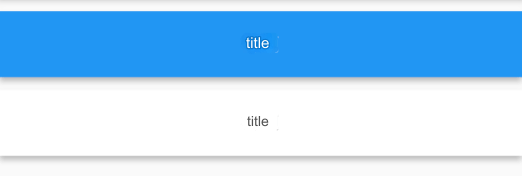
Suppose we want to implement a customizable navigation bar where both the background color and title color can be set. If the background color is dark, the title should appear in a light color; if the background is light, the title should be dark. To achieve this, we need to calculate the brightness of the background color and dynamically set the title color accordingly.
The Color class provides a method called computeLuminance(), which returns a value between [0-1]. The higher the number, the lighter the color. Using this method, we can dynamically determine the title color. Below is a simple implementation of a navigation bar (NavBar):
class NavBar extends StatelessWidget {
  final String title;
  final Color color;  // Background color

  NavBar({
    Key? key,
    required this.color,
    required this.title,
  });

  @override
  Widget build(BuildContext context) {
    return Container(
      constraints: BoxConstraints(
        minHeight: 52,
        minWidth: double.infinity,
      ),
      decoration: BoxDecoration(
        color: color,
        boxShadow: [
          // Shadow
          BoxShadow(
            color: Colors.black26,
            offset: Offset(0, 3),
            blurRadius: 3,
          ),
        ],
      ),
      child: Text(
        title,
        style: TextStyle(
          fontWeight: FontWeight.bold,
          // Determine title color based on background brightness
          color: color.computeLuminance() < 0.5 ? Colors.white : Colors.black,
        ),
      ),
      alignment: Alignment.center,
    );
  }
}
Here is the test code:
Column(
  children: <Widget>[
    // Background is blue, so the title automatically turns white
    NavBar(color: Colors.blue, title: "Title"),
    // Background is white, so the title automatically turns black
    NavBar(color: Colors.white, title: "Title"),
  ],
)
The result looks like Figure:
3. MaterialColor
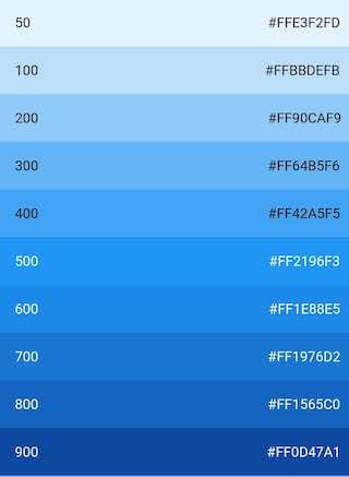
MaterialColor is a class used to implement Material Design colors, and it includes ten shades of a single color. You can access different color shades using the [] operator, where the valid indices are 50, 100, 200, …, 900. The higher the number, the darker the shade. The default shade is the color at index 500.
For example, Colors.blue is a predefined MaterialColor object, defined as follows:
static const MaterialColor blue = MaterialColor(
  _bluePrimaryValue,
  <int, Color>{
    50: Color(0xFFE3F2FD),
    100: Color(0xFFBBDEFB),
    200: Color(0xFF90CAF9),
    300: Color(0xFF64B5F6),
    400: Color(0xFF42A5F5),
    500: Color(_bluePrimaryValue),
    600: Color(0xFF1E88E5),
    700: Color(0xFF1976D2),
    800: Color(0xFF1565C0),
    900: Color(0xFF0D47A1),
  },
);
static const int _bluePrimaryValue = 0xFF2196F3;
You can use shadeXX to get the color for a specific shade. For example, Colors.blue.shade50 to Colors.blue.shade900 represent a gradient from light blue to dark blue. The result is shown in Figure:
52.2 Theme
The Theme component can define theme data (ThemeData) for a Material App. Many components in the Material component library use theme data, such as the color of the navigation bar, title font, icon styles, and so on. The Theme uses InheritedWidget to share style data with its subtree.
1. ThemeData
ThemeData is used to store the theme data for the Material component library. Material components need to adhere to specific design guidelines, and the customizable parts of these guidelines are defined within ThemeData. Therefore, we can use ThemeData to customize the application theme. In child components, we can use the Theme.of method to retrieve the current ThemeData.
Note: Some aspects of the Material Design guidelines cannot be customized, such as the height of the navigation bar. ThemeData only includes customizable parts.
Let’s take a look at the partial data definition of ThemeData:
ThemeData({
  Brightness? brightness, // Dark or Light
  MaterialColor? primarySwatch, // Theme color sample, described below
  Color? primaryColor, // Primary color, determines the color of the navigation bar
  Color? cardColor, // Card color
  Color? dividerColor, // Divider color
  ButtonThemeData buttonTheme, // Button theme
  Color dialogBackgroundColor, // Dialog background color
  String fontFamily, // Font family
  TextTheme textTheme, // Text theme, including title, body, etc.
  IconThemeData iconTheme, // Default style for Icons
  TargetPlatform platform, // Specifies the platform, applies specific platform control styles
  ColorScheme? colorScheme,
  ...
})
The above shows just a small portion of the properties of ThemeData. Readers can refer to the SDK for the complete data definition. Notably, the primarySwatch property is a "sample color" for the theme color. This sample color can be used to generate other properties under certain conditions. For example, if primaryColor is not specified and the current theme is not a dark theme, primaryColor will default to the color specified by primarySwatch. Similar properties, such as indicatorColor, will also be affected by primarySwatch.
2. Example
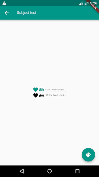
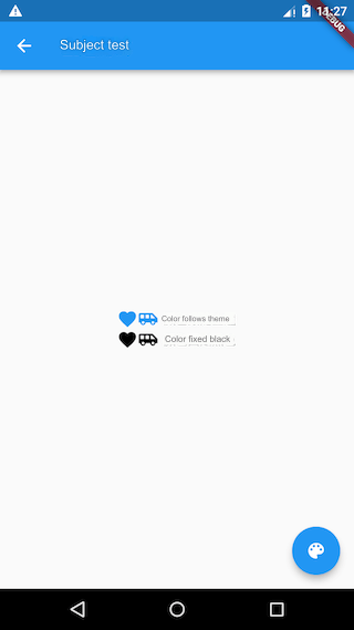
Let's implement a skin-switching feature for routes:
class ThemeTestRoute extends StatefulWidget {
  @override
  _ThemeTestRouteState createState() => _ThemeTestRouteState();
}

class _ThemeTestRouteState extends State<ThemeTestRoute> {
  var _themeColor = Colors.teal; // Current route theme color

  @override
  Widget build(BuildContext context) {
    ThemeData themeData = Theme.of(context);
    return Theme(
      data: ThemeData(
          primarySwatch: _themeColor, // Used for navigation bar, FloatingActionButton background color, etc.
          iconTheme: IconThemeData(color: _themeColor) // Used for Icon color
      ),
      child: Scaffold(
        appBar: AppBar(title: Text("Theme Test")),
        body: Column(
          mainAxisAlignment: MainAxisAlignment.center,
          children: <Widget>[
            // The first row of Icons uses the iconTheme from the theme
            Row(
                mainAxisAlignment: MainAxisAlignment.center,
                children: <Widget>[
                  Icon(Icons.favorite),
                  Icon(Icons.airport_shuttle),
                  Text("  Color follows the theme")
                ]
            ),
            // Customize the color of the second row of Icons (fixed to black)
            Theme(
              data: themeData.copyWith(
                iconTheme: themeData.iconTheme.copyWith(
                    color: Colors.black
                ),
              ),
              child: Row(
                  mainAxisAlignment: MainAxisAlignment.center,
                  children: <Widget>[
                    Icon(Icons.favorite),
                    Icon(Icons.airport_shuttle),
                    Text("  Color fixed to black")
                  ]
              ),
            ),
          ],
        ),
        floatingActionButton: FloatingActionButton(
            onPressed: () =>  // Switch themes
                setState(() =>
                _themeColor =
                _themeColor == Colors.teal ? Colors.blue : Colors.teal
                ),
            child: Icon(Icons.palette)
        ),
      ),
    );
  }
}
After running the code, clicking the floating button in the bottom right corner will switch themes, as shown in Figures :
Three points to note:
You can override the global theme with a local theme. As in the code where a fixed color (black) is specified for the second row of icons using
Theme, this is a common technique. Flutter frequently uses this method to customize the theme of subtrees.Why can a local theme override a global theme? This is primarily because when a widget uses theme styles, it retrieves them using
Theme.of(BuildContext context). Here’s a simplified version of that code:static ThemeData of(BuildContext context, { bool shadowThemeOnly = false }) { // Simplified code, not the actual source return context.dependOnInheritedWidgetOfExactType<_InheritedTheme>().theme.data; }context.dependOnInheritedWidgetOfExactTypesearches the widget tree upwards from the current position for the first widget of type_InheritedTheme. Thus, when a local theme is specified, the first_InheritedThemefound when callingTheme.of()from the subtree will be the theme we specified.
This example demonstrates skin-switching for a single route. To apply a skin change to the entire application, you can modify the theme property of MaterialApp.
