A flexible layout allows child components to allocate the parent container's space according to certain proportions. The concept of flexible layout exists in other UI systems as well, such as the flexible box layout in H5 or FlexboxLayout in Android. In Flutter, flexible layouts are mainly achieved through the combination of Flex and Expanded.
25.1 Flex
The Flex component can arrange its child components either horizontally or vertically. If you already know the main axis direction, it’s easier to use Row or Column since both Row and Column inherit from Flex, and their parameters are essentially the same. Therefore, anywhere you can use Flex, you can also use Row or Column. The Flex widget is quite powerful on its own and can be used with Expanded to achieve flexible layouts. In the following section, we’ll focus only on the properties related to flexible layouts (the other properties were introduced when discussing Row and Column).
Flex({
  ...
  required this.direction, // The direction of the flexible layout. For Row, it defaults to horizontal; for Column, it defaults to vertical.
  List<Widget> children = const <Widget>[],
})
Flex inherits from MultiChildRenderObjectWidget, and its corresponding RenderObject is RenderFlex, which implements its layout algorithm.
25.2 Expanded
Expanded can only be a child of Flex (otherwise, an error will occur), and it allows the child component of Flex to “expand” and occupy space proportionally. Since Row and Column both inherit from Flex, Expanded can also be their child.
const Expanded({
  int flex = 1,
  required Widget child,
})
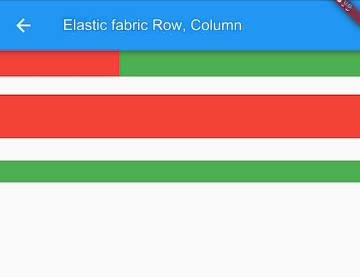
The flex parameter is the elasticity factor. If it’s 0 or null, the child will not be flexible, meaning it won’t expand to occupy any extra space. If it's greater than 0, all Expanded children will divide the available space along the main axis according to their flex ratio. Let’s look at an example:
class FlexLayoutTestRoute extends StatelessWidget {
  @override
  Widget build(BuildContext context) {
    return Column(
      children: <Widget>[
        // The two child widgets of Flex occupy the horizontal space in a 1:2 ratio
        Flex(
          direction: Axis.horizontal,
          children: <Widget>[
            Expanded(
              flex: 1,
              child: Container(
                height: 30.0,
                color: Colors.red,
              ),
            ),
            Expanded(
              flex: 2,
              child: Container(
                height: 30.0,
                color: Colors.green,
              ),
            ),
          ],
        ),
        Padding(
          padding: const EdgeInsets.only(top: 20.0),
          child: SizedBox(
            height: 100.0,
            // The three child widgets of Flex occupy the 100 pixels of vertical space in a 2:1:1 ratio
            child: Flex(
              direction: Axis.vertical,
              children: <Widget>[
                Expanded(
                  flex: 2,
                  child: Container(
                    height: 30.0,
                    color: Colors.red,
                  ),
                ),
                Spacer(
                  flex: 1,
                ),
                Expanded(
                  flex: 1,
                  child: Container(
                    height: 30.0,
                    color: Colors.green,
                  ),
                ),
              ],
            ),
          ),
        ),
      ],
    );
  }
}
The running result is shown in Figure .

In the example, the Spacer widget’s function is to occupy space according to a specified proportion. In reality, it’s just a wrapper class for Expanded. Below is the source code for Spacer:
class Spacer extends StatelessWidget {
  const Spacer({Key? key, this.flex = 1})
    : assert(flex != null),
      assert(flex > 0),
      super(key: key);

  final int flex;

  @override
  Widget build(BuildContext context) {
    return Expanded(
      flex: flex,
      child: const SizedBox.shrink(),
    );
  }
}
25.3 Summary
The flexible layout is relatively simple. The only thing to note is the relationship between Row, Column, and Flex.


