The Material component library offers a variety of rich components. This section introduces the most commonly used Scaffold component. For the others, readers can refer to the documentation or explore the examples in the Material section of the Flutter Gallery.
Note: Flutter Gallery is the official demo app provided by Flutter. Its source code is located in the examples directory of the Flutter source code. I strongly recommend users run the Flutter Gallery examples, as it's a comprehensive showcase of Flutter and an excellent reference for learning. It was my primary resource when learning Flutter.
36.1 Scaffold
A complete route page may include a navigation bar, a drawer menu, and a bottom tab navigation bar. Manually implementing these elements on every route page would be both cumbersome and tedious. Fortunately, the Flutter Material component library provides ready-to-use components that can reduce our development workload. Scaffold acts as the skeleton of a route page, allowing us to easily assemble a complete page.
Example
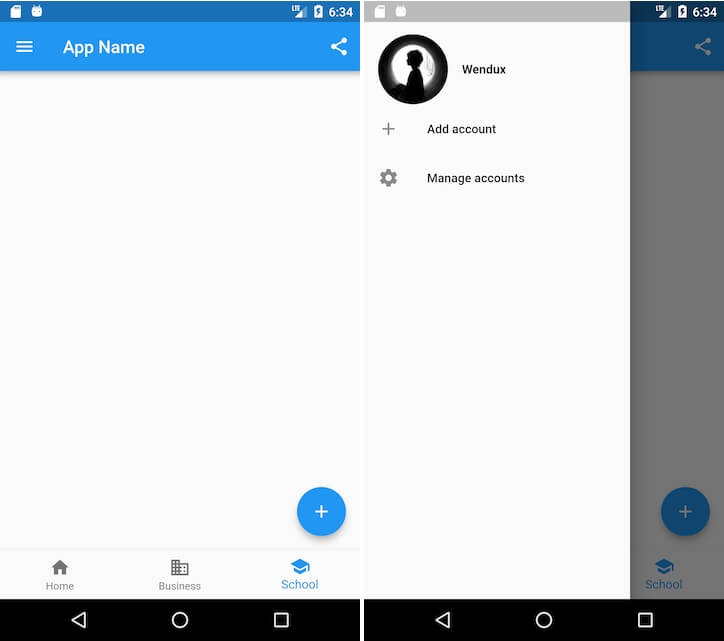
Let’s implement a page that includes:
A navigation bar
A share button on the right side of the navigation bar
A drawer menu
A bottom navigation bar
A floating action button in the lower right corner
The final effect is shown in figures.
Code implementation:
class ScaffoldRoute extends StatefulWidget {
  @override
  _ScaffoldRouteState createState() => _ScaffoldRouteState();
}

class _ScaffoldRouteState extends State<ScaffoldRoute> {
  int _selectedIndex = 1;

  @override
  Widget build(BuildContext context) {
    return Scaffold(
      appBar: AppBar( // Navigation bar
        title: Text("App Name"),
        actions: <Widget>[ // Right-side menu on the navigation bar
          IconButton(icon: Icon(Icons.share), onPressed: () {}),
        ],
      ),
      drawer: MyDrawer(), // Drawer
      bottomNavigationBar: BottomNavigationBar( // Bottom navigation
        items: <BottomNavigationBarItem>[
          BottomNavigationBarItem(icon: Icon(Icons.home), title: Text('Home')),
          BottomNavigationBarItem(icon: Icon(Icons.business), title: Text('Business')),
          BottomNavigationBarItem(icon: Icon(Icons.school), title: Text('School')),
        ],
        currentIndex: _selectedIndex,
        fixedColor: Colors.blue,
        onTap: _onItemTapped,
      ),
      floatingActionButton: FloatingActionButton( // Floating action button
          child: Icon(Icons.add),
          onPressed:_onAdd
      ),
    );
  }

  void _onItemTapped(int index) {
    setState(() {
      _selectedIndex = index;
    });
  }

  void _onAdd() {}
}
In the above code, we used the following components:
| Component Name | Description |
|---|---|
| AppBar | A framework for the navigation bar |
| MyDrawer | Drawer menu |
| BottomNavigationBar | Bottom navigation bar |
| FloatingActionButton | Floating action button |
Let’s now take a closer look at each of them.
36.2 AppBar
AppBar is a Material-style navigation bar that allows setting the page title, navigation menu, and bottom tab titles. Here's the definition of AppBar:
AppBar({
  Key? key,
  this.leading, // The left-most widget in the navigation bar, typically a drawer menu button or a back button.
  this.automaticallyImplyLeading = true, // Automatically implement a default leading button if leading is null.
  this.title, // Page title
  this.actions, // Right-side menu on the navigation bar
  this.bottom, // Bottom menu of the navigation bar, usually a Tab button group
  this.elevation = 4.0, // Shadow of the navigation bar
  this.centerTitle, // Whether the title is centered
  this.backgroundColor,
  ...   // Other attributes can be found in the source code comments
})
If a drawer menu is added to the Scaffold, by default, Scaffold will automatically set the leading of the AppBar to be a menu button . Clicking it will open the drawer. If we want to customize the menu icon, we can manually set the leading, like this:
Scaffold(
  appBar: AppBar(
    title: Text("App Name"),
    leading: Builder(builder: (context) {
      return IconButton(
        icon: Icon(Icons.dashboard, color: Colors.white), // Custom icon
        onPressed: () {
          // Open the drawer menu
          Scaffold.of(context).openDrawer();
        },
      );
    }),
    ...
  )
)
The running effect of the code is shown in figure .

As we can see, the left-side menu has been successfully replaced.
The method to open the drawer menu comes from the ScaffoldState. You can obtain the closest Scaffold component’s state object using Scaffold.of(context).
36.3 Drawer
The drawer and endDrawer properties of Scaffold can accept a Widget as the left or right drawer menu of the page, respectively. If the developer provides a drawer menu, the user can swipe in from the left (or right) side of the screen to open it. At the beginning of this section, we implemented a left drawer menu, MyDrawer. The source code is as follows:
class MyDrawer extends StatelessWidget {
  const MyDrawer({
    Key? key,
  }) : super(key: key);

  @override
  Widget build(BuildContext context) {
    return Drawer(
      child: MediaQuery.removePadding(
        context: context,
        // Remove the default top padding from the drawer menu
        removeTop: true,
        child: Column(
          crossAxisAlignment: CrossAxisAlignment.start,
          children: <Widget>[
            Padding(
              padding: const EdgeInsets.only(top: 38.0),
              child: Row(
                children: <Widget>[
                  Padding(
                    padding: const EdgeInsets.symmetric(horizontal: 16.0),
                    child: ClipOval(
                      child: Image.asset(
                        "imgs/avatar.png",
                        width: 80,
                      ),
                    ),
                  ),
                  Text(
                    "Wendux",
                    style: TextStyle(fontWeight: FontWeight.bold),
                  )
                ],
              ),
            ),
            Expanded(
              child: ListView(
                children: <Widget>[
                  ListTile(
                    leading: const Icon(Icons.add),
                    title: const Text('Add account'),
                  ),
                  ListTile(
                    leading: const Icon(Icons.settings),
                    title: const Text('Manage accounts'),
                  ),
                ],
              ),
            ),
          ],
        ),
      ),
    );
  }
}
The drawer menu typically uses the Drawer component as its root widget, which implements a Material-style menu panel. The MediaQuery.removePadding function can remove some of the default padding (such as the padding at the top of the Drawer, which is as high as the phone's status bar). Readers can experiment with different parameters to see the effect. The drawer menu page consists of a top section and a bottom section. The top section includes the user’s avatar and nickname, and the bottom section is a menu list implemented using ListView.
36.4 FloatingActionButton
The FloatingActionButton is a special button in the Material Design guidelines, usually floating in a specific position on the page as a shortcut to a frequently used action, such as the "➕" button at the bottom right corner of the page in this example. We can set a FloatingActionButton through the floatingActionButton property of Scaffold, and use the floatingActionButtonLocation property to specify its position on the page. This is quite simple, so we won’t go into more detail.
36.5 Bottom Tab Navigation Bar
We can set a bottom navigation bar using the bottomNavigationBar property of Scaffold. As shown in the example at the beginning of this section, we use the BottomNavigationBar and BottomNavigationBarItem components from the Material library to create a Material-style bottom navigation bar. The implementation code is very simple, so we won’t repeat it here. However, how can we implement the effect shown in Figure?
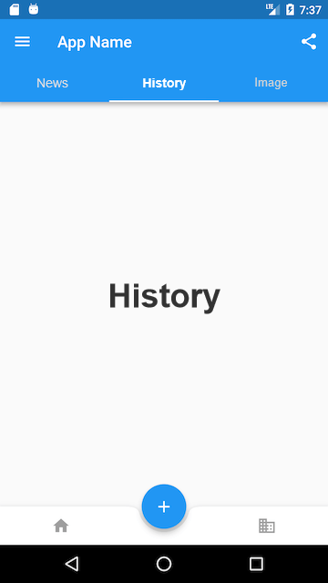
The Material library provides a BottomAppBar component, which can be used in conjunction with a FloatingActionButton to achieve the "notch" effect. The source code is as follows:
bottomNavigationBar: BottomAppBar(
  color: Colors.white,
  shape: CircularNotchedRectangle(), // Creates a circular notch in the bottom navigation bar
  child: Row(
    children: [
      IconButton(icon: Icon(Icons.home)),
      SizedBox(), // Leave an empty space in the middle
      IconButton(icon: Icon(Icons.business)),
    ],
    mainAxisAlignment: MainAxisAlignment.spaceAround, // Distribute horizontal space evenly in the bottom navigation bar
  ),
)
As you can see, there is no property to control the notch position in the above code. In fact, the position of the notch depends on the location of the FloatingActionButton. In this case, the position of the FloatingActionButton is:
floatingActionButtonLocation: FloatingActionButtonLocation.centerDocked,
So, the notch is in the center of the bottom navigation bar.
The shape property of BottomAppBar determines the shape of the notch. The CircularNotchedRectangle creates a circular notch, but we can customize the shape. For example, the Flutter Gallery demo includes a "diamond" shaped notch. Interested readers can explore this on their own.
36.6 Page Body
Finally, we come to the body section of the page. The Scaffold widget has a body property that accepts any Widget. We can pass in any widget. In the next chapter, we will introduce TabBarView, a component that allows page switching. In apps with multiple tabs, TabBarView is typically used as the body of the Scaffold.
![[C++ Chapter] Setting Sail—An Introduction to C++ (Part 2)](/static/upload/image/20241120/1732094910609611.jpg)
