46.1 CustomScrollView
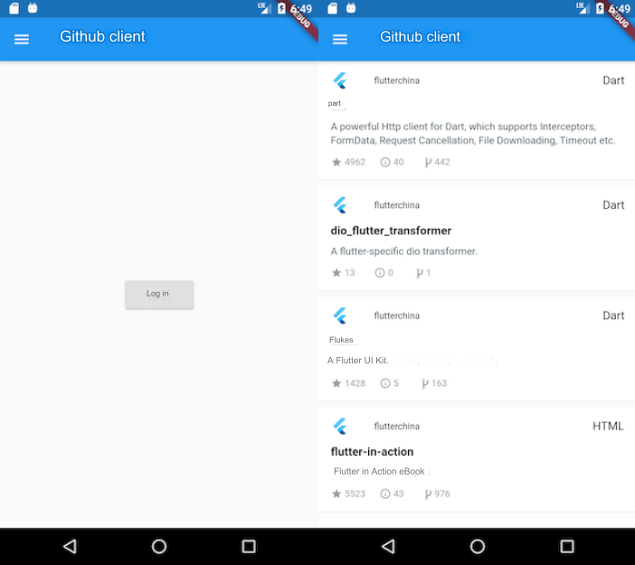
Previously introduced widgets like ListView, GridView, and PageView are all complete scrollable components. "Complete" means that they include Scrollable, Viewport, and Sliver. But if we want to include multiple scrollable components in one page and have them share a unified scrolling effect, for example, combining two vertically scrolling ListView into one, so that when the first ListView scrolls to the bottom, the second one automatically follows, you might try to write a demo like this:
Widget buildTwoListView() {
  var listView = ListView.builder(
    itemCount: 20,
    itemBuilder: (_, index) => ListTile(title: Text('$index')),
  );
  return Column(
    children: [
      Expanded(child: listView),
      Divider(color: Colors.grey),
      Expanded(child: listView),
    ],
  );
}
The result would look like Figure .

In this example, there are two ListView widgets, each taking up half of the visible area. Although they are displayed correctly, each ListView only responds to scrolling within its own visible area, which doesn't achieve our desired unified scrolling effect. The reason for this is that both ListView instances have their own independent Scrollable, Viewport, and Sliver objects. To achieve our goal, we need to manually create a shared Scrollable and Viewport object, and then add the slivers from both ListView instances into this common Viewport. However, this is a complex task for developers. To simplify this process, Flutter provides a CustomScrollView component that allows us to create a shared Scrollable and Viewport. The slivers parameter of CustomScrollView accepts an array of Sliver objects, making it easier to implement the functionality we want:
Widget buildTwoSliverList() {
  // SliverFixedExtentList is a sliver that can generate list items of equal height.
  // As a reminder, if the list items have the same height, it's recommended to use
  // SliverFixedExtentList or SliverPrototypeExtentList. For varying heights, use SliverList.
  var listView = SliverFixedExtentList(
    itemExtent: 56, // Fixed height for list items
    delegate: SliverChildBuilderDelegate(
      (_, index) => ListTile(title: Text('$index')),
      childCount: 10,
    ),
  );
  // Using CustomScrollView
  return CustomScrollView(
    slivers: [
      listView,
      listView,
    ],
  );
}
The result would look like Figure .

As you can see, we’ve achieved our desired effect.
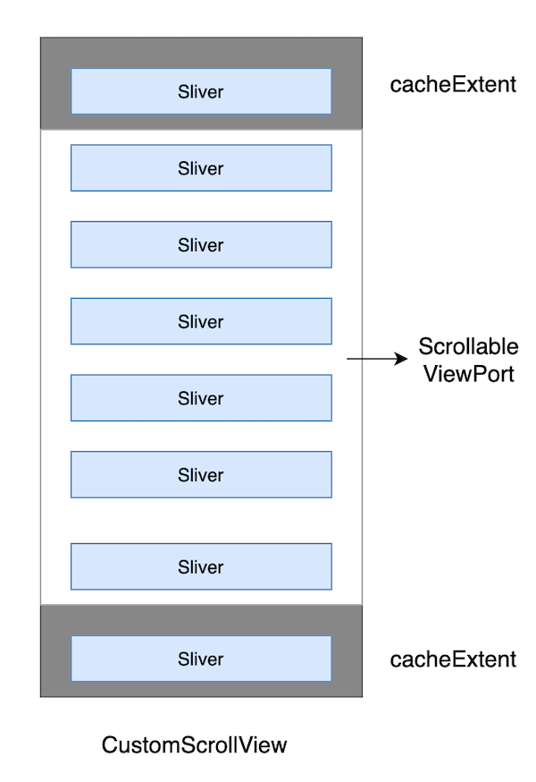
In summary, the primary purpose of CustomScrollView is to provide a shared Scrollable and Viewport to combine multiple Sliver objects. The structure of CustomScrollView is shown in Figure :
46.2 Common Slivers in Flutter
The scrollable components introduced in previous sections all have corresponding Sliver equivalents:
| Sliver Name | Function | Corresponding Scrollable Component |
|---|---|---|
| SliverList | List | ListView |
| SliverFixedExtentList | List with fixed item heights | ListView (with itemExtent specified) |
| SliverAnimatedList | List that animates when items are added/removed | AnimatedList |
| SliverGrid | Grid | GridView |
| SliverPrototypeExtentList | List with fixed item height based on a prototype | ListView (with prototypeItem specified) |
| SliverFillViewport | Contains multiple children that each fill the viewport | PageView |
In addition to these Sliver widgets corresponding to lists, there are also some used for layout and decoration, and their child components must be Sliver widgets. Some commonly used examples are:
| Sliver Name | Corresponding RenderBox |
|---|---|
| SliverPadding | Padding |
| SliverVisibility, SliverOpacity | Visibility, Opacity |
| SliverFadeTransition | FadeTransition |
| SliverLayoutBuilder | LayoutBuilder |
There are also some other common Sliver widgets:
| Sliver Name | Description |
|---|---|
| SliverAppBar | Corresponds to AppBar, primarily used in CustomScrollView |
| SliverToBoxAdapter | An adapter that converts a RenderBox into a Sliver. More details later. |
| SliverPersistentHeader | Can remain fixed at the top when scrolled to the top. More details later. |
There are many Sliver widgets in Flutter, and we won’t cover all of them here. Just remember their key features, and refer to the documentation as needed. The reason we say "most" Sliver widgets correspond to scrollable components is because some, like SliverPadding and SliverAppBar, are unrelated to scrolling. They are mainly designed to work with CustomScrollView, since the child components of CustomScrollView must all be Sliver widgets.
Example
// Since this route does not use Scaffold, we wrap the route in Material
// to apply the default Material Design styles to the child widgets (like Text).
Material(
  child: CustomScrollView(
    slivers: <Widget>[
      // AppBar, with a navigation bar.
      SliverAppBar(
        pinned: true, // Stays pinned when scrolled to the top
        expandedHeight: 250.0,
        flexibleSpace: FlexibleSpaceBar(
          title: const Text('Demo'),
          background: Image.asset(
            "./imgs/sea.png",
            fit: BoxFit.cover,
          ),
        ),
      ),
      SliverPadding(
        padding: const EdgeInsets.all(8.0),
        sliver: SliverGrid(
          // Grid
          gridDelegate: SliverGridDelegateWithFixedCrossAxisCount(
            crossAxisCount: 2, // Grid displayed in two columns
            mainAxisSpacing: 10.0,
            crossAxisSpacing: 10.0,
            childAspectRatio: 4.0,
          ),
          delegate: SliverChildBuilderDelegate(
            (BuildContext context, int index) {
              // Create child widgets
              return Container(
                alignment: Alignment.center,
                color: Colors.cyan[100 * (index % 9)],
                child: Text('grid item $index'),
              );
            },
            childCount: 20,
          ),
        ),
      ),
      SliverFixedExtentList(
        itemExtent: 50.0,
        delegate: SliverChildBuilderDelegate(
          (BuildContext context, int index) {
            // Create list items
            return Container(
              alignment: Alignment.center,
              color: Colors.lightBlue[100 * (index % 9)],
              child: Text('list item $index'),
            );
          },
          childCount: 20,
        ),
      ),
    ],
  ),
);
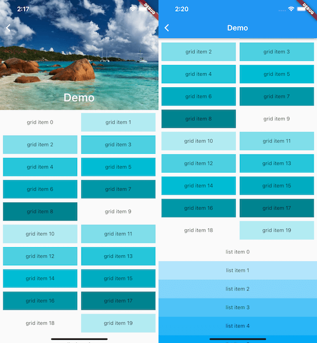
The code consists of three parts:
SliverAppBar: This corresponds to the AppBar, but unlike AppBar, it can be integrated into CustomScrollView. With SliverAppBar, you can achieve the Material Design collapsible header effect using FlexibleSpaceBar. To see the exact effect, you can run the example.
SliverGrid: Wrapped in SliverPadding to add padding around the SliverGrid. This is a two-column grid with a 4:1 aspect ratio and contains 20 child widgets.
SliverFixedExtentList: This is a list where all child items have a fixed height of 50 pixels.
The results can be seen in Figures .
SliverToBoxAdapter
In real-world layouts, we often need to add custom components to a CustomScrollView, but not all components have a Sliver version. For this, Flutter provides a SliverToBoxAdapter, which acts as an adapter to wrap a RenderBox as a Sliver. For example, if we want to add a horizontally scrollable PageView at the top of a list, we can configure it using SliverToBoxAdapter:
CustomScrollView(
  slivers: [
    SliverToBoxAdapter(
      child: SizedBox(
        height: 300,
        child: PageView(
          children: [Text("1"), Text("2")],
        ),
      ),
    ),
    buildSliverFixedList(),
  ],
);
Note that the above code works fine, but if we replace the PageView with a ListView that scrolls in the same direction as the CustomScrollView, it won’t work properly! The reason is that CustomScrollView combines its child Slivers by providing them with a shared Scrollable, which handles all scrolling events in the specified direction. If a Sliver introduces another Scrollable, the scrolling events will conflict.
In the example above, PageView works without issues because its Scrollable only handles horizontal scrolling, while the CustomScrollView handles vertical scrolling, so there is no conflict. However, if you replace it with a vertically scrolling ListView, only the ListView will respond to the scroll events because its Scrollable consumes the scroll events first, preventing the CustomScrollView’s Scrollable from receiving the events.
By default, Flutter's gesture conflict strategy favors the child element. We’ll discuss this in more detail in the gesture handling section.
Thus, we can conclude that if a child of CustomScrollView is also a complete scrollable widget, and their scroll directions are the same, the CustomScrollView won’t work properly. To solve this problem, you can use NestedScrollView, which we’ll introduce in the next section.
SliverPersistentHeader
The purpose of SliverPersistentHeader is to allow a component to stay pinned at the top of the CustomScrollView once it reaches the top of the viewport.
It’s important to note that SliverPersistentHeader was originally designed to implement SliverAppBar, so some of its properties and callbacks are specifically used in SliverAppBar. If you use SliverPersistentHeader directly, you might find some of its configurations confusing and feel a higher mental load when using it. To make things easier, I’ll point out the most important aspects you need to focus on and what can be ignored. Finally, to simplify its usage, we’ll encapsulate a SliverHeaderDelegate, which allows you to focus only on the relevant attributes.
Let’s first look at the definition of SliverPersistentHeader:
const SliverPersistentHeader({
  Key? key,
  required SliverPersistentHeaderDelegate delegate,
  this.pinned = false, // Whether the header is pinned at the top when it reaches the top of the viewport.
  this.floating = false, // Explained below.
})
The floating property allows the header to reappear immediately at the top of the viewport if the user scrolls back down after it has scrolled out of view. Even if the header has been scrolled far out of view, it will reappear at the top and remain there until the user scrolls back down to its original position. We’ll see an example of this later.
The delegate parameter is used to construct the header and is of type SliverPersistentHeaderDelegate. It’s an abstract class that we need to implement ourselves. Its definition is as follows:
abstract class SliverPersistentHeaderDelegate {
  double get maxExtent; // Maximum height of the header when pinned.

  double get minExtent; // Minimum height of the header when pinned.

  Widget build(BuildContext context, double shrinkOffset, bool overlapsContent);

  bool shouldRebuild(covariant SliverPersistentHeaderDelegate oldDelegate);

  // These properties are mainly used in `SliverAppBar` for floating and snap effects.
  TickerProvider? get vsync => null;
  FloatingHeaderSnapConfiguration? get snapConfiguration => null;
  OverScrollHeaderStretchConfiguration? get stretchConfiguration => null;
  PersistentHeaderShowOnScreenConfiguration? get showOnScreenConfiguration => null;
}
The most important attributes to focus on are maxExtent and minExtent. When pinned is true, the maxExtent is applied as soon as the header reaches the top of the viewport. If the user continues to scroll up, the height of the header gradually decreases from maxExtent to minExtent. If you want a fixed-height header, simply set maxExtent and minExtent to the same value.
To build the header, we must define a class that extends SliverPersistentHeaderDelegate, which adds complexity. To simplify things, we can create a utility delegate constructor called SliverHeaderDelegate:
typedef SliverHeaderBuilder = Widget Function(
  BuildContext context, double shrinkOffset, bool overlapsContent);

class SliverHeaderDelegate extends SliverPersistentHeaderDelegate {
  SliverHeaderDelegate({
    required this.maxHeight,
    this.minHeight = 0,
    required Widget child,
  }) : builder = ((a, b, c) => child);

  SliverHeaderDelegate.fixedHeight({
    required double height,
    required Widget child,
  }) : builder = ((a, b, c) => child),
       maxHeight = height,
       minHeight = height;

  SliverHeaderDelegate.builder({
    required this.maxHeight,
    this.minHeight = 0,
    required this.builder,
  });

  final double maxHeight;
  final double minHeight;
  final SliverHeaderBuilder builder;

  @override
  Widget build(
    BuildContext context,
    double shrinkOffset,
    bool overlapsContent,
  ) {
    Widget child = builder(context, shrinkOffset, overlapsContent);
    return SizedBox.expand(child: child);
  }

  @override
  double get maxExtent => maxHeight;

  @override
  double get minExtent => minHeight;

  @override
  bool shouldRebuild(SliverHeaderDelegate old) {
    return old.maxExtent != maxExtent || old.minExtent != minExtent;
  }
}
Here’s an example of how to use it:
class PersistentHeaderRoute extends StatelessWidget {
  @override
  Widget build(BuildContext context) {
    return CustomScrollView(
      slivers: [
        buildSliverList(),
        SliverPersistentHeader(
          pinned: true,
          delegate: SliverHeaderDelegate(
            maxHeight: 80,
            minHeight: 50,
            child: buildHeader(1),
          ),
        ),
        buildSliverList(),
        SliverPersistentHeader(
          pinned: true,
          delegate: SliverHeaderDelegate.fixedHeight(
            height: 50,
            child: buildHeader(2),
          ),
        ),
        buildSliverList(20),
      ],
    );
  }

  Widget buildSliverList([int count = 5]) {
    return SliverFixedExtentList(
      itemExtent: 50,
      delegate: SliverChildBuilderDelegate(
        (context, index) {
          return ListTile(title: Text('$index'));
        },
        childCount: count,
      ),
    );
  }

  Widget buildHeader(int i) {
    return Container(
      color: Colors.lightBlue.shade200,
      alignment: Alignment.centerLeft,
      child: Text("PersistentHeader $i"),
    );
  }
}
The result is shown in the diagram below (Figure).

Some Important Notes
We’ve mentioned that the overlapsContent parameter in the SliverPersistentHeader’s builder is generally not recommended for use, as it can be tricky. Based on its name, it seems to suggest that it should be true whenever content overlaps with the Sliver. However, in the example above, the overlapsContent value for the first PersistentHeader 1 is always false, while it behaves as expected for PersistentHeader 2. If we add more SliverPersistentHeaders, they all work fine except the first one.
This behavior might be a bug, or it could be intentional since the original design of SliverPersistentHeader was mainly for SliverAppBar, not for more generic use cases. However, as of the current Flutter version (2.5), this is how it behaves. Therefore, a general guideline is to ensure that if you rely on the overlapsContent parameter, there must be at least one SliverPersistentHeader or SliverAppBar before it in the list of Slivers.
Conclusion
This section mainly introduces the common Slivers in Flutter and how to combine them using CustomScrollView. A few key points to remember:
The principle of
CustomScrollViewis to provide a sharedScrollablefor all childSlivers, handling scroll events in a unified direction.Like
ListView,GridView, andPageView,CustomScrollViewis a complete scrollable widget (withScrollable,Viewport, andSliver).CustomScrollViewcan only combineSlivers. If a child is also a complete scrollable component (embedded viaSliverToBoxAdapter), and if its scroll direction matches that ofCustomScrollView, it will not work correctly. To address this, useNestedScrollViewor split the content into two scroll views.The
SliverPersistentHeaderis designed to keep headers at the top of the viewport when scrolled.SliverAppBaris based on this.
In the next section, we will explore NestedScrollView.
