18.1 Images
In Flutter, we can use the Image widget to load and display images. The image source can be from assets, files, memory, or the internet.
1. ImageProvider
ImageProvider is an abstract class that defines the interface load() for obtaining image data. Different data sources require different implementations of ImageProvider. For instance, AssetImage is an ImageProvider that loads images from assets, while NetworkImage is used to load images from the internet.
2. Image
The Image widget has a required image parameter, which corresponds to an ImageProvider. Below are examples of loading images from assets and the internet.
1) Loading an image from assets
First, create an images directory in the root of the project and copy the image avatar.png into it.
Then, add the following content under the flutter section of the pubspec.yaml file:
  assets:
    - images/avatar.png
Note: Since YAML files are sensitive to indentation, you must ensure that every level is indented with two spaces. In this case, assets should be preceded by two spaces.
Now, you can load the image with:
Image(
  image: AssetImage("images/avatar.png"),
  width: 100.0,
);
The Image widget also provides a shortcut constructor Image.asset for loading images from assets:
Image.asset("images/avatar.png",
  width: 100.0,
)
2) Loading an image from the internet
NetworkImage can be used to load an image from the internet, for example:
Image(
  image: NetworkImage(
      "https://avatars2.githubusercontent.com/u/20411648?s=460&v=4"),
  width: 100.0,
)
Similarly, Image.network provides a shortcut constructor for loading images from the web:
Image.network(
  "https://avatars2.githubusercontent.com/u/20411648?s=460&v=4",
  width: 100.0,
)
When these two examples are executed, the images will load successfully, as shown in Figure 3.

3) Parameters
The Image widget defines several parameters that control the appearance, size, and blend mode of the image. Let’s explore the main parameters of the Image widget:
const Image({
  ...
  this.width, // Image width
  this.height, // Image height
  this.color, // Color to blend with the image
  this.colorBlendMode, // Blending mode
  this.fit, // Scaling mode
  this.alignment = Alignment.center, // Alignment
  this.repeat = ImageRepeat.noRepeat, // Repeat mode
  ...
})
width, height: Used to set the width and height of the image. If not specified, the image will be displayed at its original size as much as possible, constrained by the parent container. If only one of
widthorheightis set, the other dimension will scale proportionally. This behavior can be adjusted using thefitproperty.fit: This property defines how the image should be scaled to fit within its display area if the display size is different from the image's natural size. The possible values are defined in
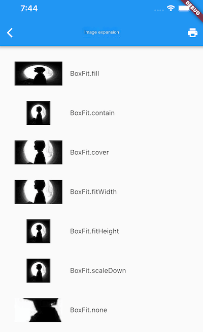
BoxFit, which is an enum:fill: Stretches the image to fill the display area, changing the aspect ratio (causing distortion).cover: Scales the image to maintain its aspect ratio while filling the display area. The excess parts are cropped.contain: This is the default value. Scales the image to fit within the display area without changing its aspect ratio (no distortion).fitWidth: Scales the image to match the width of the display area while maintaining its aspect ratio. The height is scaled accordingly.fitHeight: Scales the image to match the height of the display area while maintaining its aspect ratio. The width is scaled accordingly.none: No scaling is applied. If the image is larger than the display area, only the center portion is displayed.
A picture is worth a thousand words! Different fit values applied to a square avatar image produce results like those shown in Figure .
color and colorBlendMode: These properties allow color blending during image rendering.
colorspecifies the blend color, andcolorBlendModedefines the blending mode. Here's a simple example:
Image(
  image: AssetImage("images/avatar.png"),
  width: 100.0,
  color: Colors.blue,
  colorBlendMode: BlendMode.difference,
);
The result is shown in Figure (colored image).

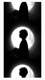
repeat: Specifies how the image should repeat when its size is smaller than the display area. Here's a simple example:
Image(
  image: AssetImage("images/avatar.png"),
  width: 100.0,
  height: 200.0,
  repeat: ImageRepeat.repeatY ,
)
The result is shown in Figure .
Here’s a complete example:
import 'package:flutter/material.dart';

class ImageAndIconRoute extends StatelessWidget {
  @override
  Widget build(BuildContext context) {
    var img = AssetImage("images/avatar.png");
    return SingleChildScrollView(
      child: Column(
        children: <Image>[
          Image(image: img, height: 50.0, width: 100.0, fit: BoxFit.fill),
          Image(image: img, height: 50.0, width: 50.0, fit: BoxFit.contain),
          Image(image: img, width: 100.0, height: 50.0, fit: BoxFit.cover),
          Image(image: img, width: 100.0, height: 50.0, fit: BoxFit.fitWidth),
          Image(image: img, width: 100.0, height: 50.0, fit: BoxFit.fitHeight),
          Image(image: img, width: 100.0, height: 50.0, fit: BoxFit.scaleDown),
          Image(image: img, height: 50.0, width: 100.0, fit: BoxFit.none),
          Image(
            image: img,
            width: 100.0,
            color: Colors.blue,
            colorBlendMode: BlendMode.difference,
            fit: BoxFit.fill,
          ),
          Image(
            image: img,
            width: 100.0,
            height: 200.0,
            repeat: ImageRepeat.repeatY,
          )
        ].map((e) {
          return Row(
            children: <Widget>[
              Padding(
                padding: EdgeInsets.all(16.0),
                child: SizedBox(width: 100, child: e),
              ),
              Text(e.fit.toString())
            ],
          );
        }).toList(),
      ),
    );
  }
}
3. Image Caching
Flutter automatically caches images in memory after loading them. More details about Image and its internals will be covered in the advanced sections.
18.2 Icons
In Flutter, you can use icon fonts, similar to how they are used in web development. An icon font is essentially a font file where each character represents a specific glyph, and in the case of icon fonts, these glyphs are icons.
Icon fonts have several advantages over images in Flutter development:
Smaller size: Reduces the size of the app package.
Vector-based: Icon fonts are vector images, so they remain sharp when scaled up.
Can apply text styles: You can change the color, size, and alignment of icon fonts, just like text.
Mixed with text: Icon fonts can be used alongside text via
TextSpan.
1. Using Material Design Icon Fonts
Flutter includes a set of Material Design icon fonts by default, which can be enabled by adding the following to the pubspec.yaml file:
flutter:
  uses-material-design: true
You can browse all Material Design icons on their official website.
Here's a simple example:
String icons = "";
// accessible: 0xe03e
icons += "uE03e";
// error: 0xe237
icons += " uE237";
// fingerprint: 0xe287
icons += " uE287";

Text(
  icons,
  style: TextStyle(
    fontFamily: "MaterialIcons",
    fontSize: 24.0,
    color: Colors.green,
  ),
);
The result is shown in Figure .

Instead of manually specifying each icon’s code point, Flutter provides the IconData and Icon classes to display icon fonts. The above example can be rewritten as:
Row(
  mainAxisAlignment: MainAxisAlignment.center,
  children: <Widget>[
    Icon(Icons.accessible, color: Colors.green),
    Icon(Icons.error, color: Colors.green),
    Icon(Icons.fingerprint, color: Colors.green),
  ],
)
The Icons class contains static variables representing all Material Design icons.
2. Using Custom Icon Fonts
You can also use custom icon fonts. Websites like iconfont.cn offer a variety of icon fonts that you can download and use in your project.
To use a custom icon font, for example, for a book icon and a WeChat icon, follow these steps:
Import the icon font file. This process is the same as importing regular fonts. Assuming the font file is located in the project root directory at "fonts/iconfont.ttf", add the following to the
pubspec.yamlfile:
fonts:
  - family: myIcon  # Specify a font family name
    fonts:
      - asset: fonts/iconfont.ttf
Define a class
MyIconsthat maps the custom icons from the font file to static variables, similar to how theIconsclass works:
class MyIcons {
  // Book icon
  static const IconData book = const IconData(
      0xe614,
      fontFamily: 'myIcon',
      matchTextDirection: true);

  // WeChat icon
  static const IconData wechat = const IconData(
      0xec7d,
      fontFamily: 'myIcon',
      matchTextDirection: true);
}
Use the custom icons:
Row(
  mainAxisAlignment: MainAxisAlignment.center,
  children: <Widget>[
    Icon(MyIcons.book, color: Colors.purple),
    Icon(MyIcons.wechat, color: Colors.green),
  ],
)
The result is shown in Figure .

![[C++ Chapter] Setting Sail—An Introduction to C++ (Part 2)](/static/upload/image/20241120/1732094910609611.jpg)
