The Material component library provides the TextField input box component and the Form component. Let's introduce them one by one.
20.1 TextField
The TextField is used for text input and offers many properties. We'll briefly introduce the main properties and then demonstrate the usage of key properties with a few examples.
const TextField({
  ...
  TextEditingController controller,
  FocusNode focusNode,
  InputDecoration decoration = const InputDecoration(),
  TextInputType keyboardType,
  TextInputAction textInputAction,
  TextStyle style,
  TextAlign textAlign = TextAlign.start,
  bool autofocus = false,
  bool obscureText = false,
  int maxLines = 1,
  int maxLength,
  this.maxLengthEnforcement,
  ToolbarOptions? toolbarOptions,
  ValueChanged<String> onChanged,
  VoidCallback onEditingComplete,
  ValueChanged<String> onSubmitted,
  List<TextInputFormatter> inputFormatters,
  bool enabled,
  this.cursorWidth = 2.0,
  this.cursorRadius,
  this.cursorColor,
  this.onTap,
  ...
})
Main Properties:
controller: The text field controller. It allows you to set or get the content of the text field, select the text, and listen for changes. In most cases, it's necessary to explicitly provide a controller for interaction with the text field. If not provided, theTextFieldwill create one internally.focusNode: Controls whether theTextFieldcurrently has focus, which is how it interacts with the keyboard.InputDecoration: Controls the appearance of theTextField, such as hint text, background color, and borders.keyboardType: Sets the default keyboard type for the input field. Here are some possible values:
TextInputType Enum | Meaning |
|---|---|
text | Text input keyboard |
multiline | Multi-line text; should be used with maxLines (set to null or greater than 1) |
number | Numeric input keyboard |
phone | Optimized for phone number input |
datetime | Optimized for date input on Android |
emailAddress | Optimized for email input |
url | Optimized for URL input |
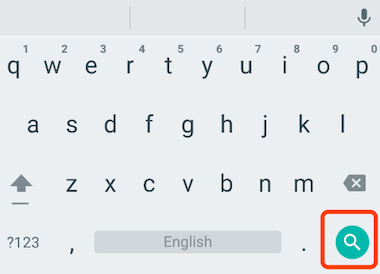
textInputAction: Defines the icon on the action button of the keyboard (e.g., the "enter" key). It is an enum with multiple values. You can find the full list in the API documentation. For example, when set toTextInputAction.search, the keyboard on native Android looks as shown in Figure .
style: The style for the text being edited.textAlign: Specifies how the text within the input field is aligned horizontally.autofocus: Whether the input field should automatically receive focus.obscureText: Whether to obscure the text being edited, useful for password fields, where the text is replaced by “•”.maxLines: The maximum number of lines for the input field, defaulting to 1. If set tonull, there is no limit.maxLengthandmaxLengthEnforcement:maxLengthspecifies the maximum number of characters allowed in the text field, and a character counter is displayed at the bottom right when set.maxLengthEnforcementdetermines how to handle input when the length exceedsmaxLength(e.g., truncation, overflow).toolbarOptions: The menu that appears on long-press or right-click, offering options like copy, cut, paste, and selectAll.onChanged: A callback function triggered whenever the content of the text field changes. Note: content changes can also be listened to via the controller.onEditingCompleteandonSubmitted: Both are triggered when input is complete, for example, when the user presses the "done" button or the search button on the keyboard. The difference is thatonSubmittedtakes the current input as a parameter (ValueChanged<String>), whileonEditingCompletedoes not.inputFormatters: Specifies input formatting rules. When the user changes the content, it is validated against the given format.enabled: Iffalse, the input field is disabled. In this state, the input field will not respond to inputs or events, and the disabled style will be shown (defined in itsdecoration).cursorWidth,cursorRadius, andcursorColor: These properties allow you to customize the width, corner radius, and color of the text field cursor.
Example: Login Input Fields
1) Layout
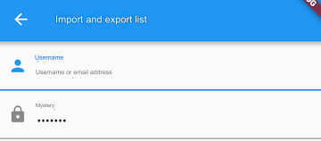
We will create a login form:
Column(
  children: <Widget>[
    TextField(
      autofocus: true,
      decoration: InputDecoration(
        labelText: "Username",
        hintText: "Username or email",
        prefixIcon: Icon(Icons.person),
      ),
    ),
    TextField(
      decoration: InputDecoration(
        labelText: "Password",
        hintText: "Your login password",
        prefixIcon: Icon(Icons.lock),
      ),
      obscureText: true,
    ),
  ],
);
After running this code, the result looks like Figure .
2) Retrieving Input
There are two ways to retrieve the input:
Define two variables to store the username and password, then save the input when the
onChangedcallback is triggered.Directly retrieve the input using a controller.
The first method is straightforward, so we'll focus on the second method using the controller. Let's take the username input field as an example:
// Define a controller
TextEditingController _unameController = TextEditingController();
Set the controller for the input field:
TextField(
    autofocus: true,
    controller: _unameController, // Set the controller
    ...
)
Retrieve the input content using the controller:
print(_unameController.text);
3) Listening to Text Changes
There are two ways to listen for text changes:
Set the
onChangedcallback, like this:
TextField(
    autofocus: true,
    onChanged: (v) {
      print("onChange: $v");
    },
)
Use the controller to listen for changes:
@override
void initState() {
  // Listen for input changes
  _unameController.addListener(() {
    print(_unameController.text);
  });
}
The onChanged callback is specifically used for listening to text changes, while the controller has more functions. In addition to listening for changes, it can set default values and select text. Here's an example:
Create a controller:
TextEditingController _selectionController = TextEditingController();
Set the default value and select text starting from the third character:
_selectionController.text = "hello world!";
_selectionController.selection = TextSelection(
    baseOffset: 2,
    extentOffset: _selectionController.text.length,
);
Set the controller:
TextField(
  controller: _selectionController,
)
The result is shown in Figure .

4) Controlling Focus
Focus in TextField can be managed using FocusNode and FocusScopeNode. By default, focus is controlled by FocusScope, which represents a scope for focus control. Within this scope, you can move focus between input fields, set default focus, etc., using FocusScopeNode. You can obtain the default FocusScopeNode in the widget tree via FocusScope.of(context).
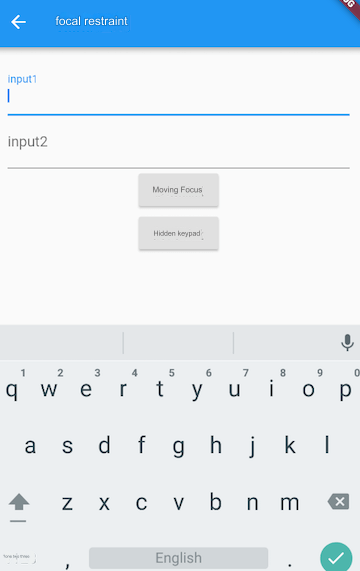
Let’s look at an example where we create two TextFields. The first one will automatically get focus, and we’ll also create two buttons:
Clicking the first button moves the focus from the first
TextFieldto the second one.Clicking the second button hides the keyboard.
The desired result is shown in Figure .
Code Example:
class FocusTestRoute extends StatefulWidget {
  @override
  _FocusTestRouteState createState() => _FocusTestRouteState();
}

class _FocusTestRouteState extends State<FocusTestRoute> {
  FocusNode focusNode1 = FocusNode();
  FocusNode focusNode2 = FocusNode();
  FocusScopeNode? focusScopeNode;

  @override
  Widget build(BuildContext context) {
    return Padding(
      padding: EdgeInsets.all(16.0),
      child: Column(
        children: <Widget>[
          TextField(
            autofocus: true,
            focusNode: focusNode1, // Associated with focusNode1
            decoration: InputDecoration(
              labelText: "input1",
            ),
          ),
          TextField(
            focusNode: focusNode2, // Associated with focusNode2
            decoration: InputDecoration(
              labelText: "input2",
            ),
          ),
          Builder(
            builder: (ctx) {
              return Column(
                children: <Widget>[
                  ElevatedButton(
                    child: Text("Move Focus"),
                    onPressed: () {
                      // Move focus from the first TextField to the second
                      // This is one way: FocusScope.of(context).requestFocus(focusNode2);
                      // Another way:
                      if (focusScopeNode == null) {
                        focusScopeNode = FocusScope.of(context);
                      }
                      focusScopeNode.requestFocus(focusNode2);
                    },
                  ),
                  ElevatedButton(
                    child: Text("Hide Keyboard"),
                    onPressed: () {
                      // The keyboard is dismissed when all text fields lose focus
                      focusNode1.unfocus();
                      focusNode2.unfocus();
                    },
                  ),
                ],
              );
            },
          ),
        ],
      ),
    );
  }
}
FocusNode and FocusScopeNode have other useful methods, which can be found in the API documentation.
5) Listening for Focus Changes
FocusNode inherits from ChangeNotifier, allowing you to listen for focus change events, for example:
// Create a FocusNode
FocusNode focusNode = FocusNode();
...
// Bind the focusNode to a TextField
TextField(focusNode: focusNode);
...
// Listen for focus changes
focusNode.addListener(() {
   print(focusNode.hasFocus);
});
When the field gains focus, focusNode.hasFocus is true; when it loses focus, it becomes false.
6) Customizing Styles
Although we can define the style of the TextField through the decoration property, let's look at an example of customizing the underline color for the input field:
TextField(
  decoration: InputDecoration(
    labelText: "Enter your username",
    prefixIcon: Icon(Icons.person),
    // Set the underline color to gray when the field is not focused
    enabledBorder: UnderlineInputBorder(
      borderSide: BorderSide(color: Colors.grey),
    ),
    // Set the underline color to blue when the field is focused
    focusedBorder: UnderlineInputBorder(
      borderSide: BorderSide(color: Colors.blue),
    ),
  ),
)
In the code above, we use InputDecoration's enabledBorder and focusedBorder to set different underline colors for when the field is focused or not. We can also use themes to customize the style without using enabledBorder and focusedBorder. Let’s explore how to do this:
Since the color used for the underline is controlled by the theme's hintColor, modifying it directly would change both the underline and the hint text color. Fortunately, decoration allows you to override the hint color using hintStyle. Also, the input field’s default decoration can be customized through the theme's inputDecorationTheme. Here's how:
Theme(
  data: Theme.of(context).copyWith(
    hintColor: Colors.grey[200], // Define the underline color
    inputDecorationTheme: InputDecorationTheme(
      labelStyle: TextStyle(color: Colors.grey), // Define label text style
      hintStyle: TextStyle(color: Colors.grey, fontSize: 14.0), // Define hint text style
    ),
  ),
  child: Column(
    children: <Widget>[
      TextField(
        decoration: InputDecoration(
          labelText: "Username",
          hintText: "Username or email",
          prefixIcon: Icon(Icons.person),
        ),
      ),
      TextField(
        decoration: InputDecoration(
          prefixIcon: Icon(Icons.lock),
          labelText: "Password",
          hintText: "Your login password",
          hintStyle: TextStyle(color: Colors.grey, fontSize: 13.0),
        ),
        obscureText: true,
      ),
    ],
  ),
)
The result is shown in Figure .
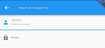
We have successfully customized the underline color and hint text style. Attentive readers might notice that after customizing this way, the labelText does not highlight when the input field gains focus (e.g., "Username" should be highlighted in blue but remains gray), and we still can’t control the width of the underline.
Another flexible approach is to hide the underline provided by the TextField itself and define the style using a Container. For example:
Container(
  child: TextField(
    keyboardType: TextInputType.emailAddress,
    decoration: InputDecoration(
      labelText: "Email",
      hintText: "Email address",
      prefixIcon: Icon(Icons.email),
      border: InputBorder.none, // Hide the underline
    ),
  ),
  decoration: BoxDecoration(
    // Set a light gray underline, 1 pixel wide
    border: Border(bottom: BorderSide(color: Colors.grey[200], width: 1.0)),
  ),
)
The result is shown in Figure .

With this combination of components, you can also define things like background and rounded corners. In general, it’s best to customize styles using decoration whenever possible, and only resort to widget combinations if decoration can’t achieve the desired effect.
Thought Exercise: In this example, the underline color is fixed, so it remains gray even when the field is focused. How could we make the underline change color when clicked?
20.2 Form
In real-world applications, data in input fields is usually validated before being submitted to the server. Validating each TextField individually can be cumbersome. Additionally, if users want to clear multiple TextFields, it can be inefficient to clear them one by one. To solve these issues, Flutter provides the Form widget, which allows input fields to be grouped for unified operations such as validation, resetting, and saving input data.
1. Form
The Form widget extends StatefulWidget, and its associated state class is FormState. Let’s look at the definition of the Form class:
Form({
  required Widget child,
  bool autovalidate = false,
  WillPopCallback? onWillPop,
  VoidCallback? onChanged,
})autovalidate: Whether to automatically validate the input. If set to
true, the childFormFields will be validated automatically whenever their content changes, and any errors will be displayed immediately. Otherwise, you must callFormState.validate()to manually trigger validation.onWillPop: Decides whether the route containing the form can be popped (e.g., by pressing the back button). This callback returns a
Futureobject. If the result of theFutureisfalse, the current route will not pop; iftrue, the route will return to the previous one. This is usually used to intercept the back button action.onChanged: Triggered when any of the child
FormFieldcontents change.
2. FormField
The children of a Form must be of type FormField. FormField is an abstract class with several attributes that allow the FormState to perform operations. A portion of the FormField definition is as follows:
const FormField({
  ...
  FormFieldSetter<T>? onSaved,  // Save callback
  FormFieldValidator<T>? validator,  // Validation callback
  T? initialValue,  // Initial value
  bool autovalidate = false,  // Whether to auto-validate
})
For convenience, Flutter provides the TextFormField widget, which extends FormField and is a wrapper for TextField. Therefore, in addition to the properties defined by FormField, it also includes the properties of TextField.
3. FormState
FormState is the state class for Form. It can be accessed through Form.of() or by using a GlobalKey. Using FormState, you can perform unified operations on all child FormFields. Let’s explore three commonly used methods:
FormState.validate(): When called, this method triggers the
validatecallback on all childFormFields. If any validation fails, the method returnsfalse, and all failed validation fields will return the corresponding error message to the user.FormState.save(): When called, this method triggers the
savecallback on all childFormFields to save the form data.FormState.reset(): This method clears the contents of all child
FormFields.
4. Example
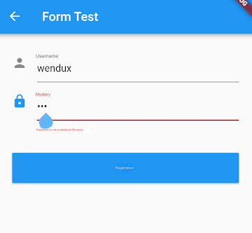
Let’s modify the previous login example to include validation before submission:
The username field cannot be empty. If it is, an error message "Username cannot be empty" is displayed.
The password must be at least 6 characters long. If it is less than 6, an error message "Password must be at least 6 characters long" is shown.
Here’s the complete code:
import 'package:flutter/material.dart';

class FormTestRoute extends StatefulWidget {
  @override
  _FormTestRouteState createState() => _FormTestRouteState();
}

class _FormTestRouteState extends State<FormTestRoute> {
  TextEditingController _unameController = TextEditingController();
  TextEditingController _pwdController = TextEditingController();
  GlobalKey _formKey = GlobalKey<FormState>();

  @override
  Widget build(BuildContext context) {
    return Form(
      key: _formKey,  // Set the GlobalKey to access FormState
      autovalidateMode: AutovalidateMode.onUserInteraction,
      child: Column(
        children: <Widget>[
          TextFormField(
            autofocus: true,
            controller: _unameController,
            decoration: InputDecoration(
              labelText: "Username",
              hintText: "Username or email",
              icon: Icon(Icons.person),
            ),
            // Validate the username
            validator: (v) {
              return v!.trim().isNotEmpty ? null : "Username cannot be empty";
            },
          ),
          TextFormField(
            controller: _pwdController,
            decoration: InputDecoration(
              labelText: "Password",
              hintText: "Your login password",
              icon: Icon(Icons.lock),
            ),
            obscureText: true,
            // Validate the password
            validator: (v) {
              return v!.trim().length > 5 ? null : "Password must be at least 6 characters long";
            },
          ),
          // Login button
          Padding(
            padding: const EdgeInsets.only(top: 28.0),
            child: Row(
              children: <Widget>[
                Expanded(
                  child: ElevatedButton(
                    child: Padding(
                      padding: const EdgeInsets.all(16.0),
                      child: Text("Login"),
                    ),
                    onPressed: () {
                      // Get the FormState using _formKey.currentState,
                      // and call validate() to check if the username and password are valid.
                      // If they are, submit the data.
                      if ((_formKey.currentState as FormState).validate()) {
                        // Validation passed, submit data
                      }
                    },
                  ),
                ),
              ],
            ),
          ),
        ],
      ),
    );
  }
}
After running, the result will look like Figure .
Important Notes:
In the onPressed method of the login button, you cannot use Form.of(context) to get the FormState. This is because the context in this instance refers to the FormTestRoute’s context. Form.of(context) works by traversing up the widget tree from the specified context, but since FormState is in the subtree of FormTestRoute, this approach won’t work. The correct way is to use a Builder to construct the login button, which provides the actual context of the widget node as a callback parameter:
Expanded(
  // Use Builder to obtain the true context (Element) of the ElevatedButton in the widget tree
  child: Builder(builder: (context) {
    return ElevatedButton(
      ...
      onPressed: () {
        // Since this widget is also a descendant of the Form widget, we can use the following to get the FormState
        if (Form.of(context).validate()) {
          // Validation passed, submit data
        }
      },
    );
  }),
)
The context is an interface to the Element that represents the corresponding widget. Since the Elements in the widget tree are all different, the contexts are also different. You’ll learn more about context in the advanced sections later in this book. Flutter has many methods that use of(context), so it’s essential to ensure the context you’re using is correct.
