31.1 DecoratedBox
DecoratedBox allows you to draw some decorations (like background, border, gradients, etc.) either before (or after) its child component is rendered. The definition of DecoratedBox is as follows:
const DecoratedBox({
  Decoration decoration,
  DecorationPosition position = DecorationPosition.background,
  Widget? child
})decoration: Represents the decoration to be painted. Its type is
Decoration, which is an abstract class. It defines an interfacecreateBoxPainter(), and the main responsibility of its subclasses is to create a painter by implementing this interface. This painter is used to paint the decoration.position: This property determines where to draw the decoration. It accepts the enum type
DecorationPosition, which has two values:background: Paints the decoration behind the child, as a background.foreground: Paints the decoration above the child, as a foreground.
31.2 BoxDecoration
We typically use the BoxDecoration class directly, which is a subclass of Decoration that implements the drawing of common decorative elements.
BoxDecoration({
  Color color, // Color
  DecorationImage image, // Image
  BoxBorder border, // Border
  BorderRadiusGeometry borderRadius, // Border radius
  List<BoxShadow> boxShadow, // Shadows, can specify multiple
  Gradient gradient, // Gradient
  BlendMode backgroundBlendMode, // Background blend mode
  BoxShape shape = BoxShape.rectangle, // Shape
})
Each of these property names is self-explanatory. For more details, readers can refer to the API documentation.
31.3 Example
Let's create a button with a gradient background and shadow effect:
DecoratedBox(
decoration: BoxDecoration(
gradient: LinearGradient(colors: [Colors.red, Colors.orange.shade700]), // Background gradient
borderRadius: BorderRadius.circular(3.0), // 3-pixel radius corners
boxShadow: [ // Shadow
BoxShadow(
color: Colors.black54,
offset: Offset(2.0, 2.0),
blurRadius: 4.0
)
]
),
child: Padding(
padding: EdgeInsets.symmetric(horizontal: 80.0, vertical: 18.0),
child: Text("Login", style: TextStyle(color: Colors.white)),
)
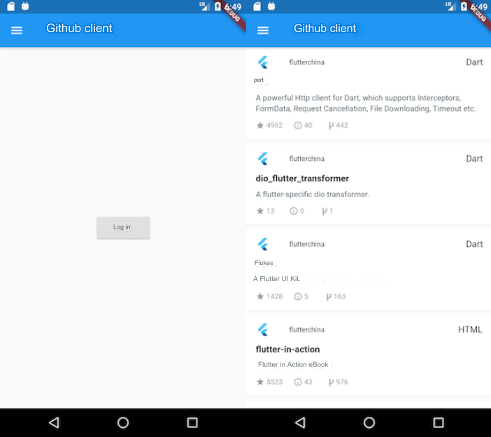
)The result is shown in Figure:

With BoxDecoration, we've created a gradient-styled button, but this example isn't yet a standard button since it doesn't respond to click events. We’ll implement a fully functional GradientButton in section 10.2. Additionally, the above example uses the LinearGradient class, which defines a linear gradient. Flutter also provides other gradient configuration classes such as RadialGradient and SweepGradient. Readers can refer to the API documentation for further details if needed.