The Material component library provides two types of progress indicators: LinearProgressIndicator and CircularProgressIndicator. Both can be used to indicate either a precise progress or an indeterminate one. Precise progress is usually applied in situations where task completion can be calculated and predicted, such as file downloads. Indeterminate progress is used when task progress cannot be accurately measured, such as during pull-to-refresh or data submission.
21.1 LinearProgressIndicator
LinearProgressIndicator is a linear bar-style progress indicator, defined as follows:
LinearProgressIndicator({
  double? value,
  Color? backgroundColor,
  Animation<Color>? valueColor,
  ...
})value: Represents the current progress, with a range of [0, 1]. If
valueisnull, the indicator performs an indeterminate animation. Ifvalueis notnull, the indicator displays a specific progress.backgroundColor: The background color of the progress indicator.
valueColor: The color of the progress bar. Notably, this value is of type
Animation<Color>, allowing you to animate the progress bar's color. If you don’t need the progress bar’s color to animate, and instead want to apply a fixed color, you can useAlwaysStoppedAnimation.
Example
Indeterminate progress bar (with an animation):
LinearProgressIndicator(
  backgroundColor: Colors.grey[200],
  valueColor: AlwaysStoppedAnimation(Colors.blue),
),
Progress bar showing 50% progress:
LinearProgressIndicator(
  backgroundColor: Colors.grey[200],
  valueColor: AlwaysStoppedAnimation(Colors.blue),
  value: 0.5,
)
After running, the result looks like Figure .

In the first progress bar, a blue bar continuously moves, indicating an indeterminate state. The second progress bar is static, stopping at 50%.
21.2 CircularProgressIndicator
CircularProgressIndicator is a circular progress indicator, defined as follows:
CircularProgressIndicator({
  double? value,
  Color? backgroundColor,
  Animation<Color>? valueColor,
  this.strokeWidth = 4.0,
  ...
})
The first three parameters are the same as those in LinearProgressIndicator. strokeWidth represents the thickness of the circular progress bar.
Example
Indeterminate circular progress bar (with a rotating animation):
CircularProgressIndicator(
  backgroundColor: Colors.grey[200],
  valueColor: AlwaysStoppedAnimation(Colors.blue),
),
Circular progress bar showing 50% progress (a semicircle):
CircularProgressIndicator(
  backgroundColor: Colors.grey[200],
  valueColor: AlwaysStoppedAnimation(Colors.blue),
  value: 0.5,
),
After running, the result looks like Figure .
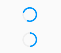
In the first progress bar, the circular indicator rotates, while the second progress bar is static and stops at 50%.
21.3 Customizing the Size
You may notice that neither LinearProgressIndicator nor CircularProgressIndicator provide parameters for setting their size. So how can we make the LinearProgressIndicator thinner or the CircularProgressIndicator larger?
Both LinearProgressIndicator and CircularProgressIndicator take the size of their parent container as their drawing boundary. Knowing this, you can use size-constraining widgets like ConstrainedBox or SizedBox (introduced later in the chapter on container widgets) to specify their size. For example:
To set the height of a linear progress bar to 3:
SizedBox(
  height: 3,
  child: LinearProgressIndicator(
    backgroundColor: Colors.grey[200],
    valueColor: AlwaysStoppedAnimation(Colors.blue),
    value: 0.5,
  ),
),
To set the diameter of a circular progress bar to 100:
SizedBox(
  height: 100,
  width: 100,
  child: CircularProgressIndicator(
    backgroundColor: Colors.grey[200],
    valueColor: AlwaysStoppedAnimation(Colors.blue),
    value: 0.7,
  ),
),
After running, the result looks like Figure .
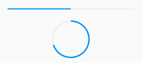
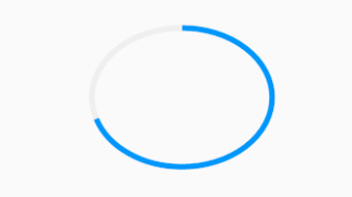
Note that if the width and height of CircularProgressIndicator are not equal, it will be displayed as an ellipse. For example:
// Unequal width and height
SizedBox(
  height: 100,
  width: 130,
  child: CircularProgressIndicator(
    backgroundColor: Colors.grey[200],
    valueColor: AlwaysStoppedAnimation(Colors.blue),
    value: 0.7,
  ),
),
The result is shown in Figure .
21.4 Progress Color Animation
As mentioned earlier, you can animate the color of the progress bar using valueColor. We’ll explore animations in detail in a later chapter, but for now, here’s an example of a progress bar animating from gray to blue over 3 seconds:
import 'package:flutter/material.dart';

class ProgressRoute extends StatefulWidget {
  @override
  _ProgressRouteState createState() => _ProgressRouteState();
}

class _ProgressRouteState extends State<ProgressRoute>
    with SingleTickerProviderStateMixin {
  late AnimationController _animationController;

  @override
  void initState() {
    // Animation duration is 3 seconds
    _animationController = AnimationController(
      vsync: this,  // Note: The State class must mix in SingleTickerProviderStateMixin to provide frame timing for the animation
      duration: Duration(seconds: 3),
    );
    _animationController.forward();
    _animationController.addListener(() => setState(() {}));
    super.initState();
  }

  @override
  void dispose() {
    _animationController.dispose();
    super.dispose();
  }

  @override
  Widget build(BuildContext context) {
    return SingleChildScrollView(
      child: Column(
        children: <Widget>[
          Padding(
            padding: EdgeInsets.all(16),
            child: LinearProgressIndicator(
              backgroundColor: Colors.grey[200],
              valueColor: ColorTween(begin: Colors.grey, end: Colors.blue)
                .animate(_animationController),  // Animates from gray to blue
              value: _animationController.value,
            ),
          ),
        ],
      ),
    );
  }
}
21.5 Customizing Progress Indicator Styles
To create custom progress indicator styles, you can use the CustomPainter widget to define custom drawing logic. In fact, both LinearProgressIndicator and CircularProgressIndicator use CustomPainter to implement their visual appearance.
