Custom Drawing in Flutter
For some complex or irregular UIs, we may not be able to achieve the desired result simply by combining other components. For instance, we might need a regular hexagon, a gradient circular progress bar, or a chessboard. Of course, sometimes we can use images to achieve these effects, but in scenarios that require dynamic interaction, static images won't suffice. For example, if we want to create a handwritten input panel, we need to draw the UI ourselves.
Almost all UI systems provide an interface for custom drawing. This interface typically offers a 2D canvas called Canvas, which encapsulates some basic drawing APIs that developers can use to draw various custom shapes. In Flutter, there is a CustomPaint widget that works with the CustomPainter class to enable custom shape drawing.
72.1 CustomPaint
Let's take a look at the CustomPaint constructor:
CustomPaint({
  Key? key,
  this.painter,
  this.foregroundPainter,
  this.size = Size.zero,
  this.isComplex = false,
  this.willChange = false,
  Widget? child, // Optional child node
})
-
painter: The background painter, which is drawn behind the child node.
-
foregroundPainter: The foreground painter, which is drawn in front of the child node.
-
size: When the child is null, this represents the default drawing area size. If a child is present, this parameter is ignored, and the canvas size will be the size of the child. To specify a specific size for the canvas when a child is present, you can wrap
CustomPaintin aSizedBox. -
isComplex: Indicates whether the drawing is complex. If true, Flutter will apply some caching strategies to reduce the overhead of redundant rendering.
-
willChange: Used in conjunction with
isComplex. When caching is enabled, this property indicates whether the drawing will change in the next frame.
As you can see, when drawing, we need to provide either a foreground or a background painter, and both can be provided simultaneously. Our painter must extend the CustomPainter class, where we will implement the actual drawing logic.
1. Drawing Boundaries: RepaintBoundary
If CustomPaint has child nodes, to avoid unnecessary repainting of child nodes and improve performance, we usually wrap the child nodes in a RepaintBoundary widget. This creates a new drawing layer during rendering, where the child components will be drawn on the new layer, while the parent component will be drawn on the original layer. This means that the drawing of the RepaintBoundary child components is independent of the drawing of the parent component. The RepaintBoundary isolates its child nodes from the drawing boundaries of CustomPaint itself. Here is an example:
CustomPaint(
  size: Size(300, 300), // Specify canvas size
  painter: MyPainter(),
  child: RepaintBoundary(child: ...),
)
2. CustomPainter and Canvas
In CustomPainter, there is a virtual function defined called paint:
void paint(Canvas canvas, Size size);
The paint function has two parameters:
-
Canvas: A canvas that includes various drawing methods. Here are some common methods:
API Name Function drawLine Draw a line drawPoint Draw a point drawPath Draw a path drawImage Draw an image drawRect Draw a rectangle drawCircle Draw a circle drawOval Draw an oval drawArc Draw an arc -
Size: The size of the current drawing area.
3. Paint Class
Now that we have a canvas, we still need a paintbrush. Flutter provides the Paint class to implement the paintbrush. In Paint, we can configure various properties of the brush such as thickness, color, style, etc. For example:
var paint = Paint() // Create a paintbrush and configure its properties
  ..isAntiAlias = true // Enable anti-aliasing
  ..style = PaintingStyle.fill // Paintbrush style: fill
  ..color = Color(0x77cdb175); // Paintbrush color
For more configuration properties, readers can refer to the Paint class definition.
72.2 Example: Gomoku (Five-in-a-Row)
1. Drawing the Board and Pieces
Next, we'll demonstrate the process of custom UI drawing using the drawing of a Gomoku game board and pieces. First, let's look at our target effect, as shown in Figure :
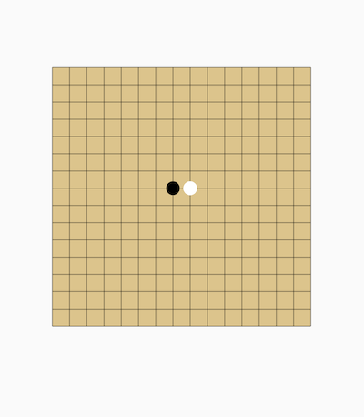
Here is the code:
import 'package:flutter/material.dart';
import 'dart:math';

class CustomPaintRoute extends StatelessWidget {
  const CustomPaintRoute({Key? key}) : super(key: key);

  @override
  Widget build(BuildContext context) {
    return Center(
      child: CustomPaint(
        size: Size(300, 300), // Specify canvas size
        painter: MyPainter(),
      ),
    );
  }
}

class MyPainter extends CustomPainter {
  @override
  void paint(Canvas canvas, Size size) {
    print('paint');
    var rect = Offset.zero & size;
    // Draw the board
    drawChessboard(canvas, rect);
    // Draw the pieces
    drawPieces(canvas, rect);
  }

  // Return false; this will be explained later
  @override
  bool shouldRepaint(CustomPainter oldDelegate) => false;
}
First, let's implement the board drawing:
void drawChessboard(Canvas canvas, Rect rect) {
  // Background of the board
  var paint = Paint()
    ..isAntiAlias = true
    ..style = PaintingStyle.fill // Fill
    ..color = Color(0xFFDCC48C);
  canvas.drawRect(rect, paint);

  // Draw the board grid
  paint
    ..style = PaintingStyle.stroke // Line
    ..color = Colors.black38
    ..strokeWidth = 1.0;

  // Draw horizontal lines
  for (int i = 0; i <= 15; ++i) {
    double dy = rect.top + rect.height / 15 * i;
    canvas.drawLine(Offset(rect.left, dy), Offset(rect.right, dy), paint);
  }

  for (int i = 0; i <= 15; ++i) {
    double dx = rect.left + rect.width / 15 * i;
    canvas.drawLine(Offset(dx, rect.top), Offset(dx, rect.bottom), paint);
  }
}
Next, let's implement the drawing of the pieces:
// Draw the pieces
void drawPieces(Canvas canvas, Rect rect) {
  double eWidth = rect.width / 15;
  double eHeight = rect.height / 15;
  // Draw a black piece
  var paint = Paint()
    ..style = PaintingStyle.fill
    ..color = Colors.black;

  // Draw a black piece
  canvas.drawCircle(
    Offset(rect.center.dx - eWidth / 2, rect.center.dy - eHeight / 2),
    min(eWidth / 2, eHeight / 2) - 2,
    paint,
  );

  // Draw a white piece
  paint.color = Colors.white;
  canvas.drawCircle(
    Offset(rect.center.dx + eWidth / 2, rect.center.dy - eHeight / 2),
    min(eWidth / 2, eHeight / 2) - 2,
    paint,
  );
}
2. Drawing Performance
Drawing is a relatively expensive operation, so we should consider performance overhead when implementing custom-drawn widgets. Here are two performance optimization suggestions:
-
Utilize the
shouldRepaintReturn Value: When the UI tree is rebuilt, the widget calls this method before drawing to determine whether a redraw is necessary. If the UI we are drawing does not depend on external state—meaning that changes in external state will not affect the appearance of our UI—we should returnfalse. If the drawing does depend on external state, we should check inshouldRepaintwhether the dependent state has changed. If it has changed, we should returntrueto trigger a redraw; otherwise, we returnfalseto avoid unnecessary redraws. -
Layer Drawing as Much as Possible: In the previous Gomoku example, we combined the drawing of the board and the pieces. This presents a problem: since the board is always static and only the pieces change with each move, using the above code means we redraw the board every time we draw a piece, which is unnecessary. The optimization is to separate the board into its own component and set its
shouldRepaintreturn value tofalse, then use this board component as the background. The drawing of the pieces can then be placed in another component, allowing us to draw only the pieces with each move.
3. Preventing Unwanted Redraws
Building on the previous example, we can add an ElevatedButton that does nothing when clicked:
class CustomPaintRoute extends StatelessWidget {
  const CustomPaintRoute({Key? key}) : super(key: key);

  @override
  Widget build(BuildContext context) {
    return Center(
      child: Column(
        mainAxisSize: MainAxisSize.min,
        children: [
          CustomPaint(
            size: Size(300, 300), // Specify canvas size
            painter: MyPainter(),
          ),
          // Add a refresh button
          ElevatedButton(onPressed: () {}, child: Text("Refresh"))
        ],
      ),
    );
  }
}
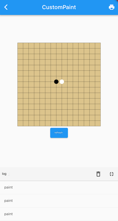
When we run this code and click the "Refresh" button, we see in the logs that many "paint" messages are output, indicating multiple redraws occurred when the button was clicked. It's strange because we returned false from shouldRepaint, and clicking the refresh button does not trigger a rebuild of the page. To fully understand this issue, we will need to wait until Chapter 14, where we discuss Flutter's rendering principles. For now, we can simplify the explanation by stating that the canvas of the refresh button and the canvas of CustomPaint are the same. When the refresh button is clicked, it executes a water ripple animation, which continuously refreshes the canvas during the animation, causing CustomPaint to be redrawn repeatedly.
The solution to this problem is simple: we can add a RepaintBoundary as a parent component to either the refresh button or CustomPaint. This will effectively create a new canvas:
RepaintBoundary(
  child: CustomPaint(
    size: Size(300, 300), // Specify canvas size
    painter: MyPainter(),
  ),
),
// Or add a RepaintBoundary to the refresh button
// RepaintBoundary(child: ElevatedButton(onPressed: () {}, child: Text("Refresh")))
72.3 Summary
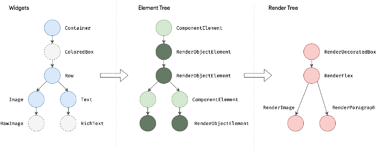
Custom-drawn widgets are very powerful and can theoretically achieve any 2D graphic appearance. In practice, all components provided by Flutter are ultimately drawn using Canvas, although the drawing logic is encapsulated. Readers interested in this can look at the source code of styled components to find their corresponding RenderObject. For instance, the Text widget corresponds to the RenderParagraph object, which implements the text drawing logic through Canvas. In the next section, we will help readers deepen their understanding with an example of a custom-drawn circular background gradient progress bar.
